-
Type:
Suggestion
-
Resolution: Fixed
-
Component/s: Classic - Boards
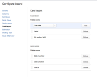
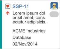
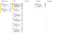
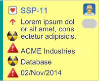
It would be nice to be able to modify the fields that are displayed in the cards on the RapidBoard, just like you can for the Planing and Task boards.
In particular, it would be nice to be able to show the name of the assignee in addition of their avatar ![]()
Please Note
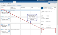
This issue relates to configuring the layout of the card on the Rapid Board. If you are instead interested in configuring the fields shown in the detail view that pops up when you click on an issue in the Rapid Board, please see GHS-3474 - As a Rapid Board user I would like to configure the detail view for an issue

Latest update by Tom can be found at here
- details
-
JSWCLOUD-6754 As an Atlassian (enterprise) customer I request that Rapid Board fulfills some MUST HAVE requirements
- Closed
- incorporates
-
JSWCLOUD-5693 Viewing Mode drop down in classic Planning Board to appear in the new board
- Closed
-
JSWCLOUD-6059 As a User, I can see the project, component, priority, assignee and title of the story on the planning board
- Closed
- is duplicated by
-
JSWCLOUD-6452 Configuring fields which appear on cards in rapid board
-
- Closed
-
-
JSWCLOUD-4975 As a developer, I want to see more information on Rapid Board's issue
- Closed
-
JSWCLOUD-5306 Edit fields on Cards
- Closed
-
JSWCLOUD-5352 Please add the ability to customize the card layout on the Rapid Board
- Closed
-
JSWCLOUD-5798 Templates for Scrum Board Views
- Closed
-
JSWCLOUD-6003 Add several fields in the summary view in the Rapid Board cards (like the classic board)
- Closed
-
JSWCLOUD-6898 scrum board: configure the way tasks are displayed in Plan mode
- Closed
-
JSWCLOUD-8079 Add Issue Status information to Issues Sprint and Backlog
- Closed
-
JSWCLOUD-8118 As a Product Owner, I would like to configure which columns to display on issues in plan mode
- Closed
-
JSWCLOUD-8773 As a user of Greenhopper I will see aggregated remaining estimates in Stories on my Work board.
- Closed
-
JSWCLOUD-9003 As Team Member/Epics I want to use nested swinlanes (Assignee and Epics) in Work mode
- Closed
-
JSWCLOUD-9182 - GreenHopper Card Configuration, add fields
- Closed
-
JSWCLOUD-9242 Customize Scrum Board Template
- Closed
-
JSWCLOUD-9313 Greenhopper Scrum Board - make it possible to edit the shown issue details in plan and work mode
- Closed
-
JSWCLOUD-9456 In the Plan view, want fields shown in backlog screen to be configurable
- Closed
-
JSWCLOUD-9578 Please allow additional fields to be viewed on Work view
- Closed
-
JSWCLOUD-9653 As an administrator, I want to be able to configure cards in rapid board work mode
- Closed
-
JSWCLOUD-9693 As a user of Jira OnDemand / Greenhopper, I'd like to see Business Value in plan mode.
- Closed
-
JSWCLOUD-9855 Add fields to cards on scrum/kanban boards
- Closed
-
JSWCLOUD-9898 Ability to view Issue Status in Plan Mode
- Closed
-
JSWCLOUD-10001 Customize the Agile Plan Board display
- Closed
-
JSWCLOUD-10125 Would like to be able to add columns to the Plan view for Agile
- Closed
-
JSWCLOUD-10342 I would like the card (vertical) size on the Agile Board to be adjustable
- Closed
-
JSWCLOUD-10429 As a JIRA Agile Board Owner, I would like to have the ability to configure more issues to be displayed in a single line in Work Mode
- Closed
-
JSWCLOUD-10763 Show the rank of the ticket on the backlog
- Closed
-
JSWCLOUD-10923 As a user, I would like to be able to customize what information appears in the cards in the Agile (Kanban) board in Work mode.
- Closed
- is related to
-
JSWCLOUD-4822 Ability to customize cards / card colors in Rapid View board
- Closed
-
JSWCLOUD-5140 customizing the "View Issue" screen of Rapid Board
- Closed
-
JSWCLOUD-6045 As Product Owner I want to see additional fields in Plan View for highlighted PBIs so that I can make better decisions in ordering them
- Closed
-
JSWCLOUD-6920 Show related Epic on 'Work' tab and create links to Epic or show Epic label on Details
- Closed
-
JSWCLOUD-7018 As a user, I want to have multiple estimation statics in a single board
- Closed
-
JSWCLOUD-7087 As a sprint master or developer i would like to see what epic tasks are part of on the work screen in the issue cells within the columns
- Closed
-
JSWCLOUD-7253 Inconsistent use of the Estimate field
- Closed
-
JSWCLOUD-7303 Time in cards on KanBan board
- Closed
-
JSWCLOUD-7879 As a GH User, it would be great to show assignee's name in Rapid Board.
- Closed
-
JSWCLOUD-9435 As a GH User, I would like to see Avatars for everyone working on the story
- Closed
-
JSWCLOUD-9699 As a RB user I want to see the Epic listed in the Story Swimlane.
- Closed
-
JSWCLOUD-10147 Contracted layout of cards in JIRA Agile boards
- Closed
-
JSWCLOUD-10604 As a product owner I would like a way to see if work is assigned in plan mode so I can plan more efficiently
- Closed
-
JSWCLOUD-10605 As a product owner I would like to see an additional statistic on the card in plan mode so I can plan more efficiently
- Closed
-
JSWCLOUD-10606 As a developer I would like to see both the original estimate and remaining estimate on a card in work mode so I can see how I'm tracking (when time-tracking is enabled)
- Closed
-
JRACLOUD-86976 Ability to remove the priority icon from company-managed boards
- Gathering Interest
-
JRACLOUD-91133 As a user I would like to add a custom field from a third party JIRA plugin to my card
- Gathering Interest
-
JRACLOUD-91140 As a user, I would like to toggle the display of custom fields on the card from the board / backlog view
- Gathering Interest
-
JSWCLOUD-8444 As a GH scrum user, I can see both the epic and version panels but toggle on/off label sets on the sprint backlog
- Gathering Interest
- relates to
-
JSWCLOUD-3940 Rapid Board does not respect colors set in Task Board
-
- Closed
-
-
JSWCLOUD-3474 As a Rapid Board user I would like to configure the detail view for an issue
- Closed
-
JSWCLOUD-5200 As a user, I would like to be able to change the size of cards on the Rapid Board
- Closed
-
JSWCLOUD-6714 As a Rapid Board user i would like a compact UI displaying as many cards as the classic board can
- Closed
-
JSWCLOUD-7848 Additional configuration of base swimlane data displayed
- Closed
-
JSWCLOUD-9314 Ability to display multiple values in the Plan View tooltips
- Closed
-
JSWCLOUD-9451 Show epic on cards in "work" view
- Closed
- supersedes
-
JSWCLOUD-4533 As PO I want to see more than the summary on the Plan tab of the Scrum rapid board
- Closed
