-
Suggestion
-
Resolution: Unresolved
-
None
-
10
-
13
-
We collect Jira feedback from various sources, and we evaluate what we've collected when planning our product roadmap. To understand how this piece of feedback will be reviewed, see our Implementation of New Features Policy.
Was As a user, I would like compact cards on the Rapid Board but broadening to cover requests for larger cards too.
—
As a user, I cannot fit all our Rapid Board cards on my oversized screen. Moreover, my colleagues dislike scrolling with a passion!
Please may I request compact cards for the Rapid Board. It's the only feature that's preventing our development teams from switching from the Task Board.
- banner-css.txt
- 1.0 kB
- card-size.png
- 103 kB
- ScrollOff.png
- 198 kB
- ScrollOn.png
- 162 kB
- details
-
JSWSERVER-6754 As an Atlassian (enterprise) customer I request that Rapid Board fulfills some MUST HAVE requirements
- Closed
- is duplicated by
-
JSWSERVER-9268 Skinny items in kanban/work views
- Closed
-
JSWSERVER-10147 Contracted layout of cards in JIRA Agile boards
- Closed
-
JSWSERVER-11599 Compact cards in Work View
- Closed
- is related to
-
JSWSERVER-3922 As a user, I would like to configure the cards displayed in the rapid board
- Closed
-
JSWSERVER-11928 Ability to view an Agile board with many columns
- Gathering Interest
- relates to
-
JSWSERVER-6714 As a Rapid Board user i would like a compact UI displaying as many cards as the classic board can
- Closed
-
JSWSERVER-10690 Jira Agile Board View Summary / Role up view
- Closed
-
JSWSERVER-11165 As a user, I would like to toggle the display of custom fields on the card
- Closed
[JSWSERVER-5200] As a user, I would like to be able to change the size of cards on the Rapid Board
So I know this has only been open for 12 years, but how much interest needs to actually gather before Atlassian can act on a simple refactor of a coupe poorly set CSS elements, as noted in the comments here?
+1 to this. It would be nice to run stand ups with everything on the screen when filtering to each person so the team can talk to their tickets without needing to scroll.
With only 3 columns, the wasted space on a normal 16:9 is infuriating.
I'm specifically interested in this on the Kanban view. With only the standard values the cards are 3 lines deep. Scrolling is a chore. I tried moving to 2 columns but the cards don't change the formatting when more "room" is made.
How do I ask that our projects get the old behavior? When will this be addressed? It makes the Jira tool far less useful.
It's is remarkable this is still an issue.
This style, which says minmax(270px, 1fr) is forcing all grid elements to be 270px. I changed it to minmax(0, 1fr):
#gh #ghx-work #ghx-pool-column.ghx-flexible-board #ghx-column-headers, #gh #ghx-work #ghx-pool-column.ghx-flexible-board .ghx-columns, #gh #ghx-work #ghx-pool-column.ghx-flexible-board .ghx-zone-overlay-table { display: grid; grid-column-gap: 10px; grid-template-columns: repeat(auto-fit,minmax(0,1fr)); overflow: visible; }
Additionally, there is another style forcing the column to be 270px. The min-width is set to 270px, which will always stretch a board with more than 4 columns past the container. I changed it to 0 because there never should be min-width set on anything:
#gh #ghx-work #ghx-pool-column.ghx-flexible-board #ghx-column-headers .ghx-column, #gh #ghx-work #ghx-pool-column.ghx-flexible-board #ghx-column-headers .ghx-zone-overlay-column, #gh #ghx-work #ghx-pool-column.ghx-flexible-board .ghx-columns .ghx-column, #gh #ghx-work #ghx-pool-column.ghx-flexible-board .ghx-columns .ghx-zone-overlay-column, #gh #ghx-work #ghx-pool-column.ghx-flexible-board .ghx-zone-overlay-table .ghx-column, #gh #ghx-work #ghx-pool-column.ghx-flexible-board .ghx-zone-overlay-table .ghx-zone-overlay-column { grid-row: 1; min-width: 0;}
Then, let css grid work for you. As I removed grid elements from the dom via the console, the grid filled in the remaining column width dynamically.
Changing the card size was not a good idea. All boards are now displayed with scrollbars. Please make the size configurable.
+1
This week's Jira Cloud update ruined everything. Adding horizontal scrollbar and making column cells wider was such a terrible idea...
It'd be nice to have different sizes between sub-tasks and standard tasks. In my user case we'd make the standard card bigger and the subtasks are generally just one liner summaries and an assignee, with no other content.
Would greatly help manage the board with lot more cards getting withing the display of the screen.
+1 to create a much more compact board without so much wasted space and need for scrolling! Biggest downside to Jira the way I see it.
With the new card layout in Jira 8, cards need slightly more space. See Screenshot at 3. UI refresh breathes new life into familiar Jira views on https://www.atlassian.com/blog/jira-software/introducing-jira-software-8-0.
So implementing this would allow us to fit the amount of cards on the screen Jira 7 allowed.
Yep, that's the ticket.
(A competitor in this space to watch is Kanbanize. They do a great job of the board, but I prefer Jira for everything else feature wise.)
To Do | In Prog | Done |
---|---|---|
Card 1 | Card 2 Card 3 | Card 4 |
Card 5 Card 6 Card 7 |
Card 8 | Card 9 | Card 10 |
Did you mean something like this Bill? If so, I'd definitely agree that it would be a good addition, although probably a separate card (as you mentioned)
Additionally: not just size, but if one could put multiple cards in a row in any one column that'd help too. Probably a separate development issue, but would help solve the problem that this issue is trying to address.
So, if you assume there are ToDo, In Progress, Done columns. Then having two (or more) cards per column in each row would be handy.
I tend to agree with all of the above... It's a big issue for production support teams and any medium to large scale kanban workflow. It would be really good to get this fixed.
I'm trying to get interest in moving my team to Jira, and several staff have complained about this. They are comparing it to Kanbanize, which is a much richer Kanban board than Jira offers (but less featured in many other respects). There's just not enough information on the screen at the same time. Even with z projector full screen mode you don't get it.
Also for stand ups more info at once is needed especially.
At what point does it move from "Gathering Interest" to "We will fix it after 6 years?". So frustrating that these basic user experience issues are not addressed.
I agree with comments above. My product manager likes the Kanban board because it allows him to see and rank all outstanding issues, and to see what is being actively worked on. He can also use the swim lanes to prioritize tasks between "must have" and "would be nice". But, when changing the ranks, moving the large cards is a pain especially if a lot of issues are displayed. Also, seeing all issues at a glance is not possible if less than 10 can be viewed at once.
He likes the backlog/sprint boards because of the compact cards. But, it does not have swim lanes and seeing active work requires an extra step - moving the card from back log to sprint.
Basically, the Kanban board has everything that is needed, EXCEPT the cards being too big makes it difficult and painful to use.
This is a usability issue.
At six years and counting, I don't think there's a lot of hope here, but this really needs to be addressed. I have customers coming from PivotalTracker, which IMO is not a great tool by comparison, but its default view packs in many times over more issues than a Jira Agile Board possibly can.
We have the same problem - geographically remote team doing a standup around a few surface hubs in various offices. We have a roll up board with all projects that we review, and it often has many things in the backlog. I'd like to see at least 2 cards per row per column rather than the default 1. We only have 3 columns, so we can usually only see a few stories and a lot of white space
Question: Does Jira use their own Agile and Kanban boards? Would you use, perhaps, a board for a simple workflow such as In Progress and Done? Do you know what this looks like - two long horizontal lines - like a dashboard - scroll down for eternity to see all issues - just like the time this request has been open.
Why have you not implemented this feature.
Board as a dynamic common space is practically unusable without this simple feature.
To explain just how ridiculous this is, if I were to replicate the Jira board on our office whiteboard, I would need four foot wide yellow stickies and extend the whiteboard 6 floors up! Do you discuss these points at sprint planning or are you too busy coming up with new UI design concepts that move the same buttons around the screen????
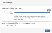
We've implemented this as part of the Agile Board Filter for JIRA Software 2.0 Horizontal Scroll bar functionality
+1 Agree
Especially needed when dragging items to change prio
+1. The cards are way to big in most cases. 80% is wasted space. The option to add more fields to the cards isn't helpful here. I don't want more information on my cards, I would like to see more cards on my board.
Just moved from Trello and the (too big) Kanban card size is very frustrating. I removed the fields - so why does JIRA insist on keeping the space?
For making sub-tasks half-size on the boards the following css may be used:
.ghx-subtask-group {
display: flex;
flex-wrap: wrap;
padding-left:10px;
}
.ghx-has-swimlanes .ghx-subtask-group {
padding-left:0px;
}
/* The next part may be used to give the first sub-task the full width. */
/*
.ghx-issue-subtask:nth-child(1) {
margin: 0;
width: 100%;
}
*/
.ghx-issue-subtask {
margin-left: 0px;
margin-right: -4px;
width: 50%;
}
If nothing else, this may be used with Stylish.
This issue was a significant reason why I chose to go with a standalone JIRA install rather than JIRA Cloud. If it wasn't for the existence of the banner hack (thank you robertbergs) it could have been a non-starter. Presentation is a feature!
It might take some time before Atlassian decides to implement this feature.
My team has tried several options, so I hope this also helps others:
1) Install a browser addon like Stylish or similar that allows you to override websites CSS. Create the CSS to match your liking. (disadvantage: cannot automate the distribution of new CSS changes in the team)
2) Create a browser addon yourself that can override websites CSS. (advantage gained: possibility to automate updates of CSS in the team. disadvantage: all browser addons need to have a user account. it's preferred you don't use your private user - so the addon doesn't become obsolete once you change your job)
3) Create your own Jira addon that overrides websites CSS (advantage gained: addon is a shared component for the team, so anybody with enough rights can work on it. We also have automated distribution of CSS in place. Possible disadvantage: on each update of CSS you need to build and deploy the addon again)
Things to consider for number 3): In order not minimize the number of changes and deployments of the addon, put the CSS files on companies shared network drive instead of embedding it into the addon. This also means that you can have multiple folders on your shared drive, each containing CSS for different team / board, and each folder having a unique board ID as a name, so the addon will know what CSS to use per each board, by looking at the board ID.
Good luck!
+1 for this issue.
Only able to see 6 or 7 cards per screen makes this very difficult to use for planning and prioritizing.
Also, side note: it is sometimes possible to fit multiple fields on the same line (e.g. Due Date | Component) really does have to take 2 lines.
45 JIRA customers have requested this 'amendment' - really a 'P1' bug fix to JIRA's core product, given that the board is practically unusable
Not only that - JIRA have removed the back door 'feature' to fix the issue via CSS in the Announcement Board - what genius came up with that plan? Just as well we can all print stickies to populate the scrum board. As such, why would you need an additional JIRA dynamic board - for developers to transition tickets twice?
Whats the next step - JIRA? This 'request' is open 1 year and 3 months. Not one JIRA representative has commented on it. It's your core product - The JIRA Board is unusable in it's current state.
How does an issue stay open for nearly 4 years!! I know! It's probably at the bottom of the their kanban board, too far down to see, because the friggin cards are too big!
Also - in the ondemand version you cannot enter html/css into the banner field.
We abused the announcement banner and added our custom css. When we evaluated the product they had some older agile boards which showed much smaller cards....
However the newer "better" board shows too few issues.
#announcement-banner
{ border-bottom: 0px solid #ccc; padding: 0px; }.ghx-issue
{ float:left; width:49%; overflow:hidden; height: 65px; }.ghx-parent-stub
{ display: none; }.ghx-issue-subtask
{ margin-left: 0px; }I have kind of gotten used to it by now. I put some extra work into having all columns sorted so that there is minimal need to scroll down and when I urgently need an overview I use zoom (Ctrl+mouse wheel).
I'm a first-time Jira user, just got it installed less than half a work day ago - and I already found my way to this issue. I find it remarkable that so few cards (vertically) can fit on a screen, it really makes the boards almost unusable (especially on a small laptop)
Even more baffling is that the issue persists despite people posting about it 2012...
What's so ridiculous about this is it doesn't even matter how big your monitor is, or what resolution it has. The cards automatically make sure you can only fit so few on the screen at a time.
It's so easy to look at a board of post-it's and figure out how this should work in Jira to be practical. Please, please, please fix this so the whole software industry can move forward.
+1 for this. I'm trying to use Jira to manage the backlog a kanban project but the cards are so big that I need to have a massive monitor to do it. Please enable it on the labs as it's not showing up.
Thanks
In this related issue - https://jira.atlassian.com/browse/GHS-3690?focusedCommentId=746696&page=com.atlassian.jira.plugin.system.issuetabpanels:comment-tabpanel#comment-746696 - I've provided a gist based on various workarounds provided by those in this thread and others with a javascript hack embeddable in the Announcement Banner area that can:
- toggle columns
- allows them to scroll horizontally
- allows you to dynamically resize column width
All of these states are preserved in local storage and the hack is intelligent across rapid boards about the state of columns with the same names. I hope it helps others who are frustrated by the lack of these features.
Attaching the 'announcement banner css hack' that we're currently using to prettify our agile boards...
I really like Robert's CSS hack!
I took the suggested styles as a base to change our board's layout and now everything is taking up much less space. Great!
Injecting the css using the announcement banner makes this a rather lightweight, but nevertheless hacky solution.
I wish that Atlassian takes this as an inspiration on how they should make future jira versions incorporate a number of board settings that accomplish the same ("show/hide issue type/prio/avatar...").
I took it one step further and by using the following I was able to show two cards next to each other per column:
.ghx-issue { float:left; width:49%; font-size: .8em; } .ghx-parent-group { float:left; width:100%; font-size: .8em;}
But I have to say that I didn't test this extensively yet, so it should be used very carefully!
Since I didn't want to apply the css changes on all boards of our productive system, I added some javascript to check which board is currently shown and then, based on that, to inject the styles or not. To not clutter up this ticket any more, I'll just attach the content of our announcement banner as a text file to this ticket.
Again, it is sad that such "hacks" are needed, but I'm sure that sooner or later we'll be seeing proper settings in some future jira version; until then we (I mean the team I'm working in) will have to make do with it.
Cheers!
Interestingly, this is a new problem to the users because in the classic boards it was much easier to increase the font size during meetings if required than it is now to do anything to make the boards more usable (display more items, longer lists) in the meetings due to the new layout. It should be considered to not force the fonts and layout to the size they are now...
We worked around this with some custom CSS which compacts the cards and removes information we didn't need. You can jam into the Announcement Banner . Sharing here as others may find it useful, but I emphasize you should edit this CSS to suit your own boards.
Reduce Avatar space to top-right from 10px to 2px:
.ghx-issue .ghx-avatar { display: none; position: absolute; right: 2px; top: 2px; }
Hide issue type icon:
.ghx-type { display: none; }
Hide priority flag:
.ghx-flags { display: none; }
Reduce padding on card content:
.ghx-issue .ghx-issue-content { min-height: 66px; padding: 2px 37px 2px 8px; }
Reduce padding around the description
.ghx-issue-fields { padding-right: 0; }
Reduce font size of issue description but not for key
.ghx-issue { font-size: 12px; } .ghx-key { font-size: 14px; }
Extra fields red and italic:
.ghx-issue .ghx-extra-fields { color: #b80419; font-style: italic; }
When the "Announcement Banner" has any content, it displayes its div, which takes up approximatley 5mm at the top of the screen, so provided you don't actually have an announcement you can add:
/* Disable The Banner */
#announcement-banner {
display: none;
}
I recently gave a presentation of a prototype of a new JIRA use case for our company to a couple of managers. I used JIRA Agile with two boards using swim lanes and quick filters,
After a while my boss said: "That looks quite promising, Rainer. But, why in the world do you waste that much unused space on the screen!?"
I said: "Well, I hate that too, but JIRA Agile won't let decide me how to use my own space on the screen ..."
Guess what! The prototype was not accepted.
Question: Is anyone from Atlassian reading our comments at all?
+1