-
Type:
Suggestion
-
Resolution: Unresolved
-
Component/s: Work Item - Transition (Legacy)
-
5
-
12
Problem Definition
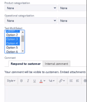
In the transition screen, if a multi-select field is present, the user experience is difficult to select multiple options. See screenshot:

Selecting multiple options is not practical for users who rely heavily on this functionality.
Suggested Solution
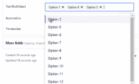
The new create issue experience appears to improve multi-select. This same experience needs to be part of the transition screen as well.
- is duplicated by
-
JRACLOUD-78745 Render multi-choice custom checkboxes same on the transition screen as they do in the new issue create experience
- Closed
- is resolved by
-
JRACLOUD-78919 Upgrade the issue transition screens to the new experience
- Closed
