-
Type:
Suggestion
-
Resolution: Unresolved
-
Component/s: Work Item - View (Internal developer use only)
-
None
-
5
-
27
Issue Summary
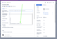
If the value of single/multi select custom field is too long it is truncated and difficult to read. It is more problematic when values of custom field has same prefix.
Steps to Reproduce
- Create a custom field of type "single select" or "multi select"
- Add list of similar options.

- Add the field to screens.
- Now create a issue or edit an existing where field created step#1 is present.
As we can see in the example screenshot below it difficult to identified the value of each options.

Suggestion:
There should be an option to extend the width of custom field, or horizontal scroll bar or tooltip so users easily identify what they are selecting.
Workaround
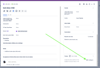
Put the field in the issue layout's Description fields, not the Context fields section. This will at least give you more characters before the option name is cut off:

- is duplicated by
-
JRACLOUD-74833 Drop down custom fields in Create Issue screen cuts off long options
- Closed
-
JRACLOUD-76124 As a Jira admin, I want to be able to edit the number of characters shown in a custom multi-select field
- Closed
-
JRACLOUD-76681 Increase the amount of characters displayed in select-list (multiple choices) fields
- Closed
-
JRACLOUD-78305 Tooltip to display entire field value
- Closed
- relates to
-
JWMCLOUD-88 Ability to resize the width of the columns and have character limit update accordingly
- Closed


