Uploaded image for project: 'Confluence Data Center'
  1. Confluence Data Center
  2. CONFSERVER-28275

Provide a way to avoid the automatic rounding of space logos

    • We collect Confluence feedback from various sources, and we evaluate what we've collected when planning our product roadmap. To understand how this piece of feedback will be reviewed, see our Implementation of New Features Policy.

      NOTE: This suggestion is for Confluence Server. Using Confluence Cloud? See the corresponding suggestion.

      Atlassian Status as of 29 September 2014

      Update: please refer to my comment for the latest status on this ticket.


      Thanks for the continued feedback and completing the survey, which helped us understand your pain points with the current design. The majority (84%) of example logos provided were rectangular in shape, so simply preventing the rounding of space logos (as some requested) would not solve the problem for these 84%. Therefore, we have built a new uploader which works for both square and rectangular logos.

      With the current uploader, you can only select a portion of a rectangular logo, e.g.:

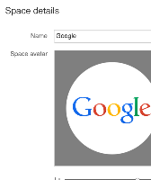
      With the new uploader, you can zoom out and crop ‘beyond’ the border of the image, allowing you to fit the entire logo in, e.g.:

      This works for a square logo as well, and allows you to adjust it inside the area that was previously clipped due to the circular mask.

      These changes will be shipping in Confluence 5.6 and in a Confluence OnDemand update in the next few weeks.

      Thanks again to all for your input and feedback, I'll now be marking this issue as closed.

      Regards,
      John
      Confluence Product Manager

      With Confluence 5.0, rounding of space logos was introduced and enforced as the only option.

      Some logos do not lend themselves to rounding and look quite bad with it. There should be a way to set space logos without modification as before.

      Workaround

      For a workaround involving CSS (as well as background on why rounded logos were introduced), please see this comment.

        1. logo_in_place.png
          logo_in_place.png
          6 kB
        2. default-space-logo-48.png
          default-space-logo-48.png
          0.8 kB
        3. after.png
          after.png
          33 kB
        4. before.png
          before.png
          62 kB
        5. image-2016-11-28-14-04-58-143.png
          image-2016-11-28-14-04-58-143.png
          67 kB

            [CONFSERVER-28275] Provide a way to avoid the automatic rounding of space logos

            I may have found the root cause of the problem: http://www.news.com.au/finance/business/australian-tech-company-atlassian-valued-at-35-billion-despite-having-no-sales-staff/story-fn5lic6c-1226879660894

            If I was having that much fun, I'm not sure that I'd bother fixing bugs either.

            John Lammers added a comment - I may have found the root cause of the problem: http://www.news.com.au/finance/business/australian-tech-company-atlassian-valued-at-35-billion-despite-having-no-sales-staff/story-fn5lic6c-1226879660894 If I was having that much fun, I'm not sure that I'd bother fixing bugs either.

            K15t's Scroll PDF Exporter has a feature that lets me work around the issue for PDFs. I presume Scroll HTML Exporter will do the same for web help.

            https://www.k15t.com/display/PDF/Uploading+Resources

            Still looks terrible in Confluence itself, but unless Atlassian changes the licensing we're never going to use it as a web server for customer-facing docs anyway.

            Robert Lauriston added a comment - K15t's Scroll PDF Exporter has a feature that lets me work around the issue for PDFs. I presume Scroll HTML Exporter will do the same for web help. https://www.k15t.com/display/PDF/Uploading+Resources Still looks terrible in Confluence itself, but unless Atlassian changes the licensing we're never going to use it as a web server for customer-facing docs anyway.

            Why is this marked "resolved"? Our new logo is rectangular and it looks terrible in my PDF output. I tried the "quadratic" plug-in but it doesn't seem to help.

            Robert Lauriston added a comment - Why is this marked "resolved"? Our new logo is rectangular and it looks terrible in my PDF output. I tried the "quadratic" plug-in but it doesn't seem to help.

            No Problem. It is just that "Sandler" is not a nice thing to say here in Bavaria - you could loosely translate it to "hobo".

            Martin Sander added a comment - No Problem. It is just that "Sandler" is not a nice thing to say here in Bavaria - you could loosely translate it to "hobo".

            I do beg your pardon, Mr Sander. I hate it when people change the way I spell MY name, I should be more careful.

            Come to think of it, I hate it when people change my company logo, too.

            Deleted Account (Inactive) added a comment - I do beg your pardon, Mr Sander. I hate it when people change the way I spell MY name, I should be more careful. Come to think of it, I hate it when people change my company logo, too.

            kathleen I am not a Sandler.

            Martin Sander added a comment - kathleen I am not a Sandler.

            Thank you @Martin Sandler. But, sadly, it still doesn't fix rectangular logos that are crushed into oblivion.

            Deleted Account (Inactive) added a comment - Thank you @Martin Sandler. But, sadly, it still doesn't fix rectangular logos that are crushed into oblivion.

            Shane Day added a comment -

            So well over 2 years since the insanity began, it's well and truly been forgotten. Martin, it's awesome that a third party has released a tiny-plug in for something that should never have been done to the main product in the first place. Those of us on OnDemand, we can just continue to suffer.... or migrate.

            Shane Day added a comment - So well over 2 years since the insanity began, it's well and truly been forgotten. Martin, it's awesome that a third party has released a tiny-plug in for something that should never have been done to the main product in the first place. Those of us on OnDemand, we can just continue to suffer.... or migrate.

            For those not on ondemand, you can just install this tiny plugin: https://marketplace.atlassian.com/plugins/com.tngtech.confluence.plugins.quadratic-icons

            Martin Sander added a comment - For those not on ondemand, you can just install this tiny plugin: https://marketplace.atlassian.com/plugins/com.tngtech.confluence.plugins.quadratic-icons

            Shane Day added a comment -

            Nicklas, I suspect a large proportion of the 84% is also dissatisfied with the solution. The 16% is only the ones that didn't care that the logo is now round.

            Shane Day added a comment - Nicklas, I suspect a large proportion of the 84% is also dissatisfied with the solution. The 16% is only the ones that didn't care that the logo is now round.

              jmasson@atlassian.com John Masson
              mknight@atlassian.com Michael Knight
              Votes:
              78 Vote for this issue
              Watchers:
              77 Start watching this issue

                Created:
                Updated:
                Resolved: