• Icon: Bug Bug
    • Resolution: Fixed
    • Icon: Medium Medium
    • 3.0.3
    • 1.9.5.0
    • Git
    • None
    • OS Windows 10

      Bitbucket.org

    • Severity 1 - Critical

      I can no longer select the files I want to commit using checkboxes. The checkboxes are missing! Why?

            [SRCTREEWIN-5947] Checkbox missing for unstaged files

            Craig Smith added a comment - - edited

            I agree with Andreas.  This is a common issue with interface design.

            Very happy to see it back though.  I've been putting off upgrading from v1.7 mostly for this reason... and a couple of others I've forgotten about it's been so long.

            Craig Smith added a comment - - edited I agree with Andreas.  This is a common issue with interface design. Very happy to see it back though.  I've been putting off upgrading from v1.7 mostly for this reason... and a couple of others I've forgotten about it's been so long.

            amaly added a comment - - edited

            Thank you for the "+/-" buttons for staging and unstaging. That is already a huge improvement on the former checkboxes gone missing. 

            Not particularly wanting to be nitpicking, but having the "+/-" buttons to the left of the filename would be a huge improvement over having them on the right of the filename. Having the buttons right-aligned potentially (depending on screen size, window layout, ...) puts a lot of whitespace between the filename and the button, making it hard to associate the filename with the correct "+/-" button if you have a lot of changed files.

            amaly added a comment - - edited Thank you for the "+/-" buttons for staging and unstaging. That is already a huge improvement on the former checkboxes gone missing.  Not particularly wanting to be nitpicking, but having the "+/-" buttons to the left of the filename would be a huge improvement over having them on the right of the filename. Having the buttons right-aligned potentially (depending on screen size, window layout, ...) puts a lot of whitespace between the filename and the button, making it hard to associate the filename with the correct "+/-" button if you have a lot of changed files.

            3.0 includes stage/unstage "+/-" buttons.

            Mike Corsaro (Inactive) added a comment - 3.0 includes stage/unstage "+/-" buttons.

            So is this ever going to get fixed? Last I checked Sourcetree on MacOS still had the checkboxes and I use them ALL THE TIME.

            Unfortunately Sourcetree on my Windows machine does not have the checkboxes anymore.

            Please just bring back the checkboxes. Or at least provide the OPTION of using checkboxes. I know this was some sort of UX or design decision, but you should not just simply kill a feature that obviously many people used. At least provide the option to turn checkboxes back on.

            Jake Wilson added a comment - So is this ever going to get fixed? Last I checked Sourcetree on MacOS still had the checkboxes and I use them ALL THE TIME. Unfortunately Sourcetree on my Windows machine does not have the checkboxes anymore. Please just bring back the checkboxes. Or at least provide the OPTION of using checkboxes. I know this was some sort of UX or design decision, but you should not just simply kill a feature that obviously many people used. At least provide the option to turn checkboxes back on.

            lumenetix added a comment -

            wow... since when programers are allowed to remove features like this one without replacement?! That simply mean that the replacement for the, albeit awkward but useful feature, was not ready.

            Somebody approved this and should not have is or her donuts at the next Friday happy hour... 

            lumenetix added a comment - wow... since when programers are allowed to remove features like this one without replacement?! That simply mean that the replacement for the, albeit awkward but useful feature, was not ready. Somebody approved this and should not have is or her donuts at the next Friday happy hour... 

            Peter Hinz added a comment -

            Just bring back the old interface. It was working 100%

            Peter Hinz added a comment - Just bring back the old interface. It was working 100%

            Thanks Rahul! Either the old checkboxes or the proposed +/- buttons work for me, as long as it's something that allows staging files individually without a lot of mouse-work. I'm reverting to 1.8.3 for now, until the option is back (yes, for me, it is sufficiently irritating for smooth workflow). The checkboxes (or other) are still missing as of 1.9.10.0.

            Erik Blake added a comment - Thanks Rahul! Either the old checkboxes or the proposed +/- buttons work for me, as long as it's something that allows staging files individually without a lot of mouse-work. I'm reverting to 1.8.3 for now, until the option is back (yes, for me, it is sufficiently irritating for smooth workflow). The checkboxes (or other) are still missing as of 1.9.10.0.

            lukerayman added a comment -

            Thank you, Rahul, for making these changes. We used to use checkboxes even if it was a bad UX (checkbox is for selecting not for making immediate changes). Now it feels more properly. 

            lukerayman added a comment - Thank you, Rahul, for making these changes. We used to use checkboxes even if it was a bad UX (checkbox is for selecting not for making immediate changes). Now it feels more properly. 

            I personally am not a fan of the new screenshot.  The pluses and minuses make me think it will expand or minimize something.  Just seems weird to use a very common conventions in non standard ways. 

            Kevin Ashton added a comment - I personally am not a fan of the new screenshot.  The pluses and minuses make me think it will expand or minimize something.  Just seems weird to use a very common conventions in non standard ways. 

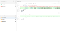
            Thank you for all the feedback. As some of you noted in your comments, the original experience was a bit awkward. We intend to bring the functionality back, but in a more appropriate user experience. Below is an example of what that might look like:


            We've been hard at work improving the infrastructure and performance of SourceTree for Windows. The most recent version, SourceTree for Windows 1.9.9.20 [1], includes a variety of bug fixes, Git LFS 1.5.2 support, patched memory leak, and performance improvements when switching tabs. Improving the overall user experience is next on the list. Thanks for your patience. 

            Lastly, if you'd like to chat about SourceTree and what we're working on, please feel free to grab some time on my calendar https://calendly.com/rchhabria/atlassian. You'll get sent an automated calendar invite with a Google Hangouts link for us to connect over. 

            [1]http://downloads.atlassian.com/software/sourcetree/windows/SourceTreeSetup_1.9.9.20.exe

            Rahul Chhabria (Inactive) added a comment - - edited Thank you for all the feedback. As some of you noted in your comments, the original experience was a bit awkward. We intend to bring the functionality back, but in a more appropriate user experience. Below is an example of what that might look like:   We've been hard at work improving the infrastructure and performance of SourceTree for Windows. The most recent version, SourceTree for Windows 1.9.9.20 [1] , includes a variety of bug fixes, Git LFS 1.5.2 support, patched memory leak, and performance improvements when switching tabs. Improving the overall user experience is next on the list. Thanks for your patience.  Lastly, if you'd like to chat about SourceTree and what we're working on, please feel free to grab some time on my calendar https://calendly.com/rchhabria/atlassian . You'll get sent an automated calendar invite with a Google Hangouts link for us to connect over.  [1] :  http://downloads.atlassian.com/software/sourcetree/windows/SourceTreeSetup_1.9.9.20.exe

            Rao Li added a comment -

            Instead of just :making a "design decision" and straight up removing it, why not make it a UI option for those who absolutely  need to use it? Removing one of your most useful features is just ridiculous.

            Meanwhile, I'm downgrading. Thanks Richard Watson for mentioning that 1.8.3 works!

            Rao Li added a comment - Instead of just :making a "design decision" and straight up removing it, why not make it a UI option for those who absolutely  need to use it? Removing one of your most useful features is just ridiculous. Meanwhile, I'm downgrading. Thanks Richard Watson for mentioning that 1.8.3 works!

            @Thomas Becker: That's exactly the problem.  I've been on this thread for a while and I've already pointed it out.  The issue is that 'one-click' stage is gone, and I even suggested it should have been replaced with a button.  But... I also mentioned that there's limited space in that list and it would be redundant to add a button to every single row. Really, the button already exists as 'stage selected' and it just takes two clicks instead of one, so it's really not a big deal.  Having a button for every row would actually lead to bad behavior when staging multiple files, leading to the same old slow, full round-trip for every button clicked.  For staging multiple files, it's just going to be a better experience to force people to learn to use control+click (like every other app) to select multiple files then click 'stage selected'.  It sucks that the one-click is gone, but two-click isn't that bad for a single file.  Again, if you're going to stage multiple files, having that one-click instant-stage per file is really inefficient and a way worse experience that just selecting what you want with control+click and staging all at once.

            James Spielvogel added a comment - @Thomas Becker: That's exactly the problem.  I've been on this thread for a while and I've already pointed it out.  The issue is that 'one-click' stage is gone, and I even suggested it should have been replaced with a button.  But... I also mentioned that there's limited space in that list and it would be redundant to add a button to every single row. Really, the button already exists as 'stage selected' and it just takes two clicks instead of one, so it's really not a big deal.  Having a button for every row would actually lead to bad behavior when staging multiple files, leading to the same old slow, full round-trip for every button clicked.  For staging multiple files, it's just going to be a better experience to force people to learn to use control+click (like every other app) to select multiple files then click 'stage selected'.  It sucks that the one-click is gone, but two-click isn't that bad for a single file.  Again, if you're going to stage multiple files, having that one-click instant-stage per file is really inefficient and a way worse experience that just selecting what you want with control+click and staging all at once.

            ttn added a comment -

            Hi, when there are updates?

            ttn added a comment - Hi, when there are updates?

            @James Spiegelvogel: Yes, for staging/unstaging files checkboxes were not the the right control elements, but they got the job done with a single click. The sensible thing to do would have been to replace them with the correct control element, like a button, or a text link. Removing them altogether just made things worse.

            Deleted Account (Inactive) added a comment - @James Spiegelvogel: Yes, for staging/unstaging files checkboxes were not the the right control elements, but they got the job done with a single click. The sensible thing to do would have been to replace them with the correct control element, like a button, or a text link. Removing them altogether just made things worse.

            Thanks for the Reply! Well in my case it didnt work at first. Sorry for the Insult, i didnt realize that there is a button at first because it was deactived. But Anyway I think the user experience could be better here. Why didnt you keep the checkboxes and introduced the "Stage selected" button anyway instead of directly staging files onClick - this would follow the simple logic of first selecting stuff and then performing an action on those items like in any other application ? Maybe with a Setting so that the user can decide what behaviour he likes better. I think am not the only user who was confused after this update .

            Sebastian M added a comment - Thanks for the Reply! Well in my case it didnt work at first. Sorry for the Insult, i didnt realize that there is a button at first because it was deactived. But Anyway I think the user experience could be better here. Why didnt you keep the checkboxes and introduced the "Stage selected" button anyway instead of directly staging files onClick - this would follow the simple logic of first selecting stuff and then performing an action on those items like in any other application ? Maybe with a Setting so that the user can decide what behaviour he likes better. I think am not the only user who was confused after this update .

            To stage a single file, select it, then click 'stage selected'. It's not that hard.

            There is a real bug with the 'stage selected' button though; it sometimes is not enabled when you initially selected a file, so you have to click on a different file and then click back onto it (or deselect and reselect it with ctrl+click) in order to enable the 'stage selected' button. That's annoying.

            Anyway, the checkboxes were misleading. They didn't mean "selected", like a normal checkbox. Also, checking them didn't mean a file was staged; rather, checking the box triggered the file to be staged, and after some delay, it would be moved into the staged file list. Click on them one at a time would result in a full round trip to stage the file, and was very slow. Now, it's much faster. Just select the items in the list with ctrl+click like every other list in ever app that's ever existed, and click 'stage selected'. It's much simpler and faster.

            James Spielvogel added a comment - To stage a single file, select it, then click 'stage selected'. It's not that hard. There is a real bug with the 'stage selected' button though; it sometimes is not enabled when you initially selected a file, so you have to click on a different file and then click back onto it (or deselect and reselect it with ctrl+click) in order to enable the 'stage selected' button. That's annoying. Anyway, the checkboxes were misleading. They didn't mean "selected", like a normal checkbox. Also, checking them didn't mean a file was staged; rather, checking the box triggered the file to be staged, and after some delay, it would be moved into the staged file list. Click on them one at a time would result in a full round trip to stage the file, and was very slow. Now, it's much faster. Just select the items in the list with ctrl+click like every other list in ever app that's ever existed, and click 'stage selected'. It's much simpler and faster.

            Sebastian M added a comment - - edited

            +1
            How did this happen? Without the checkboxes how are we supposed to stage single files? This is clearly a bug! I cannot believe this made it to a release Version (QA are you there? anyone?). I upgraded this morning and am shocked that this upgrade was actually a downgrade.

            I like Source Tree very much because of its ui but more often it crashes for no reason and I am getting more convinced to switch to another tool....

            Sebastian M added a comment - - edited +1 How did this happen? Without the checkboxes how are we supposed to stage single files? This is clearly a bug! I cannot believe this made it to a release Version (QA are you there? anyone?). I upgraded this morning and am shocked that this upgrade was actually a downgrade. I like Source Tree very much because of its ui but more often it crashes for no reason and I am getting more convinced to switch to another tool....

            +1 for bringing the checkboxes back.

            As you can see from this issue, quite a few people are surprised by the removal of the checkboxes and would like to have them back. And these are just the people who care enough about the product to join the conversation here.

            Uri Goldstein added a comment - +1 for bringing the checkboxes back. As you can see from this issue, quite a few people are surprised by the removal of the checkboxes and would like to have them back. And these are just the people who care enough about the product to join the conversation here.

            I miss these checkboxes too. They're present in the Mac version. Why not for Windows?

            lukerayman added a comment - I miss these checkboxes too. They're present in the Mac version. Why not for Windows?

            ttn added a comment -

            Please bring this back.....

            ttn added a comment - Please bring this back.....

            Yes please bring this back. Granted the new version looks nicer but now it's far less useful for me. Had to revert back to an earlier version.

            Kevin Ashton added a comment - Yes please bring this back. Granted the new version looks nicer but now it's far less useful for me. Had to revert back to an earlier version.

            Georg added a comment -

            Meeting in Atlassian:

            (Product Manager) - I'm looking for ideas how to degrade the user experience and product functionality...
            (Head of Design) - I've always hated how someone who actually uses this product added those check boxes, let's remove them - just like Jony Ive removed the 3,5 mm audio jack on iPhone 7 - it takes courage!
            (Product Manager) - Awesome!

            Sorry for the sarcasm, but the direction the product has gone since 1.7 is let's say the very least questionable. It's true that the UI wasn't in line with the latest tendencies, but for the sake of eye candy (and not particularly good one ) ....

            Georg added a comment - Meeting in Atlassian: (Product Manager) - I'm looking for ideas how to degrade the user experience and product functionality... (Head of Design) - I've always hated how someone who actually uses this product added those check boxes, let's remove them - just like Jony Ive removed the 3,5 mm audio jack on iPhone 7 - it takes courage! (Product Manager) - Awesome! Sorry for the sarcasm, but the direction the product has gone since 1.7 is let's say the very least questionable. It's true that the UI wasn't in line with the latest tendencies, but for the sake of eye candy (and not particularly good one ) ....

            Adam added a comment -

            What I think is amazing is that the space for the checkbox is still there. Very well planned out.


            Personally, I'm looking at GitKraken again.

            Adam added a comment - What I think is  amazing is that the space for the checkbox is still there. Very well planned out.   Personally, I'm looking at GitKraken again.

            This still appears to be a problem. The checkboxes are still not visible as of 1.9.6.1. I was able to revert to 1.8.3 and have the checkboxes show. My machine is Windows 10 anniversary edition, was also evident on a previous version of Windows 10. Both machines have dedicated video and at a resolution of 1920x1080.

            Richard Watson added a comment - This still appears to be a problem. The checkboxes are still not visible as of 1.9.6.1. I was able to revert to 1.8.3 and have the checkboxes show. My machine is Windows 10 anniversary edition, was also evident on a previous version of Windows 10. Both machines have dedicated video and at a resolution of 1920x1080.

            All good now. I reverted to version 1.7.

            Craig Smith added a comment - All good now. I reverted to version 1.7.

            Craig Smith added a comment - - edited

            I've had issues with the non-standard behaviour of SourceTree ever since I started using it. It's funny what you can put up with when you're forced to. My favourite feature was the way the "Unstaged files" list refreshes while you're using it causing focus to be repeatedly shifted back to the first item... not at all frustrating. It's completely buggered now though. Whenever I add a file to staging, it pops up there for an instant, then a modal appears saying "Unstaging files" , a progress bar, and no close button. I have to tick "Show Full Output" in order for the Close button to appear. Then my selected file falls back down to the unstaged list.
            Having the tick boxes is better than not having them, but I agree it should probably be a + icon instead.

            Craig Smith added a comment - - edited I've had issues with the non-standard behaviour of SourceTree ever since I started using it. It's funny what you can put up with when you're forced to. My favourite feature was the way the "Unstaged files" list refreshes while you're using it causing focus to be repeatedly shifted back to the first item... not at all frustrating. It's completely buggered now though. Whenever I add a file to staging, it pops up there for an instant, then a modal appears saying "Unstaging files" , a progress bar, and no close button. I have to tick "Show Full Output" in order for the Close button to appear. Then my selected file falls back down to the unstaged list. Having the tick boxes is better than not having them, but I agree it should probably be a + icon instead.

            I can't agree more with Adrian.

            Last few releases were quite bad, but SourceTree is constantly getting worse. Atlassian should get their act together.

            Dmitry Semashkov added a comment - I can't agree more with Adrian. Last few releases were quite bad, but SourceTree is constantly getting worse. Atlassian should get their act together.

            This is a horrible solution. SourceTree has been becoming more and more unwieldy and resource-hungry but messing up with the user flow is a bit too much.

            Victoria Pavlova added a comment - This is a horrible solution. SourceTree has been becoming more and more unwieldy and resource-hungry but messing up with the user flow is a bit too much.

            Adrian L added a comment -

            Seriously guys and gals from Atlassian - 1.9.5 is even more broken than previous versions and on Windows this starts to get out of control. I mean, I usually don't bother to leave feedback as I think things will sort out anyway but here I had to login to leave my two cents. You send funny emails and ask about feedback but somehow I guess it must be ignored or read the other way around because I refuse to believe all those ideas come from sane people.

            Checkbox were broken and not working as any Windows user would actually expect them to do, I agree. When you click a checkbox all you expect it to do is... CHECK the item, nothing more. When I select as many items as I want then I can click a button in UI like 'Stage selected' and I am done...

            You did something strange where checking immediately added to stage. Why the checkbox then? Just add a small [+] button it would be at least predictible (yet still bad UI/UX).

            Now you removed the checkboxes alltogether. Ok I said to myself. I can live with that. I checked the shortcut to stage a selected file. It is Ctrl Shift + (for such a common task that sounds like a crazy pick for a shortcut but ok). The problem is - did any of you actually test the behaviour? If I click ctrl shift + the window looses focus immediately, bounces back and then the focus is somewhere in the main menu area. Clicking for instance down or up arrows will trigger sub menu of main menu - how ridiculous is that? We checked that on three different computers this is just how it works...

            When I use keyboard and press shortcut to stage the file I expect to be able to navigate in the Unstaged files area to be able to add another and another and another one. Now this is so broken that I don't even know how to express it.

            Selecting multiple files is also bad and buggy. You try to show previews of each selected file (why on earth would anyoneone want that?) Try ctrl + a and with just a bunch of files whole APP stalls because as I understand it tries to load them and show the preview.

            It could be such a nice software if more focus was put to actually solve stability issues and UI/UX problem instead of changing icons in each update.

            Adrian L added a comment - Seriously guys and gals from Atlassian - 1.9.5 is even more broken than previous versions and on Windows this starts to get out of control. I mean, I usually don't bother to leave feedback as I think things will sort out anyway but here I had to login to leave my two cents. You send funny emails and ask about feedback but somehow I guess it must be ignored or read the other way around because I refuse to believe all those ideas come from sane people. Checkbox were broken and not working as any Windows user would actually expect them to do, I agree. When you click a checkbox all you expect it to do is... CHECK the item, nothing more. When I select as many items as I want then I can click a button in UI like 'Stage selected' and I am done... You did something strange where checking immediately added to stage. Why the checkbox then? Just add a small [+] button it would be at least predictible (yet still bad UI/UX). Now you removed the checkboxes alltogether. Ok I said to myself. I can live with that. I checked the shortcut to stage a selected file. It is Ctrl Shift + (for such a common task that sounds like a crazy pick for a shortcut but ok). The problem is - did any of you actually test the behaviour? If I click ctrl shift + the window looses focus immediately, bounces back and then the focus is somewhere in the main menu area. Clicking for instance down or up arrows will trigger sub menu of main menu - how ridiculous is that? We checked that on three different computers this is just how it works... When I use keyboard and press shortcut to stage the file I expect to be able to navigate in the Unstaged files area to be able to add another and another and another one. Now this is so broken that I don't even know how to express it. Selecting multiple files is also bad and buggy. You try to show previews of each selected file (why on earth would anyoneone want that?) Try ctrl + a and with just a bunch of files whole APP stalls because as I understand it tries to load them and show the preview. It could be such a nice software if more focus was put to actually solve stability issues and UI/UX problem instead of changing icons in each update.

            This issue is particularly annoying as now I'm not able to stage an entire branch in the treeview.

            I agree that checkboxes are awkward for single files, but there should be an (intuitive) option for staging all files in a folder at once.

            Robert Sirre added a comment - This issue is particularly annoying as now I'm not able to stage an entire branch in the treeview. I agree that checkboxes are awkward for single files, but there should be an (intuitive) option for staging all files in a folder at once.

            Bring back the checkbox. If it ain't broken why fix it ?

            Stanisav Gusakov added a comment - Bring back the checkbox. If it ain't broken why fix it ?

            The new UI just makes less sense. Put the check boxes back. Then make them work like you expect, like check boxes not buttons. so I can visually select multiple items without having to hold down ctrl or shift.

            lawrenceshort added a comment - The new UI just makes less sense. Put the check boxes back. Then make them work like you expect, like check boxes not buttons. so I can visually select multiple items without having to hold down ctrl or shift.

            Jogchem Andre Oord added a comment - - edited

            Hi @mminns. Can you point us to the release note where this change is described?

            Jogchem Andre Oord added a comment - - edited Hi @mminns. Can you point us to the release note where this change is described?

            If I hated myself enough to upgrade to the newest version (I'm staying on 1.6.23.0), I too would complain about the checkboxes missing.

            Adam van Vliet added a comment - If I hated myself enough to upgrade to the newest version (I'm staying on 1.6.23.0), I too would complain about the checkboxes missing.

            Thinking click and drag may be the answer to this problem. You can still easily select multiple using shift or control, but if you only need to stage 1 file you can still do so with only 1 click if its click and drag

            Chris Cunningham added a comment - Thinking click and drag may be the answer to this problem. You can still easily select multiple using shift or control, but if you only need to stage 1 file you can still do so with only 1 click if its click and drag

            minnsey added a comment -

            Hi

            Thanks for the feedback.

            I'm afraid I can confirm that removing the checkboxes was a deliberate decision, however I will pass on your feedback to our design team.

            As others have already pointed out, it is possible to stage individual, or multiple files by selecting the rows and using the 'space' bar.

            minnsey added a comment - Hi Thanks for the feedback. I'm afraid I can confirm that removing the checkboxes was a deliberate decision, however I will pass on your feedback to our design team. As others have already pointed out, it is possible to stage individual, or multiple files by selecting the rows and using the 'space' bar.

            James Spielvogel added a comment - - edited

            Another alternative is allowing us to drag/drop a file or files from the unstaged to staged area. I'm kinda surprised that interaction doesn't exist.

            So, definitely add the checkbox back, or add it back as a "+" sign so it's not confused with a check box list where checking the item selects it. It didn't select the item, it just staged it immediately. Bottom line, we need that 'one-click add' functionality for our own sanity.

            James Spielvogel added a comment - - edited Another alternative is allowing us to drag/drop a file or files from the unstaged to staged area. I'm kinda surprised that interaction doesn't exist. So, definitely add the checkbox back, or add it back as a "+" sign so it's not confused with a check box list where checking the item selects it. It didn't select the item, it just staged it immediately. Bottom line, we need that 'one-click add' functionality for our own sanity.

            James Spielvogel added a comment - - edited

            The old way was better in one, single, solitary circumstance: You want to add a single file... you click the checkbox. It's done. That, I agree, is now gone, and should be brought back.

            If you want to add two files, it completely broke down. After clicking the first, you have to wait for a full round trip for it to stage the file and refresh the display. Click... wait forever, click another, wait some more, click another, wait.... etc. I know you don't like to hear it, but it's going to be a hell of a lot faster to just hold control, click all 2 or 3, then click stage.

            I completely agree, I miss the 'quick-add-single-file' feature that the checkbox provided, but it was wierd as a checkbox, and I'm sure you all realized that. I think it would be back to normal and clearer if the feature was restored with a simple "+" button in place of the checkbox. That way, you'd have that quick add functionality, but it wouldn't be misleading as a checkbox. You wouldn't get that extra space, but the functionality is really important to some people as I can see.

            TL;DR; bring back the checkbox, but as a "+" button.

            James Spielvogel added a comment - - edited The old way was better in one, single, solitary circumstance: You want to add a single file... you click the checkbox. It's done. That, I agree, is now gone, and should be brought back. If you want to add two files, it completely broke down. After clicking the first, you have to wait for a full round trip for it to stage the file and refresh the display. Click... wait forever, click another, wait some more, click another, wait.... etc. I know you don't like to hear it, but it's going to be a hell of a lot faster to just hold control, click all 2 or 3, then click stage. I completely agree, I miss the 'quick-add-single-file' feature that the checkbox provided, but it was wierd as a checkbox, and I'm sure you all realized that. I think it would be back to normal and clearer if the feature was restored with a simple "+" button in place of the checkbox. That way, you'd have that quick add functionality, but it wouldn't be misleading as a checkbox. You wouldn't get that extra space, but the functionality is really important to some people as I can see. TL;DR; bring back the checkbox, but as a "+" button.

            hugodahl added a comment -

            @James Spielvogel, I agree that Ctrl+Click may be faster, however, as a keyboard user, I made use of the checkboxes to select which files (when not just individual portions of it) I wanted to stage for a commit, if I was attempting to split my changes into several commits. Although, admittedly the keyboard navigation was a little... shall I say, dicey.

            hugodahl added a comment - @James Spielvogel, I agree that Ctrl+Click may be faster, however, as a keyboard user, I made use of the checkboxes to select which files (when not just individual portions of it) I wanted to stage for a commit, if I was attempting to split my changes into several commits. Although, admittedly the keyboard navigation was a little... shall I say, dicey.

            Removing the checkboxes is a nuisance to me for two reasons:

            1. Requires two hands to ctrl+click instead of one to click the checkbox
            2. Is now a two step (select then find the Stage Selected button) instead of adding them immediately on clicking the checkbox.

            TLDR; I like the old way better, and wish it was put back.

            Brad Crandell added a comment - Removing the checkboxes is a nuisance to me for two reasons: Requires two hands to ctrl+click instead of one to click the checkbox Is now a two step (select then find the Stage Selected button) instead of adding them immediately on clicking the checkbox. TLDR; I like the old way better, and wish it was put back.

            James Spielvogel added a comment - - edited

            Ok, this really threw me off at first, but I think I see where they're going with this one.

            • First, the checkboxes were kinda goofy, because you'd check them and they'd just immediately add the file. It's not like you could check a few of them, then add them; you always do that by selected them (not the checkbox) then clicking add or right click and add. It didn't work quickly anyway, as it would run a full git add and refresh after each file clicked.
            • They could have been replaced by dedicated stage/unstage buttons, but let's be honest, that would take up too much space in an already crowded area. Removing the checkboxes actually frees up space.
            • Finally, having one button per line is redundant, when you've already got that 'select' functionality. Better to select the the ones you want with control+click, then click a single 'stage' button in the header. Alternatively, keep the checkboxes (it's better than ctrl+click), but tie them to the selected or unselected state of the file; don't trigger an automatic add of the file.

            TLDR; it's annoying at first, but a small step in the right direction; the old functionality was rather awkward.

            James Spielvogel added a comment - - edited Ok, this really threw me off at first, but I think I see where they're going with this one. First, the checkboxes were kinda goofy, because you'd check them and they'd just immediately add the file. It's not like you could check a few of them, then add them; you always do that by selected them (not the checkbox) then clicking add or right click and add. It didn't work quickly anyway, as it would run a full git add and refresh after each file clicked. They could have been replaced by dedicated stage/unstage buttons, but let's be honest, that would take up too much space in an already crowded area. Removing the checkboxes actually frees up space. Finally, having one button per line is redundant, when you've already got that 'select' functionality. Better to select the the ones you want with control+click, then click a single 'stage' button in the header. Alternatively, keep the checkboxes (it's better than ctrl+click), but tie them to the selected or unselected state of the file; don't trigger an automatic add of the file. TLDR; it's annoying at first, but a small step in the right direction; the old functionality was rather awkward.

            Seems like i'm not the only one who's missing this feature

            Jogchem Andre Oord added a comment - Seems like i'm not the only one who's missing this feature

              Unassigned Unassigned
              77be48e0e07e Jogchem Andre Oord
              Affected customers:
              44 This affects my team
              Watchers:
              51 Start watching this issue

                Created:
                Updated:
                Resolved: