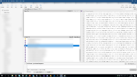
The new Local repositories tab in the new version of ST provides IMO very poor user experience. I have three major notes to it:
- lot of wasted space - the old treeview sidebar could handle all of the work with just about 300px of width
- this is more crucial for our usage - there are no tag names shown for repos that are in detached head state
- anywhere in tab for certain repository there is no displayed which tag is actually checked out, unless you want to dig into graph and hunt for the "HEAD" mark
- blurry text in changes view - on the right side when I select some source file where something has changes, it takes about two seconds to render some of file's lines. During the process the text is blurry which I find as very uncomfortable for eyes. (the second atachment with lorem ipsum text)
- relates to
-
SRCTREEWIN-5947 Checkbox missing for unstaged files
-
- Closed
-

