-
Type:
Bug
-
Resolution: Fixed
-
Priority:
High
-
Affects Version/s: 3.5.3
-
Component/s: Issue - Time Tracking & Worklog
-
3.05
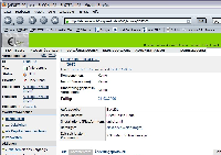
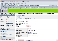
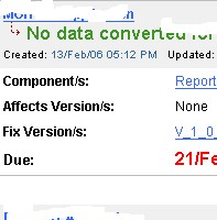
It is very easy to oversee the due date for an issue! The display in the same line as created and updated is very inconsiderable (grey font color).
Our JIRA users requests a more noticeable display of the due date, like:
- move the due date display instead of the top-line into the left pane of the issue details (like status, id etc.) and display it bold
- in addition display the due date red when the issue is over-due.
This should also be done for the HTML email notifications!
- is detailed by
-
JRASERVER-18505 View & Edit Issue Improvements
- Gathering Interest
- is duplicated by
-
JRASERVER-9822 Would be "visually" beneficial if all references to "Due" (ie the Due Date in JIRA) were in a larger font size and bold and red (so that it stands out)
- Closed
-
JRASERVER-13831 Highlight overdue due date - in different color and/or by indicator
- Closed
-
JRASERVER-16861 Due date should be shown on View Issue screen also.
- Closed
- relates to
-
JRASERVER-9201 Highlight issues red, which are late or overdue
- Gathering Interest


