• 42
    • Our product teams collect and evaluate feedback from a number of different sources. To learn more about how we use customer feedback in the planning process, check out our new feature policy.


      Aug 15, 2020: New navigation has been rolled out and the old navigation has been removed

      The new navigation has been fully rolled out for all Jira Cloud customers. The old navigation has been permanently replaced and will no longer be available for users to switch back to.

      While we feel the changes will be intuitive and easy to pick up, you are welcomed to refer to our official help documentation here: https://confluence.atlassian.com/jirasoftwarecloud/new-jira-cloud-navigation-983502691.html

      Thank you to everyone who's shared their feedback and thoughts. Our team has moved on to work on other areas and we are no longer actively monitoring this issue. To provide feedback, please use the Give feedback link in the Help menu.


      What are we doing?

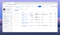
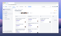
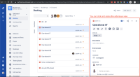
      We're in the process of redesigning Jira's navigation (for Jira Software, Jira Service Desk and Jira Core) to help you find and access your work more quickly & efficiently. Here's a sneak peek of what it might look like:


      Why are we making this change?

      Over the last couple of years, we have heard from numerous customers of their challenges with our current navigation sidebar UI, around navigation, findability, and accessing their work in Jira and Confluence. As a result, our team is now working on an improved navigation UI to better meet the needs of our diverse customer base.

      What to expect next?

      To keep you as informed as possible, we'll be using this public issue to communicate the progress of our work and also collect missing features in the form of subtasks. As features become available, we'll update the subtasks to let you know what's changed.

      If you would like to try an early exploration, you may download & install our Chrome extension. Please note that the extension is no longer being actively developed on.

      Frequently asked questions

      1. When will my instance receive the new navigation?
        We will start rolling out the new navigation in the first quarter of 2020. The rollout will take several months and we will send you an email as well as in-app notifications reminding you before your instance is selected for rollout.
      2. I’m an admin of an instance and I will need to communicate this change to my teams. Where can I go to get more information?
        In addition to the emails we've sent to Jira Cloud admins, we've also published official documentation here.
      3. I’m an admin of an instance and I need more time to communicate this change to my teams. Can I be excluded from the initial rollout?
        Yes. If you would like to be temporarily exempt from the rollout, please contact our Support team. Please note that this exclusion will only be temporary. Once the rollout is completed in early 2020 you will be given notice and prompted to switch over to the new navigation.
      4. How will my users toggle on/off the new navigation?
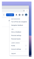
        Once we’ve started rolling out the experience, you and your instance’s users will be able to individually toggle on/off the experience by going to the user profile and clicking “Turn off the new navigation.” 
      5. I've signed up for the Early Access Program. Will all my users get the new navigation by default? 
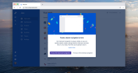
        The new navigation will be OFF by default. Once it is made available for your instance, every individual user will need to opt-in and toggle it on.   
      6. Where are Boards? Why don't they appear in the top navigation?
        We don’t plan to add boards to the main navigation bar in Jira Cloud. The main reason for this is to clarify the relationship between projects and boards. We create issues in a project, and boards are one of several ways to view those issues, along with the backlog, queues, and the issue navigator. From this perspective, it makes sense to navigate to a project that shows the various ways you can view and work on issues, including boards. Boards can show issues from multiple projects, but the vast majority show issues from a single project.
      7. How will I get to my Boards if it doesn't appear in the top navigation?
        The quickest way from anywhere in Jira is by clicking the search field (or pressing / on your keyboard). You’ll see recent boards, projects, and filters in the bottom half of the search panel. We also recommend starring boards so you can quickly find them by going to Your work > Starred. When you’re in a project, you can also use the board switcher in the sidebar. Click the board name and choose a board or type in its name.
      8. Will the new navigation be available on all Atlassian products?
        Jira Cloud and Confluence Cloud are the only products confirmed to have the new navigation in 2020. There are no commitments at this point for any of our other Cloud products (Bitbucket, Opsgenie, Statuspage, Trello, etc) to be adopting this experience. Server and Datacenter products will remain as-is. 
      9. Will the new (horizontal) navigation completely replace the old (vertical) navigation at some point?
        Yes, but not straight away. And while we’re in the process of rolling out the new navigation, you’re free to switch back and forth between the two. Once we’ve fully rolled out the new navigation, we’ll begin the process of removing the old navigation, but we’ll let you know before we remove it. We strongly believe our improved navigation will make it easier to use Jira Cloud. The clear labels; quick access to projects, filters, and dashboards; and fewer clicks to move between screens are just a few of the reasons why we think it’ll make navigation easier.

      Note: What is and isn't a distinct feature can be tricky to define, especially in something as involved as the navigation. We'll do our best to capture things as accurately and comprehensively as possible.

        1. How to opt out of new nav.png
          How to opt out of new nav.png
          103 kB
        2. How users can opt-in.jpg
          How users can opt-in.jpg
          190 kB
        3. issue view.png
          issue view.png
          525 kB
        4. marketplace apps.png
          marketplace apps.png
          289 kB
        5. Next-gen service desk (sneak peek).png
          Next-gen service desk (sneak peek).png
          1014 kB
        6. Next-gen software (sneak peek).png
          Next-gen software (sneak peek).png
          1.00 MB

            [JRACLOUD-73180] New Navigation in Jira Cloud

            Greg D added a comment -

            You can also get to your most recent Boards from the search bar at the upper right (it shows all of your recent boards in the bottom section of that search and they are always at the top of that list above Projects, Filters & Plans).  That is how I navigate to them since our boards are combinations of projects (same amount of clicks as before, just not as intuitive that they are in there).  You will probably get used to it.


            That search also has the same link that Paweł pointed out to all Boards at the bottom of that search section.  I do agree that Boards are probably more relevant than some of the other sections in the top nav, but if you build muscle memory to always use the search in the upper right, it has far more helpful information in it than an instance like this one or previous navigations.  In my opinion, they should not have People, Assets, or Apps listed as categories on the top bar since those are far less common (those should only be in the bottom of search).


            I believe Atlassian was finding that a lot of people have a single project per Board and so they thought included it in the project side panel is the best fit and that people would use Projects to get to which one they want.

            Greg D added a comment - You can also get to your most recent Boards from the search bar at the upper right (it shows all of your recent boards in the bottom section of that search and they are always at the top of that list above Projects, Filters & Plans).  That is how I navigate to them since our boards are combinations of projects (same amount of clicks as before, just not as intuitive that they are in there).  You will probably get used to it.   That search also has the same link that Paweł pointed out to all Boards at the bottom of that search section.  I do agree that Boards are probably more relevant than some of the other sections in the top nav, but if you build muscle memory to always use the search in the upper right, it has far more helpful information in it than an instance like this one or previous navigations.  In my opinion, they should not have People, Assets, or Apps listed as categories on the top bar since those are far less common (those should only be in the bottom of search).   I believe Atlassian was finding that a lot of people have a single project per Board and so they thought included it in the project side panel is the best fit and that people would use Projects to get to which one they want.

            Thx Pawel for replying.

            As I said, we are navigating between boards on a daily basis. This is the menu I'm using the most.

            So I would really appreciate to have it on top, not in a sub menu to avoid extra click.

            ruben beaujolais added a comment - Thx Pawel for replying. As I said, we are navigating between boards on a daily basis. This is the menu I'm using the most. So I would really appreciate to have it on top, not in a sub menu to avoid extra click.

            There are boards in menu...


            Paweł Albecki added a comment - There are boards in menu...  

            ruben beaujolais added a comment - - edited

            Hi,

            Regarding the removal of the "Boards" menu.

            Note that, for teams members, Boards are the main entry points for following work.

            Quick access should be clearly preferrable.

            Sorry, but this change does not help.

            ruben beaujolais added a comment - - edited Hi, Regarding the removal of the "Boards" menu. Note that, for teams members, Boards are the main entry points for following work. Quick access should be clearly preferrable. Sorry, but this change does not help.

            Matt Tse added a comment -

            Thank you everyone for all your patience, time and support during the rollout of our new navigation. We are closing this ticket now as the new navigation has been made available for every single Jira Cloud instance. 

            We are always looking for opportunities to improve how users navigate and find things in our Jira Cloud products. Comments and suggestions raised on this ticket will be referenced for any future explorations we look at. If there are any iterations that we end up prioritizing and doing, we will make sure to provide the necessary communications so that that you're aware of what might be changing.

            Thanks again!

            Matt Tse added a comment - Thank you everyone for all your patience, time and support during the rollout of our new navigation. We are closing this ticket now as the new navigation has been made available for every single Jira Cloud instance.  We are always looking for opportunities to improve how users navigate and find things in our Jira Cloud products. Comments and suggestions raised on this ticket will be referenced for any future explorations we look at. If there are any iterations that we end up prioritizing and doing, we will make sure to provide the necessary communications so that that you're aware of what might be changing. Thanks again!

            Matt Tse added a comment - - edited

            [Update Aug 13, 20 - We have stopped accepting new candidates for this round of research. Thank you to all those who reached out.]

            Thank you to everyone who's so kindly reached out.

            We've had some great interest from Jira Software Cloud users - are there any more people who use Jira Service Desk Cloud that would want to take part? So calling any Service Desk Agents, Help Desk Agents, Service Desk Managers etc, that use Jira Cloud.


            Cheers,

            Matt

            Matt Tse added a comment - - edited [Update Aug 13, 20 - We have stopped accepting new candidates for this round of research. Thank you to all those who reached out.] Thank you to everyone who's so kindly reached out. We've had some great interest from Jira Software Cloud users - are there any more people who use Jira Service Desk Cloud that would want to take part? So calling any Service Desk Agents, Help Desk Agents, Service Desk Managers etc, that use Jira Cloud.   Cheers, Matt

            Matt Tse added a comment -

            Hi all,

            Thank you so much for your votes and comments on the navigation experience.

            We are doing further research on this topic and would love to invite you to take part in an upcoming customer research study!

            What’s involved in the research:

            • Sessions are 1 hour and conducted over video-conference, so you can participate from anywhere around the globe.
            • During the research, we'll start with a general chat to get to know you, then, you might explore a prototype and complete some tasks.
            • As a token of our appreciation, you'll receive an e-gift card worth $100 USD within 5 days of completing your session.

            If you're interested in taking part, please contact me on mtse@atlassian.com to schedule a time that works for you. In your email, please tell us a bit more about yourself by answering the following:

            “In a few sentences, tell us about yourself and your job. What kind of company do you work at? What is your day-to-day role like?”

            If you have any other questions at all, feel free to email me directly. We look forward to meeting you!

            Cheers,

            Matt Tse

            Jira Cloud

            Matt Tse added a comment - Hi all, Thank you so much for your votes and comments on the navigation experience. We are doing further research on this topic and would love to invite you to take part in an upcoming customer research study! What’s involved in the research: Sessions are 1 hour and conducted over video-conference, so you can participate from anywhere around the globe. During the research, we'll start with a general chat to get to know you, then, you might explore a prototype and complete some tasks. As a token of our appreciation, you'll receive an e-gift card worth $100 USD within 5 days of completing your session. If you're interested in taking part, please contact me on mtse@atlassian.com to schedule a time that works for you. In your email, please tell us a bit more about yourself by answering the following: “In a few sentences, tell us about yourself and your job. What kind of company do you work at? What is your day-to-day role like?” If you have any other questions at all, feel free to email me directly. We look forward to meeting you! Cheers, Matt Tse Jira Cloud

            Thank you Jeanne - I'm with you on all points

            Bill Tomczak added a comment - Thank you Jeanne - I'm with you on all points

            Jeanne, perfect summary. Too bad it won't be addressed anyhow

            Dmitry Astapkovich _Colined_ added a comment - Jeanne, perfect summary. Too bad it won't be addressed anyhow

            As an Admin and a User, I have several issues with the "new" navigation. 

            Boards - As an Admin and as a user, I should not have to walk through, project by project, to find boards. Removing the Board menu, in my opinion, was nothing short of laziness. And if this "Boards can show issues from multiple projects, but the vast majority show issues from a single project." is your belief, you have no idea who your customer is. Atlassian may work within "development silos" but in the real world most development is cross-functional. This means multiple projects, teams, and platforms.

            Admin - The Admin menus are split between a right dropdown menu and a left nav column. This is very poor design. Add to that the fact that you can not navigate from one area of Admin to another unless you go back to the right dropdown menu and make another selection. Advocating for the use of the '.' shortcut is, again, laziness in design and function.

            Your Work is a waste of space in the top menu, especially since all this information shows as soon as you put your cursor into the Search bar

            People is a waste of space in the top menu. I would replace this with the Board menu

            Project dropdown - the search has been removed from the project dropdown menu. You now have to click into View All Projects to search and switch to another project. In the old navigation, I had the option of clicking on the Project Name in the Left Nav column, see a list of projects, select a project from the list, and switch to that project or click on the Project Menu and select search from the dropdown. Both of these options are now gone.

            Search - see above comment by Dmitry and Chris. Nothing more I can add. It just sucks.

            Shortcuts - there is no way to add your own shortcuts to a menu or dropdown.

            Jeanne Howe added a comment - As an Admin and a User, I have several issues with the "new" navigation.  Boards - As an Admin and as a user, I should not have to walk through, project by project, to find boards. Removing the Board menu, in my opinion, was nothing short of laziness. And if this "Boards can show issues from multiple projects, but the vast majority show issues from a single project." is your belief, you have no idea who your customer is. Atlassian may work within "development silos" but in the real world most development is cross-functional. This means multiple projects, teams, and platforms. Admin - The Admin menus are split between a right dropdown menu and a left nav column. This is very poor design. Add to that the fact that you can not navigate from one area of Admin to another unless you go back to the right dropdown menu and make another selection. Advocating for the use of the '.' shortcut is, again, laziness in design and function. Your Work is a waste of space in the top menu, especially since all this information shows as soon as you put your cursor into the Search bar People is a waste of space in the top menu. I would replace this with the Board menu Project dropdown - the search has been removed from the project dropdown menu. You now have to click into View All Projects to search and switch to another project. In the old navigation, I had the option of clicking on the Project Name in the Left Nav column, see a list of projects, select a project from the list, and switch to that project or click on the Project Menu and select search from the dropdown. Both of these options are now gone. Search - see above comment by Dmitry and Chris. Nothing more I can add. It just sucks. Shortcuts - there is no way to add your own shortcuts to a menu or dropdown.

            Matt Tse added a comment -

            dmitry.astapkovich,

            Thank you again for taking the time to provide more feedback. I presume the "search input" you're referring to here is the advanced issue search? If so, this page has not been changed as part of the new navigation experience. I do agree it needs work and this is something we will be focusing more in this financial & calendar year. In terms of Jira settings, we also are aware of the fact that admin and configuration-related concerns are less efficient for some who were used to the sidebar experience. We are looking into this now and are capturing here: https://jira.atlassian.com/browse/JRACLOUD-74676. When I've spoken to there Jira admins, they strongly advocate for the use of the '.' shortcut, which arguably is the most efficient way of getting around the admin settings, even in the days where we had the old navigation. 

            Lastly, I appreciate and admire the passion you have in wanting to make the Jira product a better experience. It sounds like it would be far easier for us to chat over a call sometime to go over each of the things you've raised here. If you're opened to it, feel free to book some time with me. My availability is here: https://calendly.com/mtse/jira-cloud-chat.

            chris.b1,

            Similar to my question for Dmitry - it sounds like you might be referencing the advanced issue search page? 

            Matt Tse added a comment - dmitry.astapkovich , Thank you again for taking the time to provide more feedback. I presume the "search input" you're referring to here is the advanced issue search? If so, this page has not been changed as part of the new navigation experience. I do agree it needs work and this is something we will be focusing more in this financial & calendar year. In terms of Jira settings, we also are aware of the fact that admin and configuration-related concerns are less efficient for some who were used to the sidebar experience. We are looking into this now and are capturing here:  https://jira.atlassian.com/browse/JRACLOUD-74676 . When I've spoken to there Jira admins, they strongly advocate for the use of the '.' shortcut, which arguably is the most efficient way of getting around the admin settings, even in the days where we had the old navigation.  Lastly, I appreciate and admire the passion you have in wanting to make the Jira product a better experience. It sounds like it would be far easier for us to chat over a call sometime to go over each of the things you've raised here. If you're opened to it, feel free to book some time with me. My availability is here:  https://calendly.com/mtse/jira-cloud-chat. chris.b1 , Similar to my question for Dmitry - it sounds like you might be referencing the advanced issue search page? 

            My biggest complaint about the new nav is about absolute unresponsiveness of the search input 

            Absolutely agree. This unresponsiveness causes so many problems when you are in a list view and click the search bar to try search, then end up assigning issues because the keyboard input is lost and the single key keyboard shortcuts (which you can't disable) take over.

            Chris Beswick added a comment - My biggest complaint about the new nav is about absolute unresponsiveness of the search input  Absolutely agree. This unresponsiveness causes so many problems when you are in a list view and click the search bar to try search, then end up assigning issues because the keyboard input is lost and the single key keyboard shortcuts (which you can't disable) take over.

            My biggest complaint about the new nav is about absolute unresponsiveness of the search input (which is the new all btw) till the page is loaded. So whenever I need to open Jira, I go to default page (dash or project), click in the search input, wait, and then click again, and yet again, and again, and only after that it starts working. Looks amazingly bad for a 100% public feature. 

            Another new  terrible thing is Jira Settings separation - first you need to top right corner to select where need to you go, then pick a section with side bar on the left (yeah, mouse trip across whole screen). If you need to go to another page (for instance go from Issues to Projects or Apps), it means you are to perform same trip to top right corner and then back to the sidebar on the left. The old nav was a lot more effective since everything was on the left. And side bar had an option to go root folder for all settings.  But who cares?.. The new nav is 100% out no matter what. 

            I would love to see interviews with real Jira users who said they like it. Same as those mystical new issue view lovers. 

            So sad =(

            Dmitry Astapkovich _Colined_ added a comment - My biggest complaint about the new nav is about absolute unresponsiveness of the search input (which is the new all btw) till the page is loaded. So whenever I need to open Jira, I go to default page (dash or project), click in the search input, wait, and then click again, and yet again, and again, and only after that it starts working. Looks amazingly bad for a 100% public feature.  Another new  terrible thing is Jira Settings separation - first you need to top right corner to select where need to you go, then pick a section with side bar on the left (yeah, mouse trip across whole screen). If you need to go to another page (for instance go from Issues to Projects or Apps), it means you are to perform same trip to top right corner and then back to the sidebar on the left. The old nav was a lot more effective since everything was on the left. And side bar had an option to go root folder for all settings.  But who cares?.. The new nav is 100% out no matter what.  I would love to see interviews with real Jira users who said they like it. Same as those mystical new issue view lovers.  So sad =(

            Matt Tse added a comment - - edited

            Hi romy.meyers,

            Thanks for your comment. We have started to remove the old navigation and have no intention of keeping it around and allowing users to switch back and forth. It sounds like you might be interested in having it around for a bit longer though. Would you mind sharing with me why? Feel free to send me an email directly if you'd prefer at mtse[at]atlassian.com.

            Matt Tse added a comment - - edited Hi romy.meyers , Thanks for your comment. We have started to remove the old navigation and have no intention of keeping it around and allowing users to switch back and forth. It sounds like you might be interested in having it around for a bit longer though. Would you mind sharing with me why? Feel free to send me an email directly if you'd prefer at mtse [at] atlassian.com.

            so Matt - earlier we had the option to switch back and forth to and from the new navigation but it appears that this option is no longer available unlike the Jira old and new issue view. I apologize if this has been discussed earlier but i would like to know IF there is an option to be able to choose either navigation experience?

            thanks - Romy

            Romy Meyers added a comment - so Matt - earlier we had the option to switch back and forth to and from the new navigation but it appears that this option is no longer available unlike the Jira old and new issue view. I apologize if this has been discussed earlier but i would like to know IF there is an option to be able to choose either navigation experience? thanks - Romy

            Matt Tse added a comment -

            @027f4ed4265f,

            Thanks for sharing your feedback. I'm shared this with the Confluence PM and will let you know what the response is.

            oren.david and 0c217be37f66,

            Thanks for your feedback. This is a suggestion that I'll be reviewing with our engineering and design team. Out of curiosity, I'm wondering if you have tried using the quick (global) search (top right of the nav) to get to the different projects? We have seen customers using this to access different kinds of projects and I'm looking to better understand if this works/does not work for your particular use case(s).

            Matt Tse added a comment - @ 027f4ed4265f , Thanks for sharing your feedback. I'm shared this with the Confluence PM and will let you know what the response is. oren.david  and 0c217be37f66 , Thanks for your feedback. This is a suggestion that I'll be reviewing with our engineering and design team. Out of curiosity, I'm wondering if you have tried using the quick (global) search (top right of the nav) to get to the different projects? We have seen customers using this to access different kinds of projects and I'm looking to better understand if this works/does not work for your particular use case(s).

            I agree with oren.david, this is very annoying. Now there is no quick way to access projects, always going to "All Projects" is not really a neat solution. Please bring back the search bar or some way to get to all the different projects.

            Jonas Börnicke added a comment - I agree with oren.david, this is very annoying. Now there is no quick way to access projects, always going to "All Projects" is not really a neat solution. Please bring back the search bar or some way to get to all the different projects.

            oren.david added a comment -

            In the former view it was possible to navigate to other projects and search for projects from the dropdown. Now the "Projects" dropdown shows only "Starred" and "Recent" projects without search field and it's missing.

            oren.david added a comment - In the former view it was possible to navigate to other projects and search for projects from the dropdown. Now the "Projects" dropdown shows only "Starred" and "Recent" projects without search field and it's missing.

            Malka added a comment -

            The custom links work for the Jira navigation menu, but are absent when you switch over to Confluence using the same navigation. This is frustrating because we have several employees that are Confluence only users but need the links on the custom link menu that we created for in house use. @mtse

            Malka added a comment - The custom links work for the Jira navigation menu, but are absent when you switch over to Confluence using the same navigation. This is frustrating because we have several employees that are Confluence only users but need the links on the custom link menu that we created for in house use. @mtse

            Matt Tse added a comment - - edited

            Hi everyone,

            Thank you again to all those who are watching this ticket. I wanted to take this time to call out a few things that I've noticed that have been recurring in the feedback. Some of you have indicated that it is difficult to find the "Create issue" button and marketplace apps. 

            • Re: "I can't find the Create issue button" - The create issue button that used to be in the sidebar navigation is now available at the top. You can find it by looking for the “Create” button. You should be able to also use the keyboard shortcut (c) to trigger it. We are aware of a small bug where a certain text & navigation colour combination will make the button look blank. We are working on this now and expect to have it resolved soon. As a temporary workaround, your system admin can adjust the Look and feel settings to fix this. More documentation on this: https://confluence.atlassian.com/adminjiracloud/configuring-the-look-and-feel-of-your-jira-applications-780861527.html.
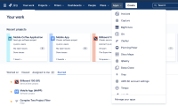
            • Re: "Where are my Apps?" - Your marketplace apps can be found under the Apps menu in the top navigation. See my screenshot below:

            Matt Tse added a comment - - edited Hi everyone, Thank you again to all those who are watching this ticket. I wanted to take this time to call out a few things that I've noticed that have been recurring in the feedback. Some of you have indicated that it is difficult to find the "Create issue" button and marketplace apps.  Re: "I can't find the Create issue button" - The create issue button that used to be in the sidebar navigation is now available at the top. You can find it by looking for the “Create” button. You should be able to also use the keyboard shortcut (c) to trigger it. We are aware of a small bug where a certain text & navigation colour combination will make the button look blank. We are working on this now and expect to have it resolved soon. As a temporary workaround, your system admin can adjust the Look and feel settings to fix this. More documentation on this:  https://confluence.atlassian.com/adminjiracloud/configuring-the-look-and-feel-of-your-jira-applications-780861527.html. Re: "Where are my Apps?"  - Your marketplace apps can be found under the Apps menu in the top navigation. See my screenshot below:

            Matt Tse added a comment -

            dmitry.astapkovich

            If you'd like, feel free to book in time with me at https://calendly.com/mtse/jira-cloud-chat regarding the bug(s) you're referring to. As for the early access; we concluded and closed that program back in February 2020. While this ticket was initially set up for soliciting early feedback, we have also been using it as a way to keep our customers informed about the progress of the rollout of the new experience. We take feedback very seriously, but it is just one input of the many that we use to prioritize what gets built and shipped. In trying to balance the needs of every user, we make trade-offs that may disappoint some; however, I am always happy to listen to what people are saying to better understand what problems we need to spend more time on.

            esther.strom, sarah811470859,

            Glad to hear they're working as expected. Thanks again for sharing your feedback with us.

            Matt Tse added a comment - dmitry.astapkovich ,  If you'd like, feel free to book in time with me at  https://calendly.com/mtse/jira-cloud-chat  regarding the bug(s) you're referring to. As for the early access; we concluded and closed that program back in February 2020. While this ticket was initially set up for soliciting early feedback, we have also been using it as a way to keep our customers informed about the progress of the rollout of the new experience. We take feedback very seriously, but it is just one input of the many that we use to prioritize what gets built and shipped. In trying to balance the needs of every user, we make trade-offs that may disappoint some; however, I am always happy to listen to what people are saying to better understand what problems we need to spend more time on. esther.strom , sarah811470859 , Glad to hear they're working as expected. Thanks again for sharing your feedback with us.

            Sarah Shepard added a comment - - edited

            @mtse thank you!!!

            Sarah Shepard added a comment - - edited @mtse thank you!!!

            @Matt Tse - yes! Thank you, the custom links are now showing up in the app switcher again. It's a little thing, but it makes a big difference to us.

            Esther Strom [ACP-JA] added a comment - @Matt Tse - yes! Thank you, the custom links are now showing up in the app switcher again. It's a little thing, but it makes a big difference to us.

            Can the pop up be disabled, please?

            Or can all UI popups be disabled, please, its very frustrating for my users to keep having to click the close button 

            Kyle Cooke added a comment - Can the pop up be disabled, please? Or can all UI popups be disabled, please, its very frustrating for my users to keep having to click the close button 

            My both comments #1 and #2 are about 100% bugs. If the user sets both colors to white and that look bad, it's up to the user, who is paying for the product. Making it unadjustable is either a bug, or very bad design decision.

            Anyways, why do you even bother with this early access if neither user feedbacks, nor vendor ones are taken into consideration? Just roll out everything straight to public, why bother?

            Dmitry Astapkovich _Colined_ added a comment - - edited My both comments #1 and #2 are about 100% bugs. If the user sets both colors to white and that look bad, it's up to the user, who is paying for the product. Making it unadjustable is either a bug, or very bad design decision. Anyways, why do you even bother with this early access if neither user feedbacks, nor vendor ones are taken into consideration? Just roll out everything straight to public, why bother?

            Matt Tse added a comment -

            Hello everyone! Hope you're all staying safe and well during these times. Apologies for the delayed response. 

            Would like to take the time to quickly thank those who have been jumping in and helping each other out in learning how to navigate the new changes (pun intended). 

            Let me try and address some of the comments and questions raised so far:

            • For those of you asking for the new navigation sooner, by now most of you should have received it. If not, I ask that you continue to stay patient as we are getting to the point of the rollout where all instances will have it available.
            • f647129a498b, sarah811470859, 027f4ed4265f, esther.strom, and whoever else I might have missed - the custom links not appearing in the Atlassian/app switcher should be appearing now. Please let me know if they still aren't and I can try to help troubleshoot further.
            • dmitry.astapkovich, thank you for sharing those helpful imgur links! Let me see if I can answer your questions in order:
              • Re: #1 - The "Highlight" color is actually used for determining the color of the Create (issue) button, and the selected state (the underline that appears when you navigate to Your work, a Project, Filter, etc)
              • Re: #2 - In trying to balance the flexibility that we've seen across several instances, we have put in measures to try and prevent the text and the colours used in the navigation from overlapping and being completely inaccessible to the naked eye. We are however aware of an issue where you could have the Background color set as #fefefe and the Highlight set as #ffffff, which makes the nav items look like they're floating.
              • Re: #3 - This is an interesting suggestion. I will pass this feedback along to our design team for future consideration.
            • stephan.loser, 027f4ed4265f, and everyone else asking about Boards. I completely understand the need for Boards and trust that I am still looking into this area. I can't make any promises here of when we'll have a solution but I promise to share our thinking in this JAC ticket once I know more. 
            • 0f3dfca751b8, bfint1413742377, I understand the need for this as it has been echoed in another comment. For these navigation changes, we did not consider allowing that capability; however, it is something that has been noted and shared back amongst our teams looking into how we do better change management as a whole. If you would like to have all your users on the new UI by default and immediately, please reach out to our Support team and they will be able to assist you with this. 
            • bruce.reed512920377, old is new again eh? On a more serious note, yes we heard the community loud and clear and we have already seen the positive impact it's hard in helping our users find things more easily. 

            Again, thanks to all of you for your patience and for taking the time to share your thoughts. This really means a lot!

            Matt Tse added a comment - Hello everyone! Hope you're all staying safe and well during these times. Apologies for the delayed response.  Would like to take the time to quickly thank those who have been jumping in and helping each other out in learning how to navigate the new changes (pun intended).  Let me try and address some of the comments and questions raised so far: For those of you asking for the new navigation sooner, by now most of you should have received it. If not, I ask that you continue to stay patient as we are getting to the point of the rollout where all instances will have it available. f647129a498b , sarah811470859 , 027f4ed4265f , esther.strom , and whoever else I might have missed - the custom links not appearing in the Atlassian/app switcher should be appearing now. Please let me know if they still aren't and I can try to help troubleshoot further. dmitry.astapkovich , thank you for sharing those helpful imgur links! Let me see if I can answer your questions in order: Re: #1 - The "Highlight" color is actually used for determining the color of the Create (issue) button, and the selected state (the underline that appears when you navigate to Your work, a Project, Filter, etc) Re: #2 - In trying to balance the flexibility that we've seen across several instances, we have put in measures to try and prevent the text and the colours used in the navigation from overlapping and being completely inaccessible to the naked eye. We are however aware of an issue where you could have the Background color set as #fefefe and the Highlight set as #ffffff, which makes the nav items look like they're floating. Re: #3 - This is an interesting suggestion. I will pass this feedback along to our design team for future consideration. stephan.loser , 027f4ed4265f , and everyone else asking about Boards. I completely understand the need for Boards and trust that I am still looking into this area. I can't make any promises here of when we'll have a solution but I promise to share our thinking in this JAC ticket once I know more.  0f3dfca751b8 , bfint1413742377 , I understand the need for this as it has been echoed in another comment. For these navigation changes, we did not consider allowing that capability; however, it is something that has been noted and shared back amongst our teams looking into how we do better change management as a whole. If you would like to have all your users on the new UI by default and immediately, please reach out to our Support team and they will be able to assist you with this.  bruce.reed512920377 , old is new again eh? On a more serious note, yes we heard the community loud and clear and we have already seen the positive impact it's hard in helping our users find things more easily.  Again, thanks to all of you for your patience and for taking the time to share your thoughts. This really means a lot!

            Bruce Reed added a comment -

            Hilarious... I just went to the "New" navigation experience and realized it's the OLD Jira Server style interface. It's vindication for those us who complained vociferously to Atlassian about how bad they made a good, useable Jira interface into an abomination. But thanks for getting us back to something useable Atlassian!

            Bruce Reed added a comment - Hilarious... I just went to the "New" navigation experience and realized it's the OLD Jira Server style interface. It's vindication for those us who complained vociferously to Atlassian about how bad they made a good, useable Jira interface into an abomination. But thanks for getting us back to something useable Atlassian!

            Malka added a comment -

            We need our custom URLs and Boards menu for adoption of this new layout. Also, when issues load in the new layout, the buttons are large and as you mouse over them, they shrink to mobile size squares? Not sure what that is about but it is annoying when doing a ton of issue maintenance at once, it really becomes noticeable after the 5th one and painful after the 25th one.

            Malka added a comment - We need our custom URLs and Boards menu for adoption of this new layout. Also, when issues load in the new layout, the buttons are large and as you mouse over them, they shrink to mobile size squares? Not sure what that is about but it is annoying when doing a ton of issue maintenance at once, it really becomes noticeable after the 5th one and painful after the 25th one.

            Bruce Fint added a comment -

            I'd also like to know if the new nav can be pushed site-wide as Koen.Dewulf asked above. Inconsistent displays present a challenge when onboarding new users (via video conferences). 

            Bruce Fint added a comment - I'd also like to know if the new nav can be pushed site-wide as Koen.Dewulf asked above. Inconsistent displays present a challenge when onboarding new users (via video conferences). 

            @matt tse: I agree with Sarah Shepard; we need the ability to add custom URLs to the app switcher. We have many users who use both Jira itself and the service desk portal, and we always have had a link to the portal in the switcher. We also have a direct link to our main Confluence documentation space and a few others. I understand not wanting to clutter up the interface, but if you keep the ability, you allow site admins to determine what's necessary and what isn't.

            Esther Strom [ACP-JA] added a comment - @matt tse: I agree with Sarah Shepard; we need the ability to add custom URLs to the app switcher. We have many users who use both Jira itself and the service desk portal, and we always have had a link to the portal in the switcher. We also have a direct link to our main Confluence documentation space and a few others. I understand not wanting to clutter up the interface, but if you keep the ability, you allow site admins to determine what's necessary and what isn't.

            Looking forward to the change! Would we be able to enforce the default navigation style to the entire Jira instance as an Jira-siite Admin?

            Koen.Dewulf added a comment - Looking forward to the change! Would we be able to enforce the default navigation style to the entire Jira instance as an Jira-siite Admin?

            With Jira-SW life happens in boards! I agree that boards can be found on projects or via search. However that takes many more clicks than with having a board-menue. Please reconsider your decision to not have a board-menue. Thank you!

            Stephan

            Stephan Loser SL added a comment - With Jira-SW life happens in boards! I agree that boards can be found on projects or via search. However that takes many more clicks than with having a board-menue. Please reconsider your decision to not have a board-menue. Thank you! Stephan

             
            @Matt Tse
            As for the saved URLs (shortcuts), we need this too.

            Anna Pososhenko added a comment -   @Matt Tse As for the saved URLs (shortcuts), we need this too.

            Couple of questions on the Look and Feel. Can't add attachments (more than 1?), so links to screenshots only. 

             1. Why any non-default highlight color sets border of the search box and action icons to pure BOLD BLACK? 

            https://i.imgur.com/GNb9Gjh.png

            https://i.imgur.com/1QgbCIX.png 


            2.  Same issue with Background color: any tweak results into getting black holes instead of icons:

            https://i.imgur.com/GpzhtPY.png 


            3. Wouldn't it be a lot more efficient to switch Create and Search? In this case Search would open to right with no jump. Also, many apps have search on the right as a part of guidelines for header actions. New BOLD SEARCH will confuse users:

            https://i.imgur.com/9wEpGQG.png 

            Dmitry Astapkovich _Colined_ added a comment - - edited Couple of questions on the Look and Feel. Can't add attachments (more than 1?), so links to screenshots only.   1. Why any non-default highlight color sets border of the search box and action icons to pure  BOLD BLACK?   https://i.imgur.com/GNb9Gjh.png https://i.imgur.com/1QgbCIX.png     2.  Same issue with Background color: any tweak results into getting black holes instead of icons: https://i.imgur.com/GpzhtPY.png     3. Wouldn't it be a lot more efficient to switch Create and Search? In this case Search would open to right with no jump. Also, many apps have search on the right as a part of guidelines for header actions. New BOLD SEARCH will confuse users: https://i.imgur.com/9wEpGQG.png  

            Markel Fennell added a comment - - edited

            Hopefully get the instance soon. No option yet.

            Markel Fennell added a comment - - edited Hopefully get the instance soon. No option yet.

            the irony is that this is almost exactly like the old navigation prior to bringing in the new large blue sidebar navigation (which I never liked in the first place and sent a LOT of feedback about it; it took me 4 extra clicks to do the same thing that I could previously do in 1) - so I'm really happy to get this (new/old) change 

            Mona Slaunwhite added a comment - the irony is that this is almost exactly like the old navigation prior to bringing in the new large blue sidebar navigation (which I never liked in the first place and sent a LOT of feedback about it; it took me 4 extra clicks to do the same thing that I could previously do in 1) - so I'm really happy to get this (new/old) change 

            Give me new navigation ! Please Please Please ! It looks nice...

            Jay Thakkar added a comment - Give me new navigation ! Please Please Please ! It looks nice...

            John Funk added a comment -

            @Rodolfo Romero - Click in the Search box at the top left, then click on Boards at the bottom of the popup box. 

            John Funk added a comment - @Rodolfo Romero - Click in the Search box at the top left, then click on Boards at the bottom of the popup box. 

            Regarding boards visibility, for Jira Administrators is very important to be able to see the whole list of boards in one view. This allows to copy boards, delete old boards, configure multiple boards, etc. How is this going to be accomplished with the new navigation?

            Rodolfo Romero - Adaptavist added a comment - Regarding boards visibility, for Jira Administrators is very important to be able to see the whole list of boards in one view. This allows to copy boards, delete old boards, configure multiple boards, etc. How is this going to be accomplished with the new navigation?

            Dario B added a comment - - edited

            Hi dave.mathijs,

            If you really cannot wait, please contact our Support team and ask if they can enable the new navigation for your instance.

            As written in one of the comments above:

            generally speaking, we're not taking in any requests to have instances enrolled earlier than scheduled, but please do get in touch with our support team if this is something you'd like to enquire about.

            Dario B added a comment - - edited Hi dave.mathijs , If you really cannot wait, please  contact our Support team  and ask if they can enable the new navigation for your instance. As written in one of the comments above: generally speaking, we're not taking in any requests to have instances enrolled earlier than scheduled, but please do get in touch with our support team if this is something you'd like to enquire about.

            It would be nice to have the ability to opt-in for the new navigation hence accelerating the rollout for those who are interested.

            Dave Mathijs added a comment - It would be nice to have the ability to opt-in for the new navigation hence accelerating the rollout for those who are interested.

            Matt Tse added a comment -

            Hi everyone, apologies for the delayed response. Thank you for taking the time to read through and leave your comments. 

            sarah811470859, thanks for raising this! We're currently investigating this further. Have you been able to get by without this? 

            endak, we haven't seen any issues reported about starred filters going missing. If it happens again, can I ask that you please submit feedback by clicking the "Give feedback" link from the Profile menu? 

            ramesh.mashetty, thanks for your interest but we've now closed the early access program. We are in the process of rolling out the changes to more instances. Thank you in advance for your patience.

            matthew.moulton655343710, we're now gradually rolling out the changes to more instances and aim to be wrapped up by the end of June 2020. Note this could change, but we will do our best to keep everyone updated on this ticket. If you're currently an on-premise customer and trying to actively migrate, please visit https://www.atlassian.com/cloud-migration for more information. Our support team would be more than happy to help with this!

            tal.levi, generally speaking, we're not taking in any requests to have instances enrolled earlier than scheduled, but please do get in touch with our support team if this is something you'd like to enquire about.

            teresa.pile, thanks for checking in! We're still in the process of gradually rolling this out. At the moment, the new navigation is available to roughly ~5% of our customers. If there is a use case for you having the new navigation sooner, please reach out to our support team. 

            Matt Tse added a comment - Hi everyone, apologies for the delayed response. Thank you for taking the time to read through and leave your comments.  sarah811470859 , thanks for raising this! We're currently investigating this further. Have you been able to get by without this?  endak , we haven't seen any issues reported about starred filters going missing. If it happens again, can I ask that you please submit feedback by clicking the "Give feedback" link from the Profile menu?  ramesh.mashetty , thanks for your interest but we've now closed the early access program. We are in the process of rolling out the changes to more instances. Thank you in advance for your patience. matthew.moulton655343710 , we're now gradually rolling out the changes to more instances and aim to be wrapped up by the end of June 2020. Note this could change, but we will do our best to keep everyone updated on this ticket. If you're currently an on-premise customer and trying to actively migrate, please visit  https://www.atlassian.com/cloud-migration  for more information. Our support team would be more than happy to help with this! tal.levi , generally speaking, we're not taking in any requests to have instances enrolled earlier than scheduled, but please do get in touch with our support team if this is something you'd like to enquire about. teresa.pile , thanks for checking in! We're still in the process of gradually rolling this out. At the moment, the new navigation is available to roughly ~5% of our customers. If there is a use case for you having the new navigation sooner, please reach out to our support team. 

            Tere Pile added a comment -

            Documentation indicated 1Q roll out of new view, obviously we're just into Q2, just curious how far from roll out we might be

            Tere Pile added a comment - Documentation indicated 1Q roll out of new view, obviously we're just into Q2, just curious how far from roll out we might be

            Tal Levi added a comment -

            Hey, is it possible to open the new navigation to our instance?

            Tal Levi added a comment - Hey, is it possible to open the new navigation to our instance?

            Matthew, I have created 2 new instances in the last couple of weeks and both came already with the new navigation. As Jack well said, new instances seem to be already coming with the new navigation.

            Rodolfo Romero - Adaptavist added a comment - Matthew, I have created 2 new instances in the last couple of weeks and both came already with the new navigation. As Jack well said, new instances seem to be already coming with the new navigation.

            Matthew, while I’m not positive I believe that any new instance will have the new navigation or at a minimum you can contact Atlassian Support to request expediting. If you have an instance set up then contact support if not I would still contact support and inquire.


            Jack Brickey added a comment - Matthew, while I’m not positive I believe that any new instance will have the new navigation or at a minimum you can contact Atlassian Support to request expediting. If you have an instance set up then contact support if not I would still contact support and inquire.  

            Do we know how far off we are from the update to be released? We have been holding off migrating to Jira Cloud until the new navigation update has been released, as we will need to help staff learn how to use Jira Cloud.

            matthew moulton added a comment - Do we know how far off we are from the update to be released? We have been holding off migrating to Jira Cloud until the new navigation update has been released, as we will need to help staff learn how to use Jira Cloud.

            shetty added a comment -

            Hey 

            We want to signup for early access program if it is still available

            shetty added a comment - Hey  We want to signup for early access program if it is still available

            Enda Kelly added a comment - - edited

            Was going to give feedback via the extension but the only way was to login to a Google account so here I am.

            Has anyone else seen an issue where some starred filters disappear from the filter dropdown in the new view?

            Enda Kelly added a comment - - edited Was going to give feedback via the extension but the only way was to login to a Google account so here I am. Has anyone else seen an issue where some starred filters disappear from the filter dropdown in the new view?

            I also can't seem to find the saved urls that used to be on the bottom left nav? Like shortcuts?

            Sarah Shepard added a comment - I also can't seem to find the saved urls that used to be on the bottom left nav? Like shortcuts?

            oren.david added a comment -

            In the previous view it was possible to navigate between projects from the navigation side-bar. Upon click, I could see all projects (or search).

            Now the "Projects" menu on the top nav bar shows only the recent and starred projects, and the search box is gone. It would be very convenient to have it back.

            oren.david added a comment - In the previous view it was possible to navigate between projects from the navigation side-bar. Upon click, I could see all projects (or search). Now the "Projects" menu on the top nav bar shows only the recent and starred projects, and the search box is gone. It would be very convenient to have it back.

            Matt Tse added a comment -

            Hi everyone,

            Thanks for the lively discussion here and apologies for my delayed response.

            dmitry.astapkovich,

            I've passed along your feedback about the search UX and interaction to our search team for consideration. Regarding your other two points:

            • "There's still no information about custom menus for apps. Even fixed ones like Tempo has not working" -> I'm not sure I understand what you mean here? Would you mind elaborating? 
            • "There's still no option for a user to add a menu with his own custom shortcuts like it's done in the Projects side bar. Instead we have semi baked "Your work" that is just nothing compared to Dashboards. And lot's of wasted space instead of a menu for Boards" -> I understand the desire to want a completely customisable global navigation bar, but that is not something we have planned. Happy to take it as a suggestion for future consideration. Regarding the overall use of space in the navigation, this is something we're thinking about and if you'd like, I'd love to chat more about it. Feel free to email me directly at mtse[at]atlassian.com.

            Also, I love the mockup you've done of the 'Your work' page. Interestingly enough, you've landed on one of the sketches we've had! Let me know if you want to chat about this in more detail. My door's open.

            akiyanovskiy,

            Thanks for your feedback. I understand the confusion around the settings nomenclature and duplication. We have plans to address this in the near-future, so thanks for your patience in advance. On the topic of 'Your work' and "Dashboards'. I had a similar conversation with greg.draper310998593 on our community discussion page that I'd like to share: 

            I completely agree that Dashboards has some amazing utility provided it’s set up correctly. Our intent with the ‘Your work’ page was to help individual contributors find and resume their work more quickly. When we shipped this 4 months ago, we were able to see a significant uptick in this set of users getting back to their work (i.e., issues) more quickly. I know there’s a lot more we could do to make it useful for other segments. Given that this is a work in progress still, I'm actively seeking out customers who are interested in this topic to chat further. If you'd like, please email me at mtse[at]atlassian.com and we can take it from there.

            greg.draper310998593

            We've chatted briefly already in the community article, so I won't repost what I shared there, but again thank you for your tenacity and passion. It's feedback and discussions like that help us create better experiences, so keep em coming and I look forward to chatting soon!

            f4ee4e12535d,

            Thanks for the feedback. This is something we've been discussing internally as well. Definitely more to come on this, so please stay tuned.

            sarah811470859,

            Sarah! Thanks for being apart of the EAP. Would you mind following up with me directly via email? The new navigation should not be impacting the issue view, so if you're unable to disable it, it sounds like it might be a bug worth investigating. As Jack pointed out, you should be able to toggle the new/old issue view by going to the Personal settings page from your profile (`secure/ViewPersonalSettings.jspa`). Let me know if this works?

            Matt Tse added a comment - Hi everyone, Thanks for the lively discussion here and apologies for my delayed response. dmitry.astapkovich , I've passed along your feedback about the search UX and interaction to our search team for consideration. Regarding your other two points: "There's still no information about custom menus for apps. Even fixed ones like Tempo has not working" -> I'm not sure I understand what you mean here? Would you mind elaborating?  "There's still no option for a user to add a menu with his own custom shortcuts like it's done in the Projects side bar. Instead we have semi baked "Your work" that is just nothing compared to Dashboards. And lot's of wasted space instead of a menu for Boards" -> I understand the desire to want a completely customisable global navigation bar, but that is not something we have planned. Happy to take it as a suggestion for future consideration. Regarding the overall use of space in the navigation, this is something we're thinking about and if you'd like, I'd love to chat more about it. Feel free to email me directly at mtse [at] atlassian.com. Also, I love the mockup you've done of the 'Your work' page. Interestingly enough, you've landed on one of the sketches we've had! Let me know if you want to chat about this in more detail. My door's open. akiyanovskiy , Thanks for your feedback. I understand the confusion around the settings nomenclature and duplication. We have plans to address this in the near-future, so thanks for your patience in advance. On the topic of 'Your work' and "Dashboards'. I had a similar conversation with greg.draper310998593  on our community discussion page that I'd like to share:  I completely agree that Dashboards has some amazing utility provided it’s set up correctly. Our intent with the ‘Your work’ page was to help individual contributors find and resume their work more quickly. When we shipped this 4 months ago, we were able to see a significant uptick in this set of users getting back to their work (i.e., issues) more quickly. I know there’s a lot more we could do to make it useful for other segments. Given that this is a work in progress still, I'm actively seeking out customers who are interested in this topic to chat further. If you'd like, please email me at mtse [at] atlassian.com and we can take it from there. greg.draper310998593 ,  We've chatted briefly already in the community article, so I won't repost what I shared there, but again thank you for your tenacity and passion. It's feedback and discussions like that help us create better experiences, so keep em coming and I look forward to chatting soon! f4ee4e12535d , Thanks for the feedback. This is something we've been discussing internally as well. Definitely more to come on this, so please stay tuned. sarah811470859 , Sarah! Thanks for being apart of the EAP. Would you mind following up with me directly via email? The new navigation should not be impacting the issue view, so if you're unable to disable it, it sounds like it might be a bug worth investigating. As Jack pointed out, you should be able to toggle the new/old issue view by going to the Personal settings page from your profile (`secure/ViewPersonalSettings.jspa`). Let me know if this works?

            Hey Jack-

            the problem is we are all on the new Jira view, BUT the issue detail view is different. I have the 'old' issue detail which is much preferred as the new one is missing data. And not fields I can add in, like remaining time. I am not able to add screenshots in this comment.

            Sarah Shepard added a comment - Hey Jack- the problem is we are all on the new Jira view, BUT the issue detail view is different. I have the 'old' issue detail which is much preferred as the new one is missing data. And not fields I can add in, like remaining time. I am not able to add screenshots in this comment.

            Sarah, if i understand your situation and question - the issue view can be enabled/disabled (for now) per user. click on profile avatar > Settings > Jira Labs

            Jack Brickey added a comment - Sarah, if i understand your situation and question - the issue view can be enabled/disabled (for now) per user. click on profile avatar > Settings > Jira Labs

            Hey! Question-we are on EAP but my view in Issue detail view is the old view (MUCH PREFERRED), and another user has the new issue detail view which I can't seem to customise and is missing a lot of details like Remaining estimate.

            Sarah Shepard added a comment - Hey! Question-we are on EAP but my view in Issue detail view is the old view (MUCH PREFERRED), and another user has the new issue detail view which I can't seem to customise and is missing a lot of details like Remaining estimate.

            looks neat and simple

            Markos Stefanou added a comment - looks neat and simple

            I would suggest that for the sake of consistency, the "Your Work" section should be setup to look similar in Confluence and Jira. For example, in Confluence you are including shortcuts to the most recent spaces on the top with a big icon/image. There should be something similar in Jira.

            Rodolfo Romero - Adaptavist added a comment - I would suggest that for the sake of consistency, the "Your Work" section should be setup to look similar in Confluence and Jira. For example, in Confluence you are including shortcuts to the most recent spaces on the top with a big icon/image. There should be something similar in Jira.

              mtse@atlassian.com Matt Tse
              mtse@atlassian.com Matt Tse
              Votes:
              92 Vote for this issue
              Watchers:
              322 Start watching this issue

                Created:
                Updated:
                Resolved: