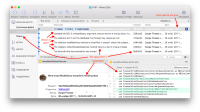
Usually I am positive about changes of applications user interfaces but the 2.7 release has brought an objectively much worse GUI. The amount of information per pixel has significantly decreased and the UI elements proportions have broken (some have got bigger while some haven't changed):
Some fonts and paddings have become too big. The left sidebar has also become bigger (because of the larger fonts) so the commits list got less space. It makes me expand the application window to fullscreen on my 1440x900 screen which is sad. I am not a child or an elder user, I don't need giant interfaces.
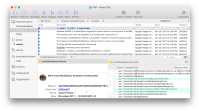
The version 2.6 fits much more text and commits on the same application window size while keeping the information well-readable:
I believe this change is a mistake. If it is not a mistake, treat the issue as my strongly desired improvement request.
- duplicates
-
SRCTREE-5154 Compact history display option
- Closed

