-
Type:
Bug
-
Resolution: Unresolved
-
Priority:
Low
-
None
-
Affects Version/s: 3.12.0, 3.14.0
-
Component/s: Email - Outgoing
-
8
-
Severity 3 - Minor
-
5
Summary
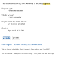
The Approval buttons for Approve or Decline in an Outlook email don't look to be formatted correctly
Steps to Reproduce
- Raise a request that requires an approval.
- Open up an email in Outlook for the issue that requires the approval.
Expected Results
The button format looks the same as it does in the Approving a Service Desk Request article under the How to approve and decline from email section.
Actual Results
The button formatting in Outlook is boxy and strange. Not sure if this is a limitation on Outlook:

Workaround
Use a different email client to open up the Approver email if you do not want to see the buttons formatted that way or proceed with the approval in the Outlook email.
- links to