-
Type:
Bug
-
Resolution: Fixed
-
Priority:
Low
-
Affects Version/s: 4.22.3
-
Component/s: Accessibility
-
Severity 2 - Major
Issue Summary
The state of an ACTIVE user interface component such as "Back to filter" and "Tree" does not have at least a 3:1 luminosity contrast ratio with either the inner or outer adjacent background.
Tested URL
Steps to Reproduce
- Launch the URL
- Navigate to the main content area and go to the "Referenced Server/s".
- Click on the "oracledb-11g-prod" button, just beside the "Referenced Server/s" text, in the "Can we get this server request approved?" page.
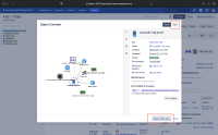
- Then the "Object Overview" modal will display.
- Click on the "Show graph" icon button.
- Click on the "Tree" button.
- Will get elements at the bottom of the modal.
Actual Results
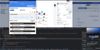
- When users with low vision access the page, the text should have sufficient color contrast of 3:1, with Outer Background: #FFFFFF and Focus indicator color: rgb(76, 154, 255) for "Back to filter view" and "Tree" which is in the bottom section of the modal dialog box which has an insufficient color contrast ratio of 2.8:1. As a result, low vision and elderly users won't be able to identify the boundary of the interactive elements. This will cause a poor user experience for low vision users.
- When users with low vision access the page, the text should have sufficient color contrast of 3:1, with Inner Background: #E0E2E6 and Focus indicator color: rgb(76, 154, 255) for "Back to filter view" and "Tree" which is in the bottom section of the modal dialog box which has an insufficient color contrast ratio of 2.4:1. As a result, low vision and elderly users won't be able to identify the boundary of the interactive elements. This will cause a poor user experience for low vision users.
Expected Results
The visual state of an active user interface component MUST have sufficient contrast of 3:1 with the adjacent background. Exceptions exist.
Fix this issue by adjusting the visual focus indicator or state indicator (e.g. selected, checked, pressed, etc.) of the user interface component and/or background to increase the contrast with either the inner or outer adjacent background to at least 3:1. People who have low vision or are colorblind may have difficulty perceiving that an element is interactive or what its state is - e.g. whether it has keyboard focus, is selected/checked/pressed, etc. - if the contrast between the element boundaries and/or state indicators and its background or adjacent colors is insufficient. When an interactive element's visual boundaries and state indicators have adequate contrast, people who have low vision or are colorblind are more likely to be able to perceive which elements on the screen are interactive and what their current state is.
Screenshot

Workaround
Currently, there is no known workaround for this behaviour. A workaround will be added here when available.
Bug Ref: 745358
Bulldog Ref: JSMDC-12577
- duplicates
-
JSDSERVER-11559 Object Overview Modal with default force mode graph : State of active component lacks color contrast ratio 3:1.
-
- Closed
-
- is blocked by
-
JSMDC-12577 Loading...

