-
Bug
-
Resolution: Fixed
-
Low
-
None
-
4.20.0, 5.3.1
-
Severity 2 - Major
-
Issue Summary
The element appears and functions like a Listbox but is missing the required ARIA role(s) and/or attribute(s).
Name of the Element:
-Popular list box
Location:
Located beside the heading "All portals", in the main region
Steps to Reproduce
- In the Help Center portal keeping the screen reader navigate to the main content area.
- Inspect the dropdown menu to order the projects.
Actual Results
The <input> elements do not use role="combobox", aria-expanded, and aria-activedescendant attributes. As well, the comboboxes do not have programmatically defined accessible names. The listbox options do not use role="listbox", role="option", and aria-selected attributes. As a result, users of assistive technologies will not be able to understand the functionality associated with the comboboxes.
Expected Results
- Make sure that Combobox components are programmatically determined. If possible, use a native "<select>" element. These have out-of-the-box accessibility. If this is not possible, create a Combobox with ARIA. Provide role=”combobox” for the <div> element containing mentioned combo boxes.
- Provide role="listbox" for the <div> element containing combo box options and also reference id of <label> element to the same <div> element using “aria-labelledby” attribute.
- Specify the “aria-expanded” attribute and set the value as “true“ when it is in the selected state. Make sure that the value should be updated on user interaction.
- The attributes "aria-autocomplete", "aria-haspopup", and "aria-controls" further define the exact behaviour of the component. They are not strictly required for conformance. However, we strongly encourage you to use these attributes.
Additionally, make sure the options available in combo boxes are also accessible for screen reader users.
Refer to this link for https://www.w3.org/WAI/ARIA/apg/patterns/combobox/examples/combobox-select-only/ implementation.
Screenshot
Workaround
No workaround is available.
Bug Ref: 744594
Bulldog Ref:
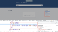
[JSDSERVER-11503] Help Center : Combobox is missing appropriate roles and /or attributes.
Resolution | New: Fixed [ 1 ] | |
Status | Original: Ready for Development [ 10049 ] | New: Closed [ 6 ] |
Labels | Original: 4.1.2 Accessibility Level-A WCAG21 ax-at-JAWS ax-at-NVDA ax-at-VO ax-bug ax-critical ax-critical-priority ax-dev-ready ax-jsm ax-macos-safari ax-platform-dc ax-qa ax-qa-prioritised ax-vpat-critical ax-windows-chrome ax-windows-firefox sprint5 | New: 4.1.2 Accessibility Level-A WCAG21 ax-at-JAWS ax-at-NVDA ax-at-VO ax-bug ax-critical ax-critical-priority ax-jsm ax-macos-safari ax-platform-dc ax-qa ax-qa-fixed ax-qa-prioritised ax-qa-verified ax-vpat-critical ax-windows-chrome ax-windows-firefox sprint5 |
Attachment | New: Option labels are announcing correctly in the select order editable combobox (1).mp4 [ 451233 ] |
Remote Link | New: This issue links to "Page (Confluence)" [ 777592 ] |
Labels | Original: 4.1.2 Accessibility Level-A WCAG21 ax-at-JAWS ax-at-NVDA ax-at-VO ax-bug ax-critical ax-critical-priority ax-dev-ready ax-jsm ax-macos-safari ax-medium-priority ax-platform-dc ax-qa ax-qa-prioritised ax-vpat-critical ax-windows-chrome ax-windows-firefox sprint5 | New: 4.1.2 Accessibility Level-A WCAG21 ax-at-JAWS ax-at-NVDA ax-at-VO ax-bug ax-critical ax-critical-priority ax-dev-ready ax-jsm ax-macos-safari ax-platform-dc ax-qa ax-qa-prioritised ax-vpat-critical ax-windows-chrome ax-windows-firefox sprint5 |
Labels | Original: 4.1.2 Accessibility Level-A WCAG21 ax-at-JAWS ax-at-NVDA ax-at-VO ax-bug ax-dev-ready ax-jsm ax-macos-safari ax-medium-priority ax-platform-dc ax-qa ax-qa-prioritised ax-vpat-critical ax-windows-chrome ax-windows-firefox sprint5 | New: 4.1.2 Accessibility Level-A WCAG21 ax-at-JAWS ax-at-NVDA ax-at-VO ax-bug ax-critical ax-critical-priority ax-dev-ready ax-jsm ax-macos-safari ax-medium-priority ax-platform-dc ax-qa ax-qa-prioritised ax-vpat-critical ax-windows-chrome ax-windows-firefox sprint5 |
Labels | Original: 4.1.2 Accessibility Level-A WCAG21 ax-at-JAWS ax-at-NVDA ax-at-VO ax-bug ax-dev-ready ax-jsm ax-macos-safari ax-medium-priority ax-platform-dc ax-qa-prioritised ax-vpat-critical ax-windows-chrome ax-windows-firefox sprint5 | New: 4.1.2 Accessibility Level-A WCAG21 ax-at-JAWS ax-at-NVDA ax-at-VO ax-bug ax-dev-ready ax-jsm ax-macos-safari ax-medium-priority ax-platform-dc ax-qa ax-qa-prioritised ax-vpat-critical ax-windows-chrome ax-windows-firefox sprint5 |
Assignee | Original: Oleksandr Stoliar [ a955dc6cda19 ] |
Labels | Original: 4.1.2 Accessibility Level-A WCAG21 ax-at-JAWS ax-at-NVDA ax-at-VO ax-bug ax-dev-ready ax-jsm ax-macos-safari ax-medium-priority ax-platform-dc ax-qa-prioritised ax-vpat-critical ax-windows-chrome ax-windows-firefox | New: 4.1.2 Accessibility Level-A WCAG21 ax-at-JAWS ax-at-NVDA ax-at-VO ax-bug ax-dev-ready ax-jsm ax-macos-safari ax-medium-priority ax-platform-dc ax-qa-prioritised ax-vpat-critical ax-windows-chrome ax-windows-firefox sprint5 |
a955dc6cda19 34549e788464 b4488184f7d2 EM from ADS Accessibility team here. Which version of @atlaskit/select are you using. I would recommend using the latest package version.
Additionally, the Select component does not use the traditional roles/ semantics but provides the same information by other means. If testers are looking for specific markup, they may not find it but should validate the expected information is still announced.
That being said, as mentioned in the Slack conversation, I ultimately believe that Select is not the correct semantic component for this use case. I would highly recommend using the @atlaskit/dropdown-menu for better support.{}