-
Type:
Suggestion
-
Resolution: Won't Fix
-
None
-
Component/s: None
-
Environment:http://feedback.onjira.com/
v4.2-m9#567
NOTE: This suggestion is for JIRA Server. Using JIRA Cloud? See the corresponding suggestion.
Update - feedback.onjira.com has been upgraded again, please re-confirm your issue and let us know of the result.
Hi all,
The upgrade of feedback.onjira.com was incomplete and we are investigating the root cause of this.
We know this because some issues raised such as this one can not be reproduced on our internal test instance.
We do understand you other UI points and will take them into consideration.
Once we upgrade feedback.onjira.com to a satisfactory state we will update this Atlassian status box.
We will also update this issue's status.
We apologise for the inconvenience and we thank you for raising these issues.
Cheers,
Roy Krishna
JIRA Product Manager
Hallo
Thanks for providing me an account for http://feedback.onjira.com/
I've had a look at the main thing that I find disturbing: the view issue screen.
Compared to 4.1.2 it does look better. For someone who migrates from 4.0.2 the changes still don't feel natural.
The idea to keep action buttons and workflow actions on the screen while scrolling is nice!
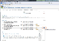
that scrolling mechanism has some drawbacks. in some cases the scrollbar appears that sort of kills the mouse-wheel
(see screenshot). to reproduce: scroll down on issue http://feedback.onjira.com/browse/BOX-1
and click on a lower sub-task menu (number 4 for ex). The view jumps and the additional scrollbar does not go away.
I dont like the buttons on top for actions and workflow. There is one rule I would recommend to follow: make same things look the same!
If some workflow actions are buttons and some are memnu-points, how do they differ? well they dont but one could think so.
There is also some white space below the work logs. I understand it is difficult to fill it. So I got a suggestion.
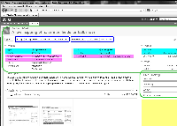
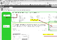
Move the work log inside the issue area (marked in green on the screenshot).
Then the width could be used in full for starting with the description.
Also it might be an idea to make that area flippable, so it could be vertical or horizontal.
The vertical way would be more for people like me
The horizontal would be more for modern fashioned folks.
There are other things as well:
- you cheat the fix versions, affects versions and components information (marked in magenta) by cutting it
- marked in blue is more what i would like to see together (type, priority, assignee, status, as most important ones)
- comments are hovered on mouseover but one cannot click on them. coloring comments odd / even with a background would make a calmer layout and would avaoid additional lines to distinguish comments
- the breadcrumb navigation on top lacks the issue / sub-issue structure.
- relates to
-
JRACLOUD-21951 Feedback on Jira 4.2 EAP - View Issue Screen
- Closed
-
JRASERVER-22093 Feedback for JIRA 4.2 beta
- Closed


