-
Type:
Bug
-
Resolution: Answered
-
Priority:
Low
-
None
-
Affects Version/s: 4.1
-
Component/s: None
-
4.01
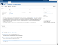
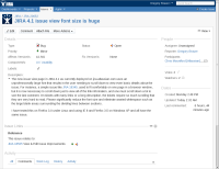
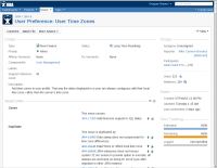
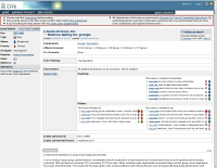
The new issue view page in JIRA 4.1 as currently deployed on jira.atlassian.com uses an unprofessionally-large font that results in the user needing to scroll down to view even basic details about the issue. For instance, a simple issue like JRA-18349, used to fit comfortably on one page in a browser window, but it is now necessary to scroll down just to view all of the link information, and one must scroll down a lot to see the last comment. On tickets with many links or a long description, the tickets require so much scrolling that they are very hard to read. Please significantly reduce the font size and eliminate wasted whitespace such as the large blank areas surrounding the dividing lines between sections.
I have tested this on Firefox 3.0 under Linux and using IE 8 and Firefox 3.5 on Windows XP and all have the same issue.
- is related to
-
JRASERVER-20669 Feedback for view issue page
- Closed
- relates to
-
JRASERVER-18505 View & Edit Issue Improvements
- Gathering Interest
