-
Type:
Bug
-
Resolution: Won't Fix
-
Priority:
Medium
-
None
-
Affects Version/s: 4.0
-
Component/s: None
-
4
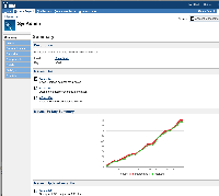
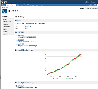
Looking at EACJ, Jens and I came up with a few small UI improvements to make the page less "spaced out".
See attached screenshot, before and after.
Just an idea. I'm sure you'll have more. ![]()
- is detailed by
-
JRASERVER-1800 Improve the UI for browse project
- Closed

