-
Type:
Suggestion
-
Resolution: Unresolved
-
Component/s: Navigation - Top, UIP - Design System
-
5
-
11
Problem Definition
I have color blind moderate disability. I found this morning your new Jira sw version has all labels with a faded red/green color. I am unable to distinguish them. Please, keep in mind people with color disabilities when designing your interfaces. The previous one was just fine.
Thanks.
Workaround
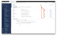
As for priority icons, try the setting below:
- Go to https://EXAMPLE.atlassian.net/secure/admin/ViewPriorities.jspa
- Change the shape of the arrow icons to ones have a distinguishable shape as below:
- /images/icons/priorities/blocker.svg
- /images/icons/priorities/critical.svg
- /images/icons/priorities/major.svg
- /images/icons/priorities/minor.svg
- /images/icons/priorities/trivial.svg
- is related to
-
JRACLOUD-18684 Default priority colours are not colour blind friendly
-
- Closed
-
- relates to
-
JRACLOUD-5574 Accessibility: Section 508 compliance
- Reviewing
