-
Type:
Bug
-
Resolution: Fixed
-
Priority:
Low
-
Affects Version/s: 10.72
-
Component/s: reports - program increment progress
-
None
-
2
-
Severity 3 - Minor
-
A-Team - TART4
-
None
Issue Summary
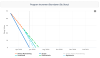
Program Increment Burndown: Chart X axis covers more time than expected. This results in short lines and empty area in chart
Steps to Reproduce
- Review Program Increment Burndown, observe X axis date range and white space.
- Cause has not been determined, as a result steps to reproduce are not clear
- See related support cases for data and examples of this problem
Expected Results
X-axis shows timeframe that matches the start date of selected PI minus one day and end dates of the selected PI(s) plus one day, even if that means the predicted lines are "cut" off. The reason for subtracting and adding one day on either end is to give space to "burn down" on that PI start and finish date.
Actual Results
Lines on chart end around half way along the X axis. The remaining area after the end of lines is empty. There is no apparent reason why X axis covers such a long timeframe.
- The way that the chart determines X axis timeframe is currently unclear.
Workaround
The cause is not yet clear therefore a workaround is not currently available. We will update this if a workaround is found.
- mentioned in
-
Page Loading...
-
Page Loading...
-
Page Loading...
-
Page Loading...
-
Page Loading...
-
Page Loading...
-
Page Loading...
-
Page Loading...
-
Page Loading...
-
Page Loading...
-
Page Loading...
-
Page Loading...
-
Page Loading...
-
Page Loading...
-
Page Loading...
-
Page Loading...
-
Page Loading...


