-
Type:
Suggestion
-
Resolution: Fixed
-
Component/s: None
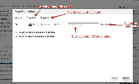
From blitz test - a user unfamiliar with the Restrictions dialog found it confusing to use.
There isn't much text on it at the moment - it assumes that users are familiar with the restrictions UI in previous versions.
We sat together and went through the points of confusion, and suggested text that would make it more obvious how the dialog is supposed to be used. See attached.
Update
Summarizing the comments below the following changes should be made:
- Revert the radio buttons to what they said before
- Change the text of the entry field (we did have an old wording that used username&groupname)
- Include a link to the documentation.
- is related to
-
CONFSERVER-18371 Auto-complete feature in the page restriction should include group names
- Closed
