-
Type:
Suggestion
-
Resolution: Duplicate
-
Component/s: Visual workflow builder
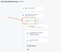
After the changes made in the Automation UI, we've seen complaints that there is a significant gap between components and it could be a little bit tight, so it will not result in having a big component tree with huge gaps between components when using IF/Else conditions, and less space for the component details section.
Below is one example that we can see that consumes a lot of space and results in having a big component tree for large and complex automation rules.
Is this something that could be tackled to make the Component tree a little bit smaller and avoid huge blank gaps?
Another improvement could be to expand the Component details space that currently is consuming less than 30% of the full Automation page, and most likely is where we have to work to modify our rules.
Having the component tree way bigger than the component details makes the rules maintanance a little bit harder as there is a small space for the component detail.
Screenshot for reference:
Thanks!
- blocks
-
AUTO-731 Visual workflow builder as a more user-friendly way to create and edit Automation rules, e.g. to show if/else or branching
- Closed

