-
Type:
Suggestion
-
Resolution: Fixed
-
Component/s: Card - Card Back
-
18
User Problem
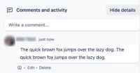
With the recent changes to the card back design, it has become a two-column layout with the comments on the right side, making its width narrower than the previous layout. This means it's taking up less space than before. Which means images within comments will also be smaller.
Previous layout (about 486pixels):

New card back layout (356 pixels in width):

Suggested Solutions
1. Make the middle column draggable to make the comments section wider.
2. Create a toggle to align the comments section vertically below the card back, which is wider already.
3. It would be great if there were a “toggle switch” allowing us to switch from “normal“ and “split“ view
Current Workarounds
Currently there is no known workaround for this behavior. A workaround will be added here when available


