It took a while for WPF to get the text rendering right. WPF 3.5 rendered text "naturally", i.e. it disregarded the physical pixel layout in favor of ideal proportionality. This is very much unlike the traditional GDI approach for rendering which tries to align letters with pixels as much as possible, thereby gaining sharpness and clarity at the cost of slight proportional inaccuracies.
While one can argue in favor of the "ideal" rendering scheme of WPF 3.5 in word processors and layouting software, font fidelity is only a minor issue in traditional UI, and the focus should be put on clarity. Thus, when VS 2010 started to use WPF to render its UI, a new option was added to switch text rendering between "Ideal" and "Display" mode: "Ideal" retains the behavior of WPF 3.5 whereas "Display" is very close to GDI's font rendering and improves screen legibility a lot. But unfortunately the "Ideal" mode is still the default in WPF 4.0!
The SourceTree UI is percieved as blurry in terms of text rendering by me and others, e.g. the guy who wrote this report:
https://jira.atlassian.com/browse/SRCTREEWIN-609
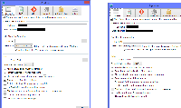
The reason is that SourceTree, despite being a WPF 4.0 application, still uses the WPF 3.5 "Ideal" rendering mode. The attached screenshots prove this: the left image was taken from unmodified SourceTree, but then I used Snoop (http://snoopwpf.codeplex.com/) to change the TextOptions.TextFormattingMode property of the Window to "Display" at runtime, which results in the much clearer font rendering in the right image.
To fix this, simply add
TextOptions.TextFormattingMode="Display"
to the properties of all the windows in the project.
For more information, please read http://karlshifflett.wordpress.com/2009/10/22/much-improved-net-4-0-wpf-text-rendering/ and http://blogs.msdn.com/b/text/archive/2009/08/24/wpf-4-0-text-stack-improvements.aspx .


