-
Type:
Suggestion
-
Resolution: Unresolved
-
None
-
Component/s: UX
-
None
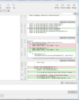
In the view where you can stage/discard hunks, there are no visual clues which hunk will be affected: The one above or the one below the buttons. This has caused me to multiple times lose code changes due to clicking the wrong buttons.
Screenshot:

Look at the first complete hunk shown to the right (with 1 green row). There are buttons both on top and below, and it is anybody's guess which belong to the hunk.
Please add some visual cue here, like a box encircling the hunk+buttons; the current look is very dangerous.
