-
Type:
Suggestion
-
Resolution: Unresolved
-
None
-
Component/s: None
-
None
-
Environment:OSX
Could we get back Sourcetree UI as of 1.8 on OSX
Update after discussint with Rahul:
Using Sourcetree on Mac for a while, I am still using Version 1.8. Main reason is that from 1.9 onward the UI is getting worse and worse. Today I gabe 2.23 a try and find my self pretty disappointed.
1. We no longer have the column view as it is well known by mac users (Rahul: Will have a look if we can bring it back).
2. There are too many horizontal lines as separators where we had alternate colors before. These lines are pretty distractive and take much space. Could it be changed by peferences? (Rahul: likely not be changed, was a user request.)
3. the workspace perspectives (File Status | History | Search) are no longer available in the toolbar (Rahul: will not be changed; was a user request)
4. the toolbar icons look ugly and are hard to recognize; maybe if you increase the contrast.
5. there are useless checkboxes in the file view. In particular the checkboxes act as buttons. If user kiicks on checkbox, it should not move the item to another pane. (Rahul: will investigate this. either make checboxes which really perform a selection or make buttons which then immedately move.)
...
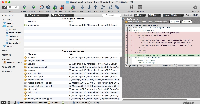
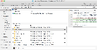
The attached screenshots make the issues evident.
It reminds of the Words by Melanie Safka "what have they done to my tool, ma" ![]()

