• Icon: Suggestion Suggestion
    • Resolution: Fixed
    • 2.7b1
    • General
    • Our product teams collect and evaluate feedback from a number of different sources. To learn more about how we use customer feedback in the planning process, check out our new feature policy.

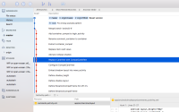
      The default font in the actual interface of SourceTree (not the diff view) has very small font. Despite having 20/20 vision, I find it quite difficult to work with, especially on high-res displays. I've searched through the preferences but could not find a way to increase the size of the GUI font.

      Please allow changing the font-size and family to any of the system's available fonts. Thanks.

        1. gitkraken.png
          627 kB
          Thuy Copeland
        2. good_old_view.png
          183 kB
          Thomas Beck
        3. Screen Shot 2017-11-07 at 21.26.36.png
          152 kB
          Mikhail Kasyanov
        4. sourcetree_ui.png
          22 kB
          rainwarrior
        5. terrible_view.png
          83 kB
          Thomas Beck

            [SRCTREE-1286] Allow Changing Font Size in SourceTree Interface

            Agree with this request.  The main view in sourcetree is a "wall of text" so being able to control the font family and size would be a welcome addition.  This item is closed as resolved, but I don't see where this is controllable in the latest version of sourcetree (v3.4.6).

            Dave Calkins added a comment - Agree with this request.  The main view in sourcetree is a "wall of text" so being able to control the font family and size would be a welcome addition.  This item is closed as resolved, but I don't see where this is controllable in the latest version of sourcetree (v3.4.6).

            besttof added a comment -

            Why the resistance (based on the original date of this issue) for making this a user setting? I personally don't have an issue with the size of the font, I do have an issue with the font itself and very much prefer a fixed-width serif font (you know, so lower case l and capital I don't look the same?).

            So, no matter how much you think you've correctly tweaked the font metrics, there will always be people with valid, different preferences.

            besttof added a comment - Why the resistance (based on the original date of this issue) for making this a user setting? I personally don't have an issue with the size of the font, I do have an issue with the font itself and very much prefer a fixed-width serif font (you know, so lower case l and capital I don't look the same?). So, no matter how much you think you've correctly tweaked the font metrics, there will always be people with valid, different preferences.

            Please make this an option to reduce the line spacing.  I don't like design decisions being made like this that reduce the usability - its OK to have it the default but the user should have control.  I dislike this enough that I'm downgrading until you fix this.

            Kenneth Palmer added a comment - Please make this an option to reduce the line spacing.  I don't like design decisions being made like this that reduce the usability - its OK to have it the default but the user should have control.  I dislike this enough that I'm downgrading until you fix this.

            I've tried to get used to the new larger font size in 2.7, but it doesn't work for me. It's just too big compared to everything else. Some customizability here would be really welcome.

            Ere Maijala added a comment - I've tried to get used to the new larger font size in 2.7, but it doesn't work for me. It's just too big compared to everything else. Some customizability here would be really welcome.

            Sergey added a comment -

            Where is the setting? The 2.7 fonts are too big.

            Sergey added a comment - Where is the setting? The 2.7 fonts are too big.

            Looking forward for having this configurable on my laptop's 13" screen ...

            Jean-Claude Passy added a comment - Looking forward for having this configurable on my laptop's 13" screen ...

            2.7b will be released this afternoon, decreasing the row height to a newly approved value that increases information density by 25%.

            Brian Ganninger (Inactive) added a comment - 2.7b will be released this afternoon, decreasing the row height to a newly approved value that increases information density by 25%.

            Also not a fan of this change.  The font size increase does make sense as it was quite small prior to 2.7, but the line spacing is too much.  

            Further discussion here:  https://jira.atlassian.com/browse/SRCTREE-5204

            Zeke Farwell added a comment - Also not a fan of this change.  The font size increase does make sense as it was quite small prior to 2.7, but the line spacing is too much.   Further discussion here:   https://jira.atlassian.com/browse/SRCTREE-5204

            rainwarrior This is a macOS ticket, you'll want to post in https://jira.atlassian.com/browse/SRCTREEWIN 

            Brian Ganninger (Inactive) added a comment - rainwarrior This is a macOS ticket, you'll want to post in https://jira.atlassian.com/browse/SRCTREEWIN  

            If you are unhappy with the changes please vote and watch this ticket:

            https://jira.atlassian.com/browse/SRCTREE-5154

            Brian Ganninger (Inactive) added a comment - If you are unhappy with the changes please vote and watch this ticket: https://jira.atlassian.com/browse/SRCTREE-5154

              Unassigned Unassigned
              df2a91e00180 Shilo Ayalon
              Votes:
              81 Vote for this issue
              Watchers:
              71 Start watching this issue

                Created:
                Updated:
                Resolved: