This is a HUGE problem...see my comment on the documentation page here:
https://confluence.atlassian.com/display/GH/GreenHopper+OnDemand+2013-05-20?focusedCommentId=358351325&#comment-358351325
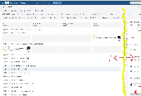
I'll attach a screenshot next.
Also, it's not just the Plan mode; it affects the Work mode as well.
"
With the new layout, we have to scroll horizontally to see all of the content in the 'details view' from either the 'Plan' view or the 'Work' view of the Rapid board. For example, why is there no vertical grid splitter allowing me to set the width of the page. I wish I could attach a screenshot here, but it needs to be hosted apparently. The biggest issue is the subtasks section of the details view - we can no longer see the time remaining column. This is a big UX problem. Double scroll regions are just plain bad. I've got resolution at 1600x1200 and despite zooming with Google Chrome, it scales the entire content. The description wraps, so do the comments. Specifically, we cannot see the Rem. or Actions columns w/o scrolling to the right.
In summary, from Greenhopper, we now have to scroll horizontally to get the 'time remaining' (and summation thereof) for every single row. Is it just me? Very surprised not to see folks complaining about this yet.
"
Agree with all above this is not an improvement.