-
Bug
-
Resolution: Won't Fix
-
Medium (View bug fix roadmap)
-
None
-
9.12.2
-
9.12
-
Severity 3 - Minor
-
Issue Summary
The border of the form fields fails the minimum color contrast requirements, i.e. 3:1.
Steps to Reproduce
- Open the "Create sprint" modal dialog.
- Navigate to the mentioned form fields.
- Use the CCA testing tool to check the color contrast of the border of those checkboxes.
- Observe that the color contrast between the input border and the adjacent color is insufficient.
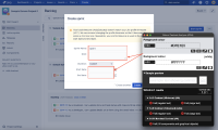
Screenshot
Actual Results
The border of all the input fields such as “Sprint name“, “Goal“ and so on, are present in the "Create sprint" modal dialog, fails the minimum color contrast requirements with its background color.
FG: #DFE1E5
BG: #FFFFFF
Contrast ratio: 1.3:1
As a result, low-vision users will find it difficult to distinguish the form controls that have insufficient contrast.
Expected Results
The mentioned border of the checkboxes should have a minimum contrast of 3:1 with the adjacent content. This helps low-vision users to easily identify the form field. The expected contrast ratio can be achieved by increasing the contrast of foreground color until it passes a contrast ratio of 3:1.
A color contrast analyzer can be downloaded from Color Contrast Checker - TPGi
Workaround
Currently, there is no known workaround for this behaviour. A workaround will be added here when available
Environment
MacBook Pro (16-inch, 2021)
macOs Sonoma 14.3
Chrome - Version 120.0.6099.109 (Official Build) (arm64)
Firefox- Version 92.0 (64-bit)
Safari- Version 17.3 (19617.2.4.11.8)
JAWS- Version 2023
NVDA- Version 2021.2
Voiceover - Version Latest
- is resolved by
-
A11Y-125 You do not have permission to view this issue
Form Name |
---|
[JSWSERVER-26197] Backlog | Create Sprint: Insufficient color contrast for the border of form fields
Resolution | New: Won't Fix [ 2 ] | |
Status | Original: Ready for Development [ 10049 ] | New: Closed [ 6 ] |
Remote Link | Original: This issue links to "A11Y-125 (Bulldog)" [ 931191 ] | New: This issue links to "A11Y-125 (JIRA Server (Bulldog))" [ 931191 ] |
Component/s | Original: Accessibility [ 62490 ] | |
Component/s | New: Backlog [ 46795 ] | |
Component/s | New: Accessibility [ 62491 ] | |
Key |
Original:
|
New:
|
Affects Version/s | Original: 9.12.2 [ 106456 ] | |
Affects Version/s | New: 9.12.2 [ 106455 ] | |
Project | Original: Jira Data Center [ 10240 ] | New: Jira Software Data Center [ 12200 ] |
Remote Link | New: This issue links to "A11Y-125 (Bulldog)" [ 931191 ] |
Labels | Original: 1.4.11 Level-AA WCAG21 ax-bug ax-jiradc-vpat2024 ax-jiradc-vpat2024-backlog ax-jiradc-vpat2024-pg09 ax-lv-user ax-medium-priority ax-qa | New: 1.4.11 Level-AA WCAG21 a11y-triaged ax-bug ax-jiradc-vpat2024 ax-jiradc-vpat2024-backlog ax-jiradc-vpat2024-pg09 ax-lv-user ax-medium-priority ax-qa |
Labels | Original: 1.4.11 Level-AA WCAG21 ax-bug ax-jiradc-vpat2024 ax-jiradc-vpat2024-backlog ax-jiradc-vpat2024-pg09 ax-jiradc-vpat2024-pg22 ax-jiradc-vpat2024-sprint ax-lv-user ax-medium-priority ax-qa | New: 1.4.11 Level-AA WCAG21 ax-bug ax-jiradc-vpat2024 ax-jiradc-vpat2024-backlog ax-jiradc-vpat2024-pg09 ax-lv-user ax-medium-priority ax-qa |
Labels | Original: 1.4.11 Level-AA WCAG21 ax-bug ax-jiradc-vpat2024 ax-jiradc-vpat2024-pg22 ax-jiradc-vpat2024-sprint ax-lv-user ax-medium-priority ax-qa | New: 1.4.11 Level-AA WCAG21 ax-bug ax-jiradc-vpat2024 ax-jiradc-vpat2024-backlog ax-jiradc-vpat2024-pg09 ax-jiradc-vpat2024-pg22 ax-jiradc-vpat2024-sprint ax-lv-user ax-medium-priority ax-qa |
Summary | Original: Sprint: Insufficient color contrast for the border of form fields | New: Backlog | Create Sprint: Insufficient color contrast for the border of form fields |
Description |
Original:
h3. Issue Summary
The border of the form fields fails the minimum color contrast requirements, i.e. 3:1. h3. Steps to Reproduce # Open the "Create sprint" modal dialog. # Navigate to the mentioned form fields. # Use the CCA testing tool to check the color contrast of the border of those checkboxes. # Observe that the color contrast between the input border and the adjacent color is insufficient. h3. Screenshot h3. !Screenshot 2024-02-12 at 7.05.06 PM.png|width=530,height=320! h3. Actual Results The border of all the input fields such as “Sprint name“, “Goal“ and so on, are present in the "Create sprint" modal dialog, fails the minimum color contrast requirements with its background color. FG: #DFE1E5 BG: #FFFFFF Contrast ratio: 1.3:1 As a result, low-vision users will find it difficult to distinguish the form controls that have insufficient contrast. h3. Expected Results The mentioned border of the checkboxes should have a minimum contrast of 3:1 with the adjacent content. This helps low-vision users to easily identify the form field. The expected contrast ratio can be achieved by increasing the contrast of foreground color until it passes a contrast ratio of 3:1. A color contrast analyzer can be downloaded from [Color Contrast Checker - TPGi|https://www.tpgi.com/color-contrast-checker/] h3. Workaround Currently, there is no known workaround for this behaviour. A workaround will be added here when available h3. Environment MacBook Pro (16-inch, 2021) macOs Sonoma 14.3 Chrome - Version 120.0.6099.109 (Official Build) (arm64) Firefox- Version 92.0 (64-bit) Safari- Version 17.3 (19617.2.4.11.8) JAWS- Version 2023 NVDA- Version 2021.2 Voiceover - Version Latest |
New:
h3. Issue Summary
The border of the form fields fails the minimum color contrast requirements, i.e. 3:1. h3. Steps to Reproduce # Open the "Create sprint" modal dialog. # Navigate to the mentioned form fields. # Use the CCA testing tool to check the color contrast of the border of those checkboxes. # Observe that the color contrast between the input border and the adjacent color is insufficient. h3. Screenshot h3. !Screenshot 2024-02-12 at 7.05.06 PM.png|width=530,height=320! h3. Actual Results The border of all the input fields such as “Sprint name“, “Goal“ and so on, are present in the "Create sprint" modal dialog, fails the minimum color contrast requirements with its background color. FG: #DFE1E5 BG: #FFFFFF Contrast ratio: 1.3:1 As a result, low-vision users will find it difficult to distinguish the form controls that have insufficient contrast. h3. Expected Results The mentioned border of the checkboxes should have a minimum contrast of 3:1 with the adjacent content. This helps low-vision users to easily identify the form field. The expected contrast ratio can be achieved by increasing the contrast of foreground color until it passes a contrast ratio of 3:1. A color contrast analyzer can be downloaded from [Color Contrast Checker - TPGi|https://www.tpgi.com/color-contrast-checker/] h3. Workaround Currently, there is no known workaround for this behaviour. A workaround will be added here when available h3. Environment MacBook Pro (16-inch, 2021) macOs Sonoma 14.3 Chrome - Version 120.0.6099.109 (Official Build) (arm64) Firefox- Version 92.0 (64-bit) Safari- Version 17.3 (19617.2.4.11.8) JAWS- Version 2023 NVDA- Version 2021.2 Voiceover - Version Latest |
Introduced in Version | New: 9.12 |