-
Bug
-
Resolution: Unresolved
-
Medium (View bug fix roadmap)
-
None
-
8.20.30, 9.12.2, 9.4.17
-
8.2
-
Severity 3 - Minor
-
Issue Summary
The border of the input field and the radio buttons fail the minimum color contrast requirement of 3:1.
Steps to Reproduce
- Open the "Accessibility Assessment - Roadmaps" page.
- Navigate and activate the "Share" button.
- Navigate to the mentioned instance present within the "Share plan" modal dialog.
- With the CCA tool, observe the input fields that fail the color contrast ratio for their borders.
- Again, navigate and activate the "Auto-schedule" expand/collapse button.
- Navigate to the radio buttons and check the color contrast using the Color Contrast Analyser.
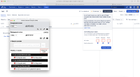
Screenshot 1
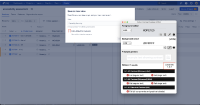
Screenshot 2
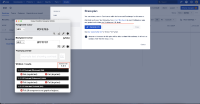
Screenshot 3
Actual Results
When checked with the color contrast analyzer tool, the color contrast for the border of the input field fails color contrast with the following details →
- The border of the input field present beside the "Generate link" button in the "Share plan" modal dialog fails color contrast with FG : #DFE1E5, BG : #FFFFFF and Ratio: 1.3:1
- The border of the radio buttons "Sprints all values", "Releases all values" and so on, fails color contrast with FG : #DFE1E5, BG : #FFFFFF, and Ratio: 1.3:1
- The border of the checkbox present within the "Save as new view" modal dialog (available by activating the "Save" button), fails color contrast with FG : #DFE1E5, BG : #FFFFFF, and Ratio: 1.3:1
As a result, low-vision users will face difficulty in accessing this field.
Expected Results
The mentioned input field border should have a minimum contrast of 3:1 with its background. This helps low-vision users easily identify the form field.
The expected contrast ratio can be achieved by increasing the contrast of foreground color until it passes a contrast ratio of 3:1.
A color contrast analyzer can be downloaded from Color Contrast Checker - TPGi
Workaround
Currently, there is no known workaround for this behavior. A workaround will be added here when available
Environment
MacBook Pro (13-inch, 2018)
macOs Ventura 13.3.1
Chrome - Version 109.0.5414.119 (Official Build) (64-bit)
Firefox- Version 92.0 (64-bit)
Safari- Version 16.4 (18615.1.26.110.1)
JAWS- Version 2022
NVDA- Version 2021.2
Voiceover - Version Latest
- links to
Form Name |
---|
[JSWSERVER-25727] Accessibility Assessment - Roadmaps : Insufficient color contrast for the borders of form controls
Labels | Original: 1.4.11 Level-AA accessibility ax-bug ax-desktop ax-jiradc-arj ax-jiradc-arj-vpat2024 ax-jiradc-vpat ax-jiradc-vpat-accessibilityassessmentroadmaps ax-jiradc-vpat-pg03 ax-lv-user ax-medium-priority ax-qa wcag21 | New: 1.4.11 Level-AA accessibility ax-bug ax-desktop ax-jiradc-arj ax-jiradc-arj-vpat2024 ax-jiradc-vpat ax-jiradc-vpat-accessibilityassessmentroadmaps ax-jiradc-vpat-pg03 ax-lv-user ax-medium-priority ax-qa ril wcag21 |
Remote Link | New: This issue links to "Internal ticket (Web Link)" [ 963900 ] |
Introduced in Version | Original: 9.12 | New: 8.2 |
Affects Version/s | New: 8.20.30 [ 106364 ] | |
Affects Version/s | New: 9.4.17 [ 106909 ] |
Labels | Original: 1.4.11 Level-AA accessibility ax-bug ax-desktop ax-jiradc-vpat ax-jiradc-vpat-accessibilityassessmentroadmaps ax-jiradc-vpat-pg03 ax-lv-user ax-medium-priority ax-qa wcag21 | New: 1.4.11 Level-AA accessibility ax-bug ax-desktop ax-jiradc-arj ax-jiradc-arj-vpat2024 ax-jiradc-vpat ax-jiradc-vpat-accessibilityassessmentroadmaps ax-jiradc-vpat-pg03 ax-lv-user ax-medium-priority ax-qa wcag21 |
Component/s | Original: Accessibility [ 62491 ] | |
Component/s | Original: (Advanced Roadmaps) Other [ 73719 ] | |
Component/s | New: (Advanced Roadmaps) Accessibility [ 74392 ] |
Status | Original: Needs Triage [ 10030 ] | New: Ready for Development [ 10049 ] |
Component/s | New: (Advanced Roadmaps) Other [ 73719 ] |
Component/s | Original: Accessibility [ 62490 ] | |
Component/s | New: Accessibility [ 62491 ] | |
Key | Original: JRASERVER-77226 | New: JSWSERVER-25727 |
Affects Version/s | Original: 9.12.2 [ 106456 ] | |
Affects Version/s | New: 9.12.2 [ 106455 ] | |
Project | Original: Jira Data Center [ 10240 ] | New: Jira Software Data Center [ 12200 ] |
Description |
Original:
h3. Issue Summary
The border of the input field and the radio buttons fail the minimum color contrast requirement of 3:1. h3. Steps to Reproduce # Open the "Accessibility Assessment - Roadmaps" page. # Navigate and activate the "Share" button. # Navigate to the mentioned instance present within the "Share plan" modal dialog. # With the CCA tool, observe the input fields that fail the color contrast ratio for their borders. # Again, navigate and activate the "Auto-schedule" expand/collapse button. # Navigate to the radio buttons and check the color contrast using the Color Contrast Analyser. h3. Screenshot 1 !Screenshot 2024-02-06 at 11.27.33 AM.png|width=596,height=312! h3. Screenshot 2 !Screenshot 2024-02-06 at 11.28.17 AM.png|width=598,height=334! h3. Actual Results When checked with the color contrast analyzer tool, the border of the input field present within the "Share plan" modal dialog and the radio buttons such as "Sprints all values", "Releases all values" and so on available by activating the "Auto-schedule" expand/collapse button, fail the minimum color contrast requirement with the following details → FG : #DFE1E5, BG: #FFFFFF and Ratio: 1.3:1. As a result, low-vision users will face difficulty in accessing this field. h3. Expected Results The mentioned input field border should have a minimum contrast of 3:1 with its background. This helps low-vision users easily identify the form field. The expected contrast ratio can be achieved by increasing the contrast of foreground color until it passes a contrast ratio of 3:1. A color contrast analyzer can be downloaded from [Color Contrast Checker - TPGi|https://www.tpgi.com/color-contrast-checker/] h3. Workaround Currently, there is no known workaround for this behavior. A workaround will be added here when available h3. Environment MacBook Pro (13-inch, 2018) macOs Ventura 13.3.1 Chrome - Version 109.0.5414.119 (Official Build) (64-bit) Firefox- Version 92.0 (64-bit) Safari- Version 16.4 (18615.1.26.110.1) JAWS- Version 2022 NVDA- Version 2021.2 Voiceover - Version Latest |
New:
h3. Issue Summary
The border of the input field and the radio buttons fail the minimum color contrast requirement of 3:1. h3. Steps to Reproduce # Open the "Accessibility Assessment - Roadmaps" page. # Navigate and activate the "Share" button. # Navigate to the mentioned instance present within the "Share plan" modal dialog. # With the CCA tool, observe the input fields that fail the color contrast ratio for their borders. # Again, navigate and activate the "Auto-schedule" expand/collapse button. # Navigate to the radio buttons and check the color contrast using the Color Contrast Analyser. h3. Screenshot 1 !Screenshot 2024-02-06 at 11.27.33 AM.png|width=596,height=312! h3. Screenshot 2 !Screenshot 2024-02-06 at 11.28.17 AM.png|width=598,height=334! h3. Screenshot 3 !Screenshot 2024-02-06 at 3.53.44 PM.png|width=568,height=301! h3. Actual Results When checked with the color contrast analyzer tool, the color contrast for the border of the input field fails color contrast with the following details → * The border of the input field present beside the "Generate link" button in the "Share plan" modal dialog fails color contrast with FG : #DFE1E5, BG : #FFFFFF and Ratio: 1.3:1 * The border of the radio buttons "Sprints all values", "Releases all values" and so on, fails color contrast with FG : #DFE1E5, BG : #FFFFFF, and Ratio: 1.3:1 * The border of the checkbox present within the "Save as new view" modal dialog (available by activating the "Save" button), fails color contrast with FG : #DFE1E5, BG : #FFFFFF, and Ratio: 1.3:1 As a result, low-vision users will face difficulty in accessing this field. h3. Expected Results The mentioned input field border should have a minimum contrast of 3:1 with its background. This helps low-vision users easily identify the form field. The expected contrast ratio can be achieved by increasing the contrast of foreground color until it passes a contrast ratio of 3:1. A color contrast analyzer can be downloaded from [Color Contrast Checker - TPGi|https://www.tpgi.com/color-contrast-checker/] h3. Workaround Currently, there is no known workaround for this behavior. A workaround will be added here when available h3. Environment MacBook Pro (13-inch, 2018) macOs Ventura 13.3.1 Chrome - Version 109.0.5414.119 (Official Build) (64-bit) Firefox- Version 92.0 (64-bit) Safari- Version 16.4 (18615.1.26.110.1) JAWS- Version 2022 NVDA- Version 2021.2 Voiceover - Version Latest |
Attachment | New: Screenshot 2024-02-06 at 3.53.44 PM.png [ 451643 ] |