Uploaded image for project: 'Jira Software Data Center'
  1. Jira Software Data Center
  2. JSWSERVER-1947

Trend lines should (optionally?) start from the previous day

    • Icon: Suggestion Suggestion
    • Resolution: Fixed
    • 4.3.1
    • None
    • We collect Jira feedback from various sources, and we evaluate what we've collected when planning our product roadmap. To understand how this piece of feedback will be reviewed, see our Implementation of New Features Policy.

      Currently the trendline in a burndown chart is based on the (first and) latest data-point of the series. However, usually this data-point represents a time in the future (end of day today). Thus it makes more sense to base the trendline on the previous day (the second-latest data-point in the series).

          Form Name

            [JSWSERVER-1947] Trend lines should (optionally?) start from the previous day

            JC added a comment -

            Makes sens Stefanus, although I will add a separate improvement for this.
            GHS-2026

            Cheers,
            JC

            JC added a comment - Makes sens Stefanus, although I will add a separate improvement for this. GHS-2026 Cheers, JC

            Along with that, you could also consider by default only displaying the ideal line and the burndown line. I find that new users to GH often find the many lines confusing, and experienced users eventually customize their BD charts anyways.

            Stefanus Du Toit added a comment - Along with that, you could also consider by default only displaying the ideal line and the burndown line. I find that new users to GH often find the many lines confusing, and experienced users eventually customize their BD charts anyways.

            True, eliminating these trendlines would be fine with me too.

            Stefanus Du Toit added a comment - True, eliminating these trendlines would be fine with me too.

            JC added a comment -

            +1

            I agree with Stefanus,

            I think the forecast should only be applied to the burndown.
            I do not see the value to show the trend of the effort nor the accuracy. They should be removed...
            Also agree that showing the trend of the burndown rate is useless. Should remove it also ...

            This will make a much leaner chart

            cheers,
            JC

            JC added a comment - +1 I agree with Stefanus, I think the forecast should only be applied to the burndown. I do not see the value to show the trend of the effort nor the accuracy. They should be removed... Also agree that showing the trend of the burndown rate is useless. Should remove it also ... This will make a much leaner chart cheers, JC

            Stefanus Du Toit added a comment - - edited

            Just looking over the chart some more and really nitpicking now , the only other thing that isn't ideal is the required daily burndown rate chart. Does it really make sense to draw this as a line chart? Even so, does it really make sense to draw a trendline for this series?

            What makes this value unique is that the latest data point always includes data from the future in its calculation already – no need to further interpolate/project. Furthermore, today's daily burndown rate is an appropriate burn down rate for the entire rest of the time period if all trends continue.

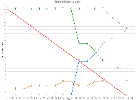
            So my suggestion would be: draw the daily burn down rate as a set of thin bars on each day instead. Draw up to today's ("this morning's") daily rate solidly. Draw an estimate for what the required burn down rate will be as of tomorrow in a dashed appearance on the separator between today and tomorrow (the same horizontal position where all the dotted lines end). Don't draw anything related to the daily burndown rate any further than this.

            Here's an illustration:

            Stefanus Du Toit added a comment - - edited Just looking over the chart some more and really nitpicking now , the only other thing that isn't ideal is the required daily burndown rate chart. Does it really make sense to draw this as a line chart? Even so, does it really make sense to draw a trendline for this series? What makes this value unique is that the latest data point always includes data from the future in its calculation already – no need to further interpolate/project. Furthermore, today's daily burndown rate is an appropriate burn down rate for the entire rest of the time period if all trends continue. So my suggestion would be: draw the daily burn down rate as a set of thin bars on each day instead. Draw up to today's ("this morning's") daily rate solidly. Draw an estimate for what the required burn down rate will be as of tomorrow in a dashed appearance on the separator between today and tomorrow (the same horizontal position where all the dotted lines end). Don't draw anything related to the daily burndown rate any further than this. Here's an illustration:

            Thanks Nick! The latest screenshot looks a lot better.

            While you guys are tweaking, one thing I've noticed is that the estimate accuracy trendline does not end in the correct spot. It looks like it always trends towards the projected effort to date, when it should presumably trend towards the sum of the projected effort to date and projected remaining effort since it's measuring the sum of the actual values of these series in the past.

            Stefanus Du Toit added a comment - Thanks Nick! The latest screenshot looks a lot better. While you guys are tweaking, one thing I've noticed is that the estimate accuracy trendline does not end in the correct spot. It looks like it always trends towards the projected effort to date, when it should presumably trend towards the sum of the projected effort to date and projected remaining effort since it's measuring the sum of the actual values of these series in the past.

            Hello,

            Please find a snapshot of the work completed to date. If you could take 30 minutes to install this and test with your data, in a staging environment, that would be brilliant.

            Changes:
            1) Dates where moved by one day on the axis
            2) Dotted line added to show ongoing day
            3) Forecast projected from the last completed day

            I look forward to all feedback. Subject to your comments we will tweak as necessary and incorporate these improvements in 4.4.

            Thank You.

            Regards,
            Nicholas Muldoon

            Nicholas Muldoon [Atlassian] added a comment - - edited Hello, Please find a snapshot of the work completed to date. If you could take 30 minutes to install this and test with your data, in a staging environment, that would be brilliant. Changes: 1) Dates where moved by one day on the axis 2) Dotted line added to show ongoing day 3) Forecast projected from the last completed day I look forward to all feedback. Subject to your comments we will tweak as necessary and incorporate these improvements in 4.4. Thank You. Regards, Nicholas Muldoon

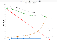
            Latest screenshot attached.

            Nicholas Muldoon [Atlassian] added a comment - Latest screenshot attached.

            Stefanus Du Toit added a comment - - edited

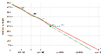
            I've attached an image showing what my ideal burndown chart looks like (concentrating only on the two lines I care most about, the burndown, including its trendline, and the ideal burndown line). As you can see, the trendline and the current day's burndown portion start on the same point.

            Stefanus Du Toit added a comment - - edited I've attached an image showing what my ideal burndown chart looks like (concentrating only on the two lines I care most about, the burndown, including its trendline, and the ideal burndown line). As you can see, the trendline and the current day's burndown portion start on the same point.

            Perhaps your chart is not intended to be read this way, but it seems to me missing anything to address a main characteristic of my problem. In the chart you show, the trend line (dashed, not dotted) starts from the very latest data point. Furthermore the example you show shows a burndown chart that is rather unlikely, since usually the number of remaining hours has not increased as much in the current day as it did previously (or maybe it depends on what date your users are using when logging their work; if everyone logs it in the morning... But that is just another pet peeve of mine – good argument for making this an option though). In any case, my suggestion is to have the trendline start at the previous day. Completely ignore the latest datapoint when it comes to the trendline. Then draw a dotted, if you wish, line to the latest datapoint (in addition to, and starting from the same point as, the trendline).

            Then it would also be consistent to not draw a trendline at all when there is only 1 day of data (2 data points, but we ignore the latest, leaving only one). It doesn't usually help me when GH draws a horizontal line reminding me nobody's logged any work yet

            Hope that makes sense!

            Stefanus

            Du Toit, Stefanus added a comment - Perhaps your chart is not intended to be read this way, but it seems to me missing anything to address a main characteristic of my problem. In the chart you show, the trend line (dashed, not dotted) starts from the very latest data point. Furthermore the example you show shows a burndown chart that is rather unlikely, since usually the number of remaining hours has not increased as much in the current day as it did previously (or maybe it depends on what date your users are using when logging their work; if everyone logs it in the morning... But that is just another pet peeve of mine – good argument for making this an option though). In any case, my suggestion is to have the trendline start at the previous day. Completely ignore the latest datapoint when it comes to the trendline. Then draw a dotted, if you wish, line to the latest datapoint (in addition to, and starting from the same point as, the trendline). Then it would also be consistent to not draw a trendline at all when there is only 1 day of data (2 data points, but we ignore the latest, leaving only one). It doesn't usually help me when GH draws a horizontal line reminding me nobody's logged any work yet Hope that makes sense! Stefanus

              Unassigned Unassigned
              79c27e0325da Stefanus Du Toit
              Votes:
              0 Vote for this issue
              Watchers:
              1 Start watching this issue

                Created:
                Updated:
                Resolved: