-
Type:
Suggestion
-
Resolution: Unresolved
-
Component/s: Classic - Boards
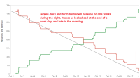
Currently, the hour burndown chart is very granular, showing a point for every work log or RTE change at every hour of the day. This is sometimes useful combined with the interactive hover information when we need to quickly assess which issue affected the burndown.
Most of the time though, it is too granular and detracts from the real day-to-day use for this chart: to see quickly assess the state and health of the sprint.
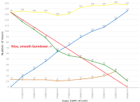
Compared with the classic burndown chart, where there was only one data point per day, the new charts look very cluttered and all over the place.
It's not possible anymore to have nice looking sprint burndowns because we would have to distribute our work logs all around the clock, which obviously doesn't reflect how we work in real life.
We'd like a version of the burndown chart with one data point per day, just like the classic chart.


