-
Type:
Suggestion
-
Resolution: Fixed
-
Component/s: None
-
None
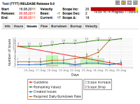
Burndown charts don't do a good job of showing when scope gets added to a project. There are q number of good charting techniques for doing this. See possible examples in fugs 3-23 to 3-26 here:
http://alistair.cockburn.us/Earned-value+and+burn+charts
Either add a vertical spike when new stories are added or old stories are re-estimated – or convey the same thing by having the bottom line step down below zero (This is nice because you can get a sense of the total scope addition over time).
- is related to
-
JSWCLOUD-1815 As a project manager I can compare the scope against a baseline
- Closed
-
JSWCLOUD-2728 Add Scope line to burnup charts
- Closed
-
JSWCLOUD-4417 Guideline end point at Version Start Date should respect corrections made to "Original Estimate" field.
- Closed
- relates to
-
JSWCLOUD-2275 Comprehensive Charts
- Closed

