-
Bug
-
Resolution: Not a bug
-
Low
-
None
-
5.13.0
-
Severity 3 - Minor
-
Issue Summary
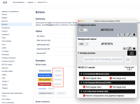
The color contrast for the Arrow button fails the minimum colour contrast requirements of 3:1.
Steps to Reproduce
- Open the Jira service management page.
- Navigate to the mentioned instances.
- Use any color contrast testing tool to check the color contrast as per the mentioned foreground and background color.
Screenshot
Expected Results
The contrast ratio between the foreground of the “Arrow“ button and its background color should be sufficient.
Ensure that the color contrast for the foreground border color of user interface controls in the hover state and on keyboard focus is 3:1 with the background color.
A color contrast analyzer can be downloaded from Color Contrast Checker - TPGi
Actual Results
The “Arrow“ button, fails the minimum color contrast requirement i.e. 3:1, on hover and keyboard focus.
FG: #A5ADBA
BG: #FFFFFF
Contrast ratio: 2.3:1
This will make it difficult for people with low vision and color blindness to distinguish the user interface components in different states that have insufficient contrast.
Workaround
Currently there is no known workaround for this behavior. A workaround will be added here when available
Environment
Chrome- Version 121.0.6167.140 (Official Build) (64-bit)
Operation System- Windows 11
MacBook Pro (16-inch, 2021)
Firefox- Version 122.0.1(64-bit)
macOs version 13.6.3
Voiceover - Version Latest
JAWS- Version 2023
NVDA- Version 2021.2
[JSDSERVER-15330] Insufficient color contrast for Arrow button
| Resolution | New: Not a bug [ 12 ] | |
| Status | Original: In Progress [ 3 ] | New: Closed [ 6 ] |
| Labels | Original: 1.4.11 Level-AA WCAG21 ax-A11Y-749 ax-bug ax-esc-Treasury-Board-of-Canada-Secretariat ax-jsm-dc-vpat ax-lv-user ax-medium-priority ax-qa | New: 1.4.11 Level-AA WCAG21 ax-A11Y-749 ax-bug ax-esc-Treasury-Board-of-Canada-Secretariat ax-jsm-dc-vpat ax-lv-user ax-medium-priority ax-qa ax-qa-verified |
| Status | Original: Short Term Backlog [ 12074 ] | New: In Progress [ 3 ] |
| Assignee | New: Rostislav Pasechnikov [ f64b10823ad4 ] |
| Attachment | New: image-2024-06-26-11-20-10-739.png [ 459583 ] |
| Labels | Original: 1.4.11 Level-AA WCAG21 ax-A11Y-755 ax-bug ax-esc-Treasury-Board-of-Canada-Secretariat ax-jsm-dc-vpat ax-lv-user ax-medium-priority ax-qa | New: 1.4.11 Level-AA WCAG21 ax-A11Y-749 ax-bug ax-esc-Treasury-Board-of-Canada-Secretariat ax-jsm-dc-vpat ax-lv-user ax-medium-priority ax-qa |
| Status | Original: Needs Triage [ 10030 ] | New: Short Term Backlog [ 12074 ] |
| Labels | Original: 1.4.11 Level-AA WCAG21 ax-bug ax-esc-Treasury-Board-of-Canada-Secretariat ax-jsm-dc-vpat ax-lv-user ax-medium-priority ax-qa | New: 1.4.11 Level-AA WCAG21 ax-A11Y-755 ax-bug ax-esc-Treasury-Board-of-Canada-Secretariat ax-jsm-dc-vpat ax-lv-user ax-medium-priority ax-qa |
| Description |
Original:
h3. Issue Summary
The color contrast for the Arrow button fails the minimum colour contrast requirements of 3:1. h3. Steps to Reproduce # Open the Jira service management page. # Navigate to the mentioned instances. # Use any color contrast testing tool to check the color contrast as per the mentioned foreground and background color. h3. Expected Results The contrast ratio between the foreground of the “Arrow“ button and its background color should be sufficient. Ensure that the color contrast for the foreground border color of user interface controls in the hover state and on keyboard focus is 3:1 with the background color. A color contrast analyzer can be downloaded from [Color Contrast Checker - TPGi|https://www.tpgi.com/color-contrast-checker/] h3. Actual Results The “Arrow“ button, fails the minimum color contrast requirement i.e. 3:1, on hover and keyboard focus. FG: #A5ADBA BG: #FFFFFF Contrast ratio: 2.3:1 This will make it difficult for people with low vision and color blindness to distinguish the user interface components in different states that have insufficient contrast. {noformat} {noformat} h3. Workaround Currently there is no known workaround for this behavior. A workaround will be added here when available h3. Environment Chrome- Version 121.0.6167.140 (Official Build) (64-bit) Operation System- Windows 11 MacBook Pro (16-inch, 2021) Firefox- Version 122.0.1(64-bit) macOs version 13.6.3 Voiceover - Version Latest JAWS- Version 2023 NVDA- Version 2021.2 |
New:
h3. Issue Summary
The color contrast for the Arrow button fails the minimum colour contrast requirements of 3:1. h3. Steps to Reproduce # Open the Jira service management page. # Navigate to the mentioned instances. # Use any color contrast testing tool to check the color contrast as per the mentioned foreground and background color. h3. Screenshot !23.05.2024_13.32.55_REC.png|thumbnail! h3. Expected Results The contrast ratio between the foreground of the “Arrow“ button and its background color should be sufficient. Ensure that the color contrast for the foreground border color of user interface controls in the hover state and on keyboard focus is 3:1 with the background color. A color contrast analyzer can be downloaded from [Color Contrast Checker - TPGi|https://www.tpgi.com/color-contrast-checker/] h3. Actual Results The “Arrow“ button, fails the minimum color contrast requirement i.e. 3:1, on hover and keyboard focus. FG: #A5ADBA BG: #FFFFFF Contrast ratio: 2.3:1 This will make it difficult for people with low vision and color blindness to distinguish the user interface components in different states that have insufficient contrast. h3. Workaround Currently there is no known workaround for this behavior. A workaround will be added here when available h3. Environment Chrome- Version 121.0.6167.140 (Official Build) (64-bit) Operation System- Windows 11 MacBook Pro (16-inch, 2021) Firefox- Version 122.0.1(64-bit) macOs version 13.6.3 Voiceover - Version Latest JAWS- Version 2023 NVDA- Version 2021.2 |


Hey f64b10823ad4, As the mentioned instances are disabled, you can close this ticket. Thank you!