-
Type:
Bug
-
Resolution: Won't Fix
-
Priority:
Medium
-
None
-
Affects Version/s: 9.12.2
-
9.12
-
Severity 3 - Minor
Issue Summary
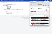
On "Find an issue" page, the border of "Daily", "Days per week", "Days per month" and so on form fields has insufficient contrast ratio (when not selected).
Steps to Reproduce
- Open above page.
- Save any filter.
- Activate "Details" link.
- Activate "New Subscription" link.
- Navigate through page using keyboard.
- Use any color contrast testing tool to check the color contrast.
- Observe that the border of form fields has insufficient contrast ratio.
Screenshot

Actual Results
The border of the form fields (when not selected) such as “ "Daily", "Days per week", "Days per month" and so on fails the minimum color contrast requirements with its background color.
FG: #DFE1E5
BG: #FFFFFF
Contrast ratio: 1.3:1
As a result, low-vision users will find it difficult to distinguish the form controls that have insufficient contrast.
Expected Results
The mentioned border of the input field should have a minimum contrast of 3:1 with the adjacent content. This helps low-vision users to easily identify the form field. The expected contrast ratio can be achieved by increasing the contrast of foreground color until it passes a contrast ratio of 3:1.
Workaround
Not available
Environment
MacBook Pro (16-inch, 2021)
macOS Sonoma Version 14.1
Chrome - Version 119.0.6045.159 (Official Build) (arm64)
Firefox- Version 93.0 (32-bit) Safari- Version 17.1 (19616.2.9.11.7)
JAWS- Version 2023
NVDA- Version 2020.3
Voiceover - Version Latest
