-
Type:
Bug
-
Resolution: Won't Fix
-
Priority:
Medium
-
None
-
Affects Version/s: 9.12.2
-
Component/s: Accessibility, Navigation - Search
-
9.12
-
Severity 3 - Minor
Issue Summary
The color contrast for the border of form controls present on the page fails minimum colour contrast requirements of 3:1.
Steps to Reproduce
- Open “Issues” page.
- Navigate to the "Affects Version/s", "Assignee", "Component/s" and so on checkboxes (available when users activate) "Order by Priority" button present on the page.
- Navigate to the "Add a comment" input field (available when users activate) "Add a comment" button present on the page
- Using CCA tool, check color contrast of mentioned instances.
- Observe that the colour contrast between the borders of form controls and the adjacent colour are insufficient.
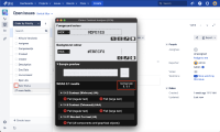
Screenshot 1

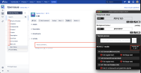
Screenshot 2

Actual Results
CCA fails for the following form controls:
- The #DFE1E5 border of "Affects Version/s", "Assignee", "Component/s" and so on checkboxes have a color contrast ratio of 1.3:1 with #FFFFFF background by default.
- The #DFE1E5 border of "Epic Status checkbox have a color contrast ratio of 1.1:1 with #EBECF0 background when focused.
- The #DFE1E5 border of "Add a comment" input field has color contrast ratio of 1.3:1 with #FFFFFF background by default.
This will make it difficult for people with low vision and color blindness to distinguish the form controls that have insufficient contrast.
Expected Results
Ensure that the color contrast for the foreground color of the borders of all form controls are 3:1 with the background color.
A color contrast analyser can be downloaded from https://www.tpgi.com/color-contrast-checker
Workaround
Not Available.
Environment
MacBook Pro (14-inch, 2021)
macOs Sonoma 14.2.1
Chrome - Version 121.0.6167.85 (Official Build) (arm64)
Firefox- Version 92.0 (64-bit)
Safari- Version 17.2.1 (19617.1.17.11.12)
JAWS- Version 2022
NVDA- Version 2021.2
Voiceover - Version Latest

