-
Type:
Bug
-
Resolution: Unresolved
-
Priority:
Low
-
None
-
Affects Version/s: 9.4.7, 9.4.9
-
Component/s: Dashboard & Gadgets
-
None
-
9.04
-
2
-
Severity 3 - Minor
Issue Summary
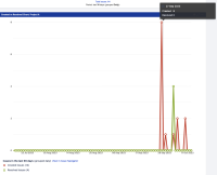
When adding the "Created vs Resolved Chart" from Jira to a dashboard, the plotted graph gets increasingly misaligned when retrieving results from a more significant number of days (90, for example). In such scenarios, the X-axis from the chart (days, for example) won't match the correct values for the Y-axis (created and resolved issues), so users may not see the correct values when hovering the mouse cursor on the graph.
Steps to Reproduce
- Create a dashboard on Jira
- Add the "Created vs Resolved Chart" to it
- Select any project containing created and resolved issues, then set the gadget to retrieve issues from the last 90 days
- Click on "Save" to finish adding the "Created vs Resolved Chart" to the dashboard
Expected Results
The gadget will display the correct number of created and resolved issues from the related day when hovering the mouse cursor to spikes on the graph depicting created and resolved issues.
Actual Results
The gadget displays the number of issues from a different day, as the X and Y axis are not aligned.

Workaround
There is no consistent workaround for this behavior. Reducing the number of elements in the X-axis (days, weeks, months, quarters, years) can help bring more consistent results, but the same behavior might still be reproduced.
- relates to
-
JRASERVER-78387 Created vs Resolved Chart Hover Text Displays Data From Wrong Column/Point
-
- Gathering Impact
-
