-
Type:
Suggestion
-
Resolution: Unresolved
-
None
-
Component/s: None
-
2
-
7
NOTE: This suggestion is for JIRA Server. Using JIRA Cloud? See the corresponding suggestion.
Summary
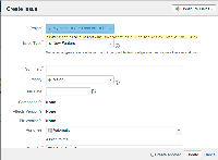
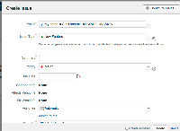
Projects with long names are cut off in the create issue screen as the project drop-down is only 250px.
Steps to Reproduce
- Create a project with a long name.
- Create an issue.
Expected Results
The drop down has sufficient space to display the project name.
Actual Results
The project name is cut off as per the example.
Notes
This could be fixed by extending the 250px width to 500px which would be sufficient and also kinda lines up with the rest of the page.
Workaround
- The JIRA files could be altered to change the display of the drop downs - if you'd like to do this please raise it on Atlassian Answers as it's unsupported - see a sample CSS fix in the comment below.
- Note that you should be able to see the project name in full, by hovering your mouse over each project name from the drop-down list.
- The project name can be shortened so that it correctly appears.
- is related to
-
JRASERVER-28478 Increasing the size of the field "project" when creating an issue
- Closed
- relates to
-
JRACLOUD-35218 Project drop down in Create Issue screen cuts off long project names
- Closed

