Uploaded image for project: 'Jira Data Center'
  1. Jira Data Center
  2. JRASERVER-31132

EAP Feedback - JIRA 6.0 Atlassian Design Guideline Rollout

    • Icon: Suggestion Suggestion
    • Resolution: Done
    • None
    • None
    • We collect Jira feedback from various sources, and we evaluate what we've collected when planning our product roadmap. To understand how this piece of feedback will be reviewed, see our Implementation of New Features Policy.

      NOTE: This suggestion is for JIRA Server. Using JIRA Cloud? See the corresponding suggestion.

      Hi everyone,

      Welcome to the JIRA 6.0 Early Access Program (EAP)!
      Thanks for trying out our early look at our next release. You can download the latest EAP release (milestone build, beta or release candidate) here.

      We have an existing issue (JRA-30983) to capture general feedback. This issue is the place to provide your thoughts on the new JIRA interface design that can be seen in JIRA 6.0 EAP 2 and all future EAP releases.

      We really appreciate you taking the time to provide us any feedback on the contents of the EAP.
      Simply comment below for any comments you may have.

      Cheers,
      Bryan, Roy, Mairead, and Josh
      JIRA Product Management

        1. JIRA 6.0-m04-modified.png
          JIRA 6.0-m04-modified.png
          337 kB
        2. JIRA 6.0-m04-orig.png
          JIRA 6.0-m04-orig.png
          341 kB
        3. JIRA view issue page 6.0-m04 modified.png
          JIRA view issue page 6.0-m04 modified.png
          287 kB
        4. JIRA view issue page 6.0-m04 modified with marker.png
          JIRA view issue page 6.0-m04 modified with marker.png
          292 kB
        5. JIRA view issue page 6.0-m04 orig.png
          JIRA view issue page 6.0-m04 orig.png
          256 kB
        6. Login gadget broken.png
          Login gadget broken.png
          193 kB
        7. Tempo Admin Navigation.png
          Tempo Admin Navigation.png
          98 kB

            [JRASERVER-31132] EAP Feedback - JIRA 6.0 Atlassian Design Guideline Rollout

            Holger Schimanski added a comment - - edited
            • I noticed, that in blue button and in Issues menu you use "Create issue" instead of "Create Issue". On other place you use chapital letter like "Search for Issues".
            • "Sign up" link in login gadget is not translated to german.
            • The link you get proposed to switch to mobile version of JIRA when using e.g. iPhone redirects to login screen (at jira.atlassian.com). Shouldn't the mobile version also be usable by unlogged user?

            Holger Schimanski added a comment - - edited I noticed, that in blue button and in Issues menu you use "Create issue" instead of "Create Issue". On other place you use chapital letter like "Search for Issues". "Sign up" link in login gadget is not translated to german. The link you get proposed to switch to mobile version of JIRA when using e.g. iPhone redirects to login screen (at jira.atlassian.com). Shouldn't the mobile version also be usable by unlogged user?

            Holger Schimanski added a comment - - edited

            Did had a look at 6.0-rc1 today. I really like view issue page now! Also Administration menu and tab layout looks nice. Thank's also for bringing back Admin search box.

            The switch between browse project and admin project is nice, but I would prefere buttons, because the tabs are waisting too much horizontal space. Actually I would merge admin versions with browse versions into one versions tab and same for versions. Then for most of the users resp. project admins there is no need to switch of view the project admin tab anyhow.

            What is confusing is the head line "concept" when switching through the vertical tabs in Administration and Project Administration.

            • When clicking on "System Info" the tab head line is "System Info". Fine!
            • Selection "Versions" tab in browse project, the tab head line is "Versions". Good!
            • Selecting "Versions" in project admin, the head line is "Versions" plus version logo. Okay!
            • If I go to "Issue Types" the header is "Issue Types Default Issue Type Scheme". But Default Issue Type Scheme is the sected value. That Default Issue Type Scheme is not a tab head line, but a selectable value is not resprected in its UI presentation. An untrained user don't really has a clue, that this is a parameter of the project, which can be changed.
            • Same for Screens, Fields, Permissions etc.
            • Click "Find new addons" than head line is "Atlassian Marketplace for JIRA".
            • "Application Links" is "Configure Application Links"
            • "Issue Collectors" is "All Issue Collectors"
            • "User Preferences" is "User Default Settings"
            • "Statuses" is "View Statuses"
            • etc.

            Holger Schimanski added a comment - - edited Did had a look at 6.0-rc1 today. I really like view issue page now! Also Administration menu and tab layout looks nice. Thank's also for bringing back Admin search box. The switch between browse project and admin project is nice, but I would prefere buttons, because the tabs are waisting too much horizontal space. Actually I would merge admin versions with browse versions into one versions tab and same for versions. Then for most of the users resp. project admins there is no need to switch of view the project admin tab anyhow. What is confusing is the head line "concept" when switching through the vertical tabs in Administration and Project Administration. When clicking on "System Info" the tab head line is "System Info". Fine! Selection "Versions" tab in browse project, the tab head line is "Versions". Good! Selecting "Versions" in project admin, the head line is "Versions" plus version logo. Okay! If I go to "Issue Types" the header is "Issue Types Default Issue Type Scheme". But Default Issue Type Scheme is the sected value. That Default Issue Type Scheme is not a tab head line, but a selectable value is not resprected in its UI presentation. An untrained user don't really has a clue, that this is a parameter of the project, which can be changed. Same for Screens, Fields, Permissions etc. Click "Find new addons" than head line is "Atlassian Marketplace for JIRA". "Application Links" is "Configure Application Links" "Issue Collectors" is "All Issue Collectors" "User Preferences" is "User Default Settings" "Statuses" is "View Statuses" etc.

            moxin added a comment -

            i was thinking of fixing it myself by using a webresource plugin. how can you run an AJS jquery function to load on Dashboard page? i have tried using context but to no avail.
            here is the question i posted on answers.atlassian.com
            https://answers.atlassian.com/questions/150185/run-an-ajs-jquery-function-on-jira-dashboard

            moxin added a comment - i was thinking of fixing it myself by using a webresource plugin. how can you run an AJS jquery function to load on Dashboard page? i have tried using context but to no avail. here is the question i posted on answers.atlassian.com https://answers.atlassian.com/questions/150185/run-an-ajs-jquery-function-on-jira-dashboard

            My bad Paul, you are correct that it indeed shows the Add-ons admin section.

            However, it would be feasible if the admin would see only links to Tempo pages, not Fisheye or other products, when he navigates to the Tempo Admin section. Is this something we can do by changing the web-fragments/decorator configuration?

            Thanks,
            ViΓ°ar

            ViΓ°ar Svansson [Tempo] added a comment - My bad Paul, you are correct that it indeed shows the Add-ons admin section. However, it would be feasible if the admin would see only links to Tempo pages, not Fisheye or other products, when he navigates to the Tempo Admin section. Is this something we can do by changing the web-fragments/decorator configuration? Thanks, ViΓ°ar

            sladey added a comment -

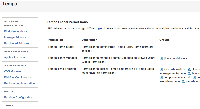
            pjesi the left hand menu does not represent the "core" admin navigation. This is the subset of the navigation under the "Add-ons" top-level admin section.

            sladey added a comment - pjesi the left hand menu does not represent the "core" admin navigation. This is the subset of the navigation under the "Add-ons" top-level admin section.

            It is not very useful to have the core Admin navigation on the left when inside the Tempo Administration section. It was much better in JIRA 5 where the left navigation only contained links from the Tempo admin section.

            I recall that we had to support two different admin navigation structures when JRIA 4.4 was released. Is this a similar case that we are unaware of?

            ViΓ°ar Svansson [Tempo] added a comment - It is not very useful to have the core Admin navigation on the left when inside the Tempo Administration section. It was much better in JIRA 5 where the left navigation only contained links from the Tempo admin section. I recall that we had to support two different admin navigation structures when JRIA 4.4 was released. Is this a similar case that we are unaware of?

            sladey added a comment -

            mohsin213jc we are on it.

            sladey added a comment - mohsin213jc we are on it.

            moxin added a comment -

            the font on gadget title is too big
            http://oi48.tinypic.com/x5589d.jpg

            moxin added a comment - the font on gadget title is too big http://oi48.tinypic.com/x5589d.jpg

            Not sure whether round project avatars will survive (I hope not), but in case of that incident - you should indicate that functionality also in project avatar setting dialog - and let user trim it in circle.

            Jozef KotlΓ‘r added a comment - Not sure whether round project avatars will survive (I hope not), but in case of that incident - you should indicate that functionality also in project avatar setting dialog - and let user trim it in circle.

            sladey added a comment - - edited

            holger.schimanski@bayerbbs.com you may be pleasantly surprised with 6.0-m9 or 6.0-m10 - we love your thinking here.

            sladey added a comment - - edited holger.schimanski@bayerbbs.com you may be pleasantly surprised with 6.0-m9 or 6.0-m10 - we love your thinking here.

            alesterre added a comment -

            I don't really like the issue list in the roadmap. I use roadmap to see the whole picture of the current development status (in other words, as a main screen) and, as a novice in JIRA, I find it relatively difficult to quickly percive statuses of the issues. For example, distinguish open issues from closed. Maybe, striking through or graying out closed issues would help. Also, issue status icons are on the far right end of the table, and they are hard to distinguish from each other ("in progress", "resolved", "closed" and so on). In my taste (as a novice, again), icon + text label would be better here.

            alesterre added a comment - I don't really like the issue list in the roadmap. I use roadmap to see the whole picture of the current development status (in other words, as a main screen) and, as a novice in JIRA, I find it relatively difficult to quickly percive statuses of the issues. For example, distinguish open issues from closed. Maybe, striking through or graying out closed issues would help. Also, issue status icons are on the far right end of the table, and they are hard to distinguish from each other ("in progress", "resolved", "closed" and so on). In my taste (as a novice, again), icon + text label would be better here.

            After some time I had a look again at JIRA 6 and I stumbled on some of the same things still in m06-7.1. I'd like to repeat a statement from JRA-30983.

            It is easy to get from project summary to project amdin by using "Administer Project". At the same position you should place the "Browse Project" button to give an easy way to get back to the project admin to project summary.

            I personally think, that this would be a real timesaver. "Browse project" is the primary action of project admin (all tabs).

            Think about adding a new version as an example: In version tab of project summary click on "Manage Versions". Then add the new version. Then click on "Browse Project" and you are back on the project page. Instead you have to click "Summary", then "cogwheel > Browse Project".

            Holger Schimanski added a comment - After some time I had a look again at JIRA 6 and I stumbled on some of the same things still in m06-7.1. I'd like to repeat a statement from JRA-30983 . It is easy to get from project summary to project amdin by using "Administer Project". At the same position you should place the "Browse Project" button to give an easy way to get back to the project admin to project summary . I personally think, that this would be a real timesaver. "Browse project" is the primary action of project admin (all tabs). Think about adding a new version as an example: In version tab of project summary click on "Manage Versions". Then add the new version. Then click on "Browse Project" and you are back on the project page. Instead you have to click "Summary", then "cogwheel > Browse Project".

            pjesi posted a few comments on ADG issues on this comment

            Bryan Rollins added a comment - pjesi posted a few comments on ADG issues on this comment

            Holger Schimanski added a comment - - edited

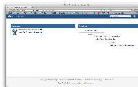
            The layout of the login dialog on the Dashboard is broken.

            Holger Schimanski added a comment - - edited The layout of the login dialog on the Dashboard is broken.

            In general I love the changes. There are a couple of changes I don't like though.

            1. Round Project Avatars - We have 180 projects and all of them have individual images tailored for the project with Square images.
            2. The amount of whitespace and large font sizes - I completely agree with Holger Schimanski in regards to the bizarre use of large fonts and vast amount of whitespace as a result of this change.

            Lastly, similar to what Patrick Sinclair mentioned I think JIRA would benefit from a customisable always on screen (and collapsable) side bar similar to confluence. Personally if I was using it I would put in: List of Favourite Dashboards, Last 5 Projects, Last 5 viewed filters, Last 5 viewed JIRA issues.

            Aaron Booth added a comment - In general I love the changes. There are a couple of changes I don't like though. Round Project Avatars - We have 180 projects and all of them have individual images tailored for the project with Square images. The amount of whitespace and large font sizes - I completely agree with Holger Schimanski in regards to the bizarre use of large fonts and vast amount of whitespace as a result of this change. Lastly, similar to what Patrick Sinclair mentioned I think JIRA would benefit from a customisable always on screen (and collapsable) side bar similar to confluence. Personally if I was using it I would put in: List of Favourite Dashboards, Last 5 Projects, Last 5 viewed filters, Last 5 viewed JIRA issues.

            Just installed the EAP, I like the new design for the most part, 2 suggestions

            1. While I like the look of the new top bar, I preferred the functionality of the top bar from 5.2, which only dropped down the list if you clicked on the dropdown arrow, and clicking on project or issue brought you to the project screen or the search screen. Is there any way to get that back?
            The current functionality seems like a step backwards to me.

            2. It would be nice if the Favorite dashboard list on the left side of the home screen were collapsible similar to the way the structure list in confluence is.

            if you only have 1 dashboard, it's not shown, but if you favorite more than 1, it always eats up a chunk of space.
            it sucks to give up that chunk of space. At the moment I just don't favorite my other dashboards and load them when I need them the long way which is a pain.

            Patrick Sinclair added a comment - Just installed the EAP, I like the new design for the most part, 2 suggestions 1. While I like the look of the new top bar, I preferred the functionality of the top bar from 5.2, which only dropped down the list if you clicked on the dropdown arrow, and clicking on project or issue brought you to the project screen or the search screen. Is there any way to get that back? The current functionality seems like a step backwards to me. 2. It would be nice if the Favorite dashboard list on the left side of the home screen were collapsible similar to the way the structure list in confluence is. if you only have 1 dashboard, it's not shown, but if you favorite more than 1, it always eats up a chunk of space. it sucks to give up that chunk of space. At the moment I just don't favorite my other dashboards and load them when I need them the long way which is a pain.

            holger.schimanski@bayerbbs.com thanks for digging up the old issues and all the feedback on the view issue page. We're still iterating on the design for it.
            We already have a ticket open re highlighting the first menu item, https://ecosystem.atlassian.net/browse/AUI-1078 and we're looking into adding a tooltip for the logo, and if this is a concern for many customers (the tooltip would need to be customisable to work with the customisable logo).

            Cheers,
            Jurgen

            Jurgen 🐝 (Inactive) added a comment - - edited holger.schimanski@bayerbbs.com thanks for digging up the old issues and all the feedback on the view issue page. We're still iterating on the design for it. We already have a ticket open re highlighting the first menu item, https://ecosystem.atlassian.net/browse/AUI-1078 and we're looking into adding a tooltip for the logo, and if this is a concern for many customers (the tooltip would need to be customisable to work with the customisable logo). Cheers, Jurgen

            Holger Schimanski added a comment - - edited

            Please take the time to really review and review again the layout of the view issue page. JRA-20669 is three years old now, but it's still in my mind for "take the users with you for major layout changes".

            A lot of feedback is valid here as well. Please have a look at JRA-20669 and think about the feedback you got there, how it is relevate for JIRA 6 layout changes.

            The main things for me during that discussion was, don't waste space.

            • I am not sure, if it is neccessary to increase font-size from 12 to 14px (I like it, but in JRA-20669 there where lots of people complaining about it).
            • Increased width for right column for people and dates (this decreases the width for descrition and comment section, which are much more important). In JIRA 5 it is 1/4 in JIRA 6 it is 1/3.
            • Increased spacing between comments. In JIRA 5 this was very compact layout.
            • Increaded spacing between sections.

            What's good

            • You removed the grey border arround the view issue page resulting in more space for the page.
            • I really like the new blue top bar with projects, issues etc. and the highlighted Create Issue button. But why is the first menu item highlighted? To mark it as the primary action? This is not common in menu. Please also add a description for the JIRA logo (e.g. "Go to the JIRA start page").

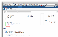
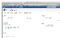
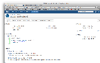
            I have modified the page with lower spacing between the elements, but still keeping 14px font-size. Hope this helps for the discussion.

            Holger Schimanski added a comment - - edited Please take the time to really review and review again the layout of the view issue page. JRA-20669 is three years old now, but it's still in my mind for "take the users with you for major layout changes". A lot of feedback is valid here as well. Please have a look at JRA-20669 and think about the feedback you got there, how it is relevate for JIRA 6 layout changes. The main things for me during that discussion was, don't waste space. I am not sure, if it is neccessary to increase font-size from 12 to 14px (I like it, but in JRA-20669 there where lots of people complaining about it). Increased width for right column for people and dates (this decreases the width for descrition and comment section, which are much more important). In JIRA 5 it is 1/4 in JIRA 6 it is 1/3. Increased spacing between comments. In JIRA 5 this was very compact layout. Increaded spacing between sections. What's good You removed the grey border arround the view issue page resulting in more space for the page. I really like the new blue top bar with projects, issues etc. and the highlighted Create Issue button. But why is the first menu item highlighted? To mark it as the primary action? This is not common in menu. Please also add a description for the JIRA logo (e.g. "Go to the JIRA start page"). I have modified the page with lower spacing between the elements, but still keeping 14px font-size. Hope this helps for the discussion.

            Holger Schimanski added a comment - - edited

            The dashboard-item-title is too big and wasting to much space. Use font-size 14px and line-height 12 px. The spacing between the gadgets is nice.

            Holger Schimanski added a comment - - edited The dashboard-item-title is too big and wasting to much space. Use font-size 14px and line-height 12 px. The spacing between the gadgets is nice.

            Have a look at Atlassian Marketplace, how many of the plugin icons will look good without modification when you would switch to round icons. This will frustrate the users, that they have to change the icons.

            And I don't think, that it is important to differentiate between users and projects. I nearly never open a profile page of a user (except my own profile when I am a new JIRA user to switch on/off autowatch or email on my own changes), so there is no problem in mixing up projects and users pages. This might be different between Bitbucket and JIRA, but I would suggest, that you have only 0.1% traffic on user profiles on a JIRA server.

            So, I don't like, that it is changed, because I don't get a real benefit for having the trouble to change the icons.

            Cheers
            Holger

            Holger Schimanski added a comment - Have a look at Atlassian Marketplace, how many of the plugin icons will look good without modification when you would switch to round icons. This will frustrate the users, that they have to change the icons. And I don't think, that it is important to differentiate between users and projects. I nearly never open a profile page of a user (except my own profile when I am a new JIRA user to switch on/off autowatch or email on my own changes), so there is no problem in mixing up projects and users pages. This might be different between Bitbucket and JIRA, but I would suggest, that you have only 0.1% traffic on user profiles on a JIRA server. So, I don't like, that it is changed, because I don't get a real benefit for having the trouble to change the icons. Cheers Holger

            Thanks for the feedback holger.schimanski@bayerbbs.com.

            What do you not like about the round project avatars? Why do you think our users would not like it?

            The reason for the change is to differentiate clearly between project avatars (round) and user avatars (square). See more details about avatars in our design guidelines: https://developer.atlassian.com/design/avatars.html

            Cheers,
            Jurgen

            Jurgen 🐝 (Inactive) added a comment - Thanks for the feedback holger.schimanski@bayerbbs.com . What do you not like about the round project avatars? Why do you think our users would not like it? The reason for the change is to differentiate clearly between project avatars (round) and user avatars (square). See more details about avatars in our design guidelines: https://developer.atlassian.com/design/avatars.html Cheers, Jurgen

            holger@schimanski-web.de had the following feedback:

            Do you really want to switch to round project avatars? I don't see any benefit and I can foresee the discussion with our users, why Atlassian is doing such layout changes without any reason or value.
            And I personally don't like the issue type images as used in Bitbucket and JIRA 6.0-m02, but I like the square ones (more clear, adequate line width) in the screenshot of the release notes.
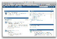
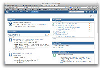
            Bryan Rollins added a comment - holger@schimanski-web.de had the following feedback: Do you really want to switch to round project avatars? I don't see any benefit and I can foresee the discussion with our users, why Atlassian is doing such layout changes without any reason or value. And I personally don't like the issue type images as used in Bitbucket and JIRA 6.0-m02, but I like the square ones (more clear, adequate line width) in the screenshot of the release notes.
              Unassigned Unassigned
              pslade@atlassian.com sladey
              Votes:
              0 Vote for this issue
              Watchers:
              20 Start watching this issue

                Created:
                Updated:
                Resolved: