-
Type:
Suggestion
-
Resolution: Won't Do
-
None
-
Component/s: Dashboard & Gadgets
NOTE: This suggestion is for JIRA Server. Using JIRA Cloud? See the corresponding suggestion.
Two areas where the JIRA dashboard could provide more screen real-estate for display data:
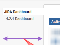
1. The dashboard options (Add Gadget, Edit Layout, Tools) are omnipresent on the dashboard, taking up vertical screen real-estate (31px, as measured by Chrome's element inspection). (attached screenshot)
2. When using multiple dashboards, the display of the dashboard names on the left uses ~130px. (attached screenshot)
Suggestions:
1. Move the dashboard options to the 'Dashboards' menu;
2. Collapse the dashboard options div, allowing it to be expanded when needed;
3. Provide an option for the list of dashboard names to be in a drop-down over the dashboard content;
3. Provide an option to eliminate the list of dashboards from the dashboard itself (they are available on the main navigation menu)
- relates to
-
JRACLOUD-26947 Dashboard - Improve use of screen real-estate
- Closed


