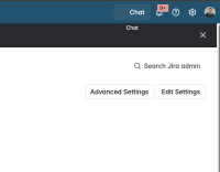
In new navigation Chat button to launch Rovo is hard to see, especially with darker colour schemes:

- The icon is nearly invisible on our (custom) dark background.
- The button border is very thin & faint.
Need to improve visibility or a way to customise it
Suggestion