-
Type:
Suggestion
-
Resolution: Duplicate
-
None
-
2
As we all know, we can not disable the comment on every transition. It always gonna show up regardless. At least, we want them to show up the same wherever.
This is how the comment field shows up in our View screen.
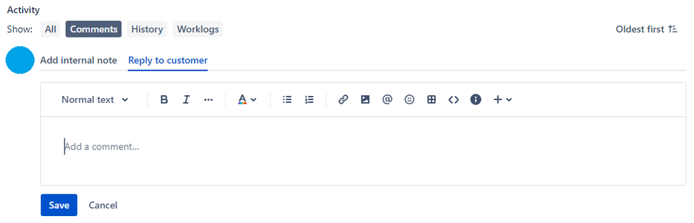
This is how it shows up in transition view and we don't like it.
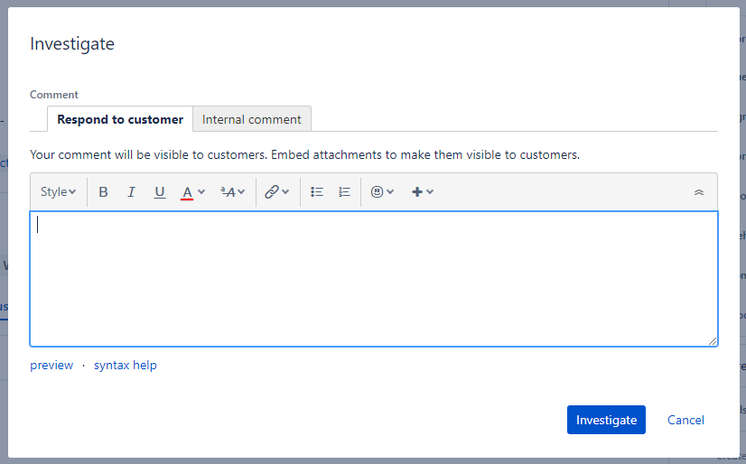
Although it serves the same function, but it works differently in terms on formatting and user friendliness.
We prefer the first one to shows up on our transition view as well.
Am I missing something here?
this has been asked in the Atlassian Community and most users are experiencing the same problem - Comment field shows differently in transition view... (atlassian.com)
- duplicates
-
- Closed