Uploaded image for project: 'Jira Cloud'
  1. Jira Cloud
  2. JRACLOUD-76057

New View's custom User Picker (multiple users) should look like Old Issue View

    XMLWordPrintable

Details

    • Suggestion
    • Resolution: Fixed
    • None
    • None
    • 1
    • Our product teams collect and evaluate feedback from a number of different sources. To learn more about how we use customer feedback in the planning process, check out our new feature policy.

    Description

      There are a couple of differences in how multi-user picker behaves on the New Issue View compared with the Old.

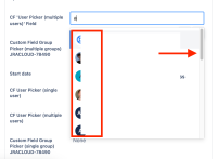
      In the old view, the list always shows together with the key typed letter. Easier to select a new user.

      However, in the new view, the list always shows at the top. It causes problems for selecting a new user once the field gets large, requiring you to zoom or scroll up to select the users:

      Showing this difference:

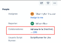
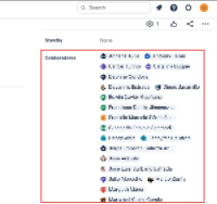
      Another important point that's eye-catching is how the User Picker shows the users already select as well (the Old View is "cleaner"):

      Old Issue View:

      • Shows the number of additional users.

      New Issue View:

      • Shows all users, despite the field cupping a huge space.

      Attachments

        1. image-2021-02-19-11-51-12-705.png
          image-2021-02-19-11-51-12-705.png
          458 kB
        2. image-2021-02-19-11-53-49-102.png
          image-2021-02-19-11-53-49-102.png
          127 kB
        3. image-2021-02-19-11-58-31-683.png
          image-2021-02-19-11-58-31-683.png
          322 kB
        4. screenshot-1.png
          screenshot-1.png
          108 kB

        Issue Links

          Activity

            People

              Unassigned Unassigned
              976c02b75079 Celso J
              Votes:
              5 Vote for this issue
              Watchers:
              4 Start watching this issue

              Dates

                Created:
                Updated:
                Resolved: