-
Type:
Suggestion
-
Resolution: Duplicate
-
2
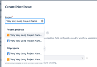
If a project has a long name, then the project names are truncated in the project picker drop-down. This causes confusion if multiple projects have a similar initial part of their name. E.g. the following names would appear the same in the dropdown.
- Very Very Long Project name 001
- Very Very Long Project name 002
- Very Very Long Project name 003
The suggestion is to make the project name picker wide enough to show the full name of the project with the largest name. It should take as much maximum space allowed by the screen resolution.
Workaround
- Use different icons for such projects to differentiate between them.
- Slid the cursor using keyboard/mouse to reveal the full name.
- duplicates
-
JRACLOUD-75590 Project Picker / dropdown are too narrow, truncate project names
- Gathering Interest
- is duplicated by
-
JRACLOUD-36872 Screen Design - Project dropdown too narrow
- Closed
