-
Type:
Suggestion
-
Resolution: Duplicate
-
Component/s: None
NOTE: This suggestion is for JIRA Cloud. Using JIRA Server? See the corresponding suggestion.
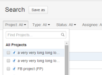
While doing a basic search from the Issue Navigator, trying to select one of several projects with long project names starting with the same set of words or characters that extend beyond the 250px width of the project drop down menu, can be quite confusing to users. As the project names get truncated by the limited width and are hard to differentiate.
It would be great to possibly extend the width of the project drop down menu to atleast 400 - 500px to allow for more visiblity.
Workarounds:
- Note that you should be able to see the project name in full, by hovering your mouse over each project name from the drop-down list.
- The project name can be shortened so that it correctly appears.
- It is possible to customise the JIRA UI by CSS to extend the width of the drop down menu. If you need assistance with that you could try posting on https://answers.atlassian.com, as this kind of customisations are beyond Atlassian Support Scope
- In the Project Field, the user could specify the project's unique project key to avoid confusion with the long project names.
- is related to
-
JRASERVER-39218 Project drop down menu in Issue Navigator should make full Project Name visible
- Closed
-
JRACLOUD-75590 Project Picker / dropdown are too narrow, truncate project names
- Gathering Interest
