-
Type:
Sub-task
-
Resolution: Won't Do
-
Priority:
Medium
-
None
-
Affects Version/s: None
-
Component/s: None
This issue has originated from https://support.atlassian.com/browse/JSP-22123
While we love Jira, some UI usability issues become a little problematic. I wanted to hear your opinion on this:
1. Open vs Non-open issues. It's very hard to see in the issue lists and issue page if the issue is open or not. The information is buried within the page and not very distinct.
It's somewhat hard in both issue navigator and issue page. When one has to review issues quickly, just the status column doesn't always provide enough distinction.
2. Users often don't notice the comments at the bottom of the page, b/c issue w/o comments doesn't differ enough from the issue with comments.
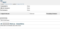
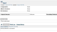
I attached two screenshots: first one w/o any comments and the second one with one comment. I noticed over and over that people often don't notice that the comment is present in the second case, b/c they're used to some text in the comments section by default.
- is related to
-
JRASERVER-14821 UI useability request for resolved/closed issues and comments
-
- Closed
-

