Problem Definition
In Portfolio, certain configurations allow Users and Groups to be added. Examples of such configurations:
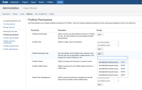
- Administration >> Add-ons >> Portfolio permissions
- Portfolio Plan/Program Administration >> Permissions
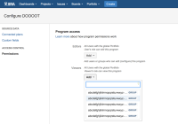


Users and Groups that are too long will be truncated with ellipses (...), making it impossible to differentiate between them if there are multiple names that are similar or begin with the same characters. This makes it difficult to select the Users/Groups that are desired.
Suggested Solution
Implement a mechanism that allows users to view more characters. This could include:
- Allowing the dropdown list to be resized, rendering more or less characters as fits on screen.
- Instead of truncating, allow for side scrolling in the window
Why this is important
Users cannot properly differentiate which User/Group they're looking for when the names are too long. They will have to guess, or must know the name of the group exactly.

