• Our product teams collect and evaluate feedback from a number of different sources. To learn more about how we use customer feedback in the planning process, check out our new feature policy.

      After having a look at the sexy new membership management - it's a huge improvement on the old system - there's a few things that need some tidying up before we can ship.

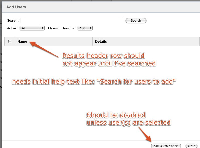
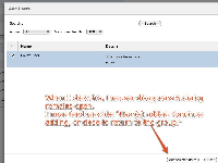
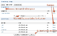
      There are three marked-up screens attached. The issues are:

      • Whitespace is too large between section header (user members or group members) and the actual members.
      • When the add/remove dialog opens, the result header should not be visible. Gives the impression that there are no users to add. Instead there should be text to help the user understand they should search for the users they want to add.
      • When you have added/removed users from a group, there's no visual feedback of success. There should be text on the lines of "Users successfully added. Continue adding or close."
      • The "Remove" link is obsolete. Having two ways to remove a user is pointless. Remove it
      • Group member adding should be through a similar dialog mechanism to user adding.
      • The "Update" button does nothing. Lets get rid of it.
      • "Add Selected Users" should not be clickable if no users are selected

            [CWD-1525] UI Improvements for Group Membership Management

            shihab added a comment -

            Group and user picker implemented, along with appropriate Selenium tests.

            The one workflow change is that clicking "add" or "remove" in the dialog closes the actual dialog (doesn't make much sense to keep the dialog open after an operation has been committed). If the user wants to add/remove more members, they can click the appropriate add/remove button again.

            shihab added a comment - Group and user picker implemented, along with appropriate Selenium tests. The one workflow change is that clicking "add" or "remove" in the dialog closes the actual dialog (doesn't make much sense to keep the dialog open after an operation has been committed). If the user wants to add/remove more members, they can click the appropriate add/remove button again.

            shihab added a comment -

            We need to also answer the question: what happens when there are 10k, or even 200 say, members of a group? That will be one fat page.

            Perhaps we need to work paging into this screen. Also what happens when there are 200 user members and 200 group members? We would need two pagers and this could actually overwhelm the UI.

            shihab added a comment - We need to also answer the question: what happens when there are 10k, or even 200 say, members of a group? That will be one fat page. Perhaps we need to work paging into this screen. Also what happens when there are 200 user members and 200 group members? We would need two pagers and this could actually overwhelm the UI.

              shamid@atlassian.com shihab
              doflynn David O'Flynn [Atlassian]
              Votes:
              0 Vote for this issue
              Watchers:
              1 Start watching this issue

                Created:
                Updated:
                Resolved:

                  Estimated:
                  Original Estimate - 16h Original Estimate - 16h
                  16h
                  Remaining:
                  Remaining Estimate - 0h
                  0h
                  Logged:
                  Time Spent - 37h
                  37h