-
Type:
Suggestion
-
Resolution: Won't Do
-
None
-
Component/s: Macros - Chart
-
1
NOTE: This suggestion is for Confluence Server. Using Confluence Cloud? See the corresponding suggestion.
Summary
The Scatter Chart Macro expects a table like the XY Line Chart that is made of a sequence of values but Scatter charts are normally made to compare 2 data sets and form (x,y) cartesian dots to graph correlation.
Here are some link about scatter graphs:
https://en.wikipedia.org/wiki/Scatter_plot
http://www.excel-easy.com/examples/scatter-chart.html
https://www.mathsisfun.com/data/scatter-xy-plots.html
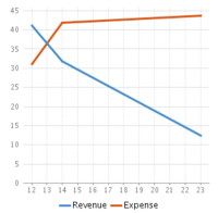
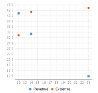
At the moment, the chart is expecting a table like XY Line Chart:
| 12 | 14 | 23 | |
|---|---|---|---|
| Revenue | 41.1 | 31.8 | 12.4 |
| Expense | 31.1 | 41.8 | 43.6 |
That graphs:
XYline: ---------------------------------------------- Scatter:


Problem
If one has a data set to compare such as
Ice Cream Sales vs Temperature: from this link
| Temperature °C | Ice Cream Sales |
|---|---|
| 14.2 | 215 |
| 16.4 | 325 |
| 11.9 | 185 |
| 15.2 | 332 |
| 18.5 | 406 |
The Scatter chart would fail to graph it.
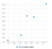
If doing:
| Temperature °C | 14.2 | 16.4 | 11.9 | 15.2 | 18.5 |
| Ice Cream Sales | 215 | 325 | 185 | 332 | 406 |
This is the result:

Which is pretty close but confirms that the first row is considered the X axis and additional rows are sequence of Y values.
The Label is missing because it is not actually considered a data set.
So it looks like scatter chart is like the XYLine Chart but without the line and so it is not a true scatter graph that graphs (x,y) tuples to compare correlation between data sets.
- relates to
-
CONFCLOUD-41329 Scatter chart of the Chart Macro expects incorrect data set
- Closed