-
Type:
Suggestion
-
Resolution: Answered
-
None
-
Component/s: None
NOTE: This suggestion is for Confluence Server. Using Confluence Cloud? See the corresponding suggestion.
Make the CSS below the default style for Confluence.
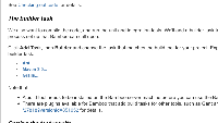
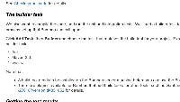
The Tech Writers felt the need to improve the look of the Expand macro. The style of the control text should suggest the possibility of clicking it, without the need for clunky "Click to expand..." messages.
See the attached screenshots.
I added custom CSS to qa-cac to change the colour and spacing of the control text and icon. See below.
We are pushing that to the CAC spaces. Note that the default Confluence alignment varies for different list types. The styling below attempts to align with a numbered list.
Is it worth making this part of the default CSS?
.expand-control-text
{ line-height:normal; font-weight:bold; padding: 2px 2px 0px 0px; font-size:12px; margin: 18px 2px 0px 4px; font-family:Arial,Helvetica,FreeSans,sans-serif; page-break-after:avoid; color: #4076AC; }.expand-control-icon
{ margin-left: 16px; }- relates to
-
CONFCLOUD-24821 Improve the styling of the Expand macro
- Closed
- mentioned in
-
Page Loading...

