-
Type:
Suggestion
-
Resolution: Unresolved
-
Component/s: Macros - Task Report
-
None
-
1
Summary\Use Case:
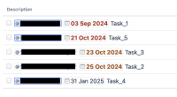
The "Task Report" macro in Confluence Cloud is a popular tool for tracking and managing tasks. However, users have reported that the color scheme used to differentiate overdue tasks (red) from incoming tasks (orange) is confusing, as the colors are visually similar. This issue can make it difficult for users to quickly and accurately assess task statuses at a glance.
Suggestion:
To improve the usability of the "Task Report" macro, we propose adjusting the color scheme to ensure a clearer visual distinction between overdue and incoming tasks. A stronger contrast—perhaps using a more distinct red or a completely different color like yellow for incoming tasks—would help users more easily differentiate between the two categories.
Impact of the Improvement:
This enhancement will significantly improve the user experience, particularly for those managing large numbers of tasks. Clearer color differentiation will lead to better task prioritization and reduced confusion. Ultimately, this will enhance productivity and ensure users can more quickly act on overdue tasks without mistaking them for incoming tasks.


