-
Type:
Suggestion
-
Resolution: Unresolved
-
Component/s: Site - Configuration
-
None
-
2
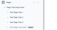
Allow the color of the page tree text in the space navigation sidebar to be customer adjustable, to allow improved visual accessibility.

Alternatively, whatever code controls this default text font could be customer adjustable.
Editor: Macro (Expand) - Insufficient color contrast for the text
Issue Description
The color contrast for the text in the expandable element fails to meet the required minimum color contrast ratio.
Steps to Reproduce
- In the editor, add the ‘expand’ macro.
- Using a CCA tool check the mentioned instruction text which fails minimum color contrast requirements.
Actual Behaviour
The text (Editable) for the naming of the ‘Expand’ macro in the editor (In edit mode) fails the minimum contrast ratio.
When checked with the Color contrast analyzer tool, the color contrast for the above instance fails to meet the required minimum color contrast ratio:
Foreground: #6C788D
Background: #FFFFFF
Ratio: 4.46:1
As a result, low vision and elderly users won't be able to read the content effectively. This will cause an unpleasant user experience for visually impaired users.
Expected Result
The text content should have a color contrast ratio of 4.5:1. Which helps low-vision users to read the text.
The expected contrast ratio can be achieved by increasing the contrast of foreground color until it passes a contrast ratio of 4.5:1
A color contrast analyzer can be downloaded from Color Contrast Checker - TPGi
- is related to
-
CONFCLOUD-76992 Provide option for Custom themes and contrasts in Confluence
- Gathering Interest
- mentioned in
-
Page Loading...
- relates to
-
ACE-3519 Loading...


